RCP’s brand refresh was instigated by a changing of the guard. Alongside its practicing board of directors, Jeremy Hay—the new managing director of RCP—identified that RCP needed to reposition itself. While construction project management has become increasingly commoditised, RCP’s long track record of delivering projects of scale means they are uniquely placed to provide strategic advisory and unbiased expertise for some of Aotearoa’s most complex buildings.
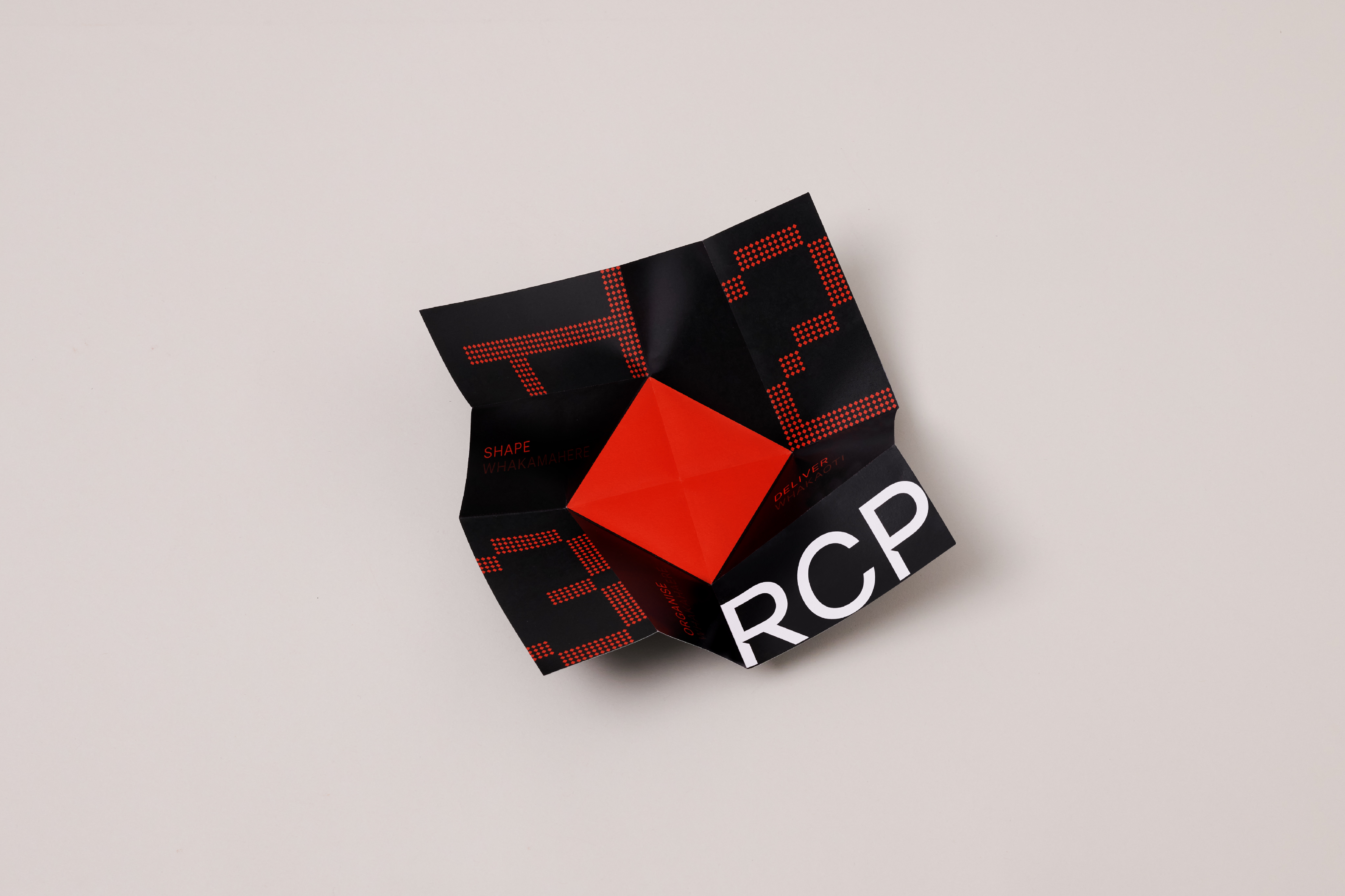
The extent of this project included an interrogation of RCP’s ethos. Their why. RCP’s purpose is to shape, organise, and deliver a better world. This simple statement has become the foundation of its newly-defined service architecture; shaping the future of our built environment, organising project teams, and then delivering the final result.
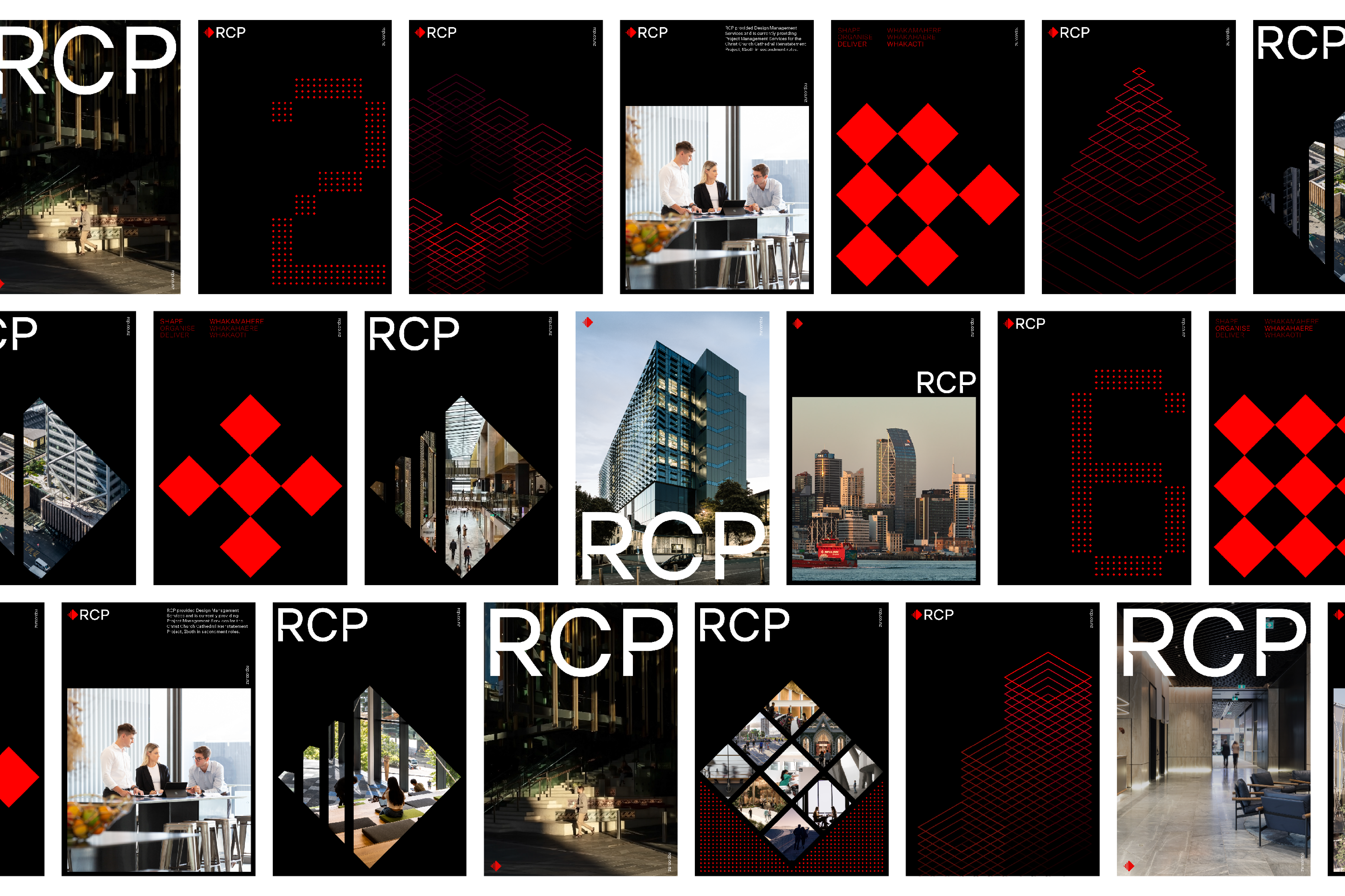
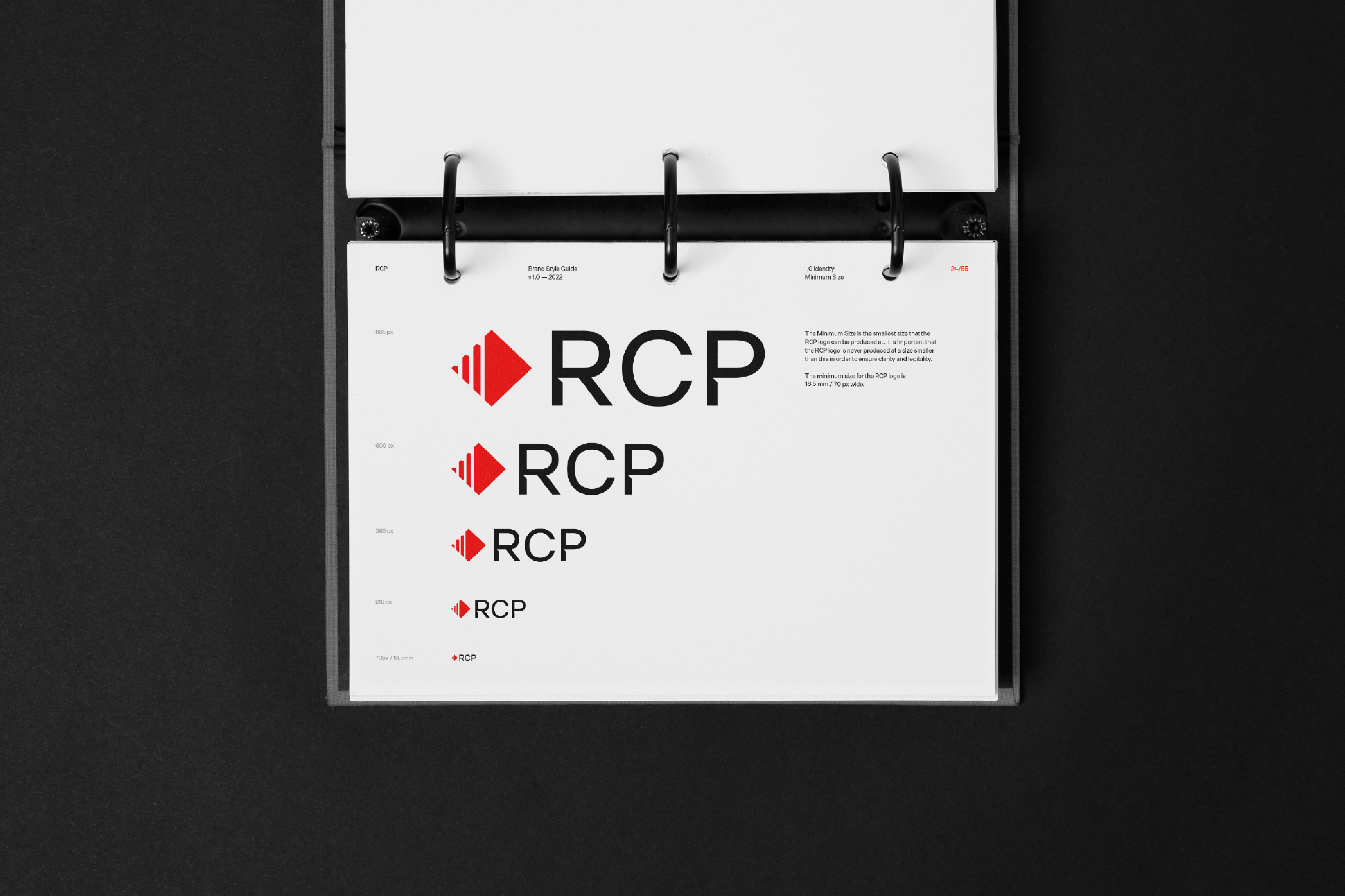
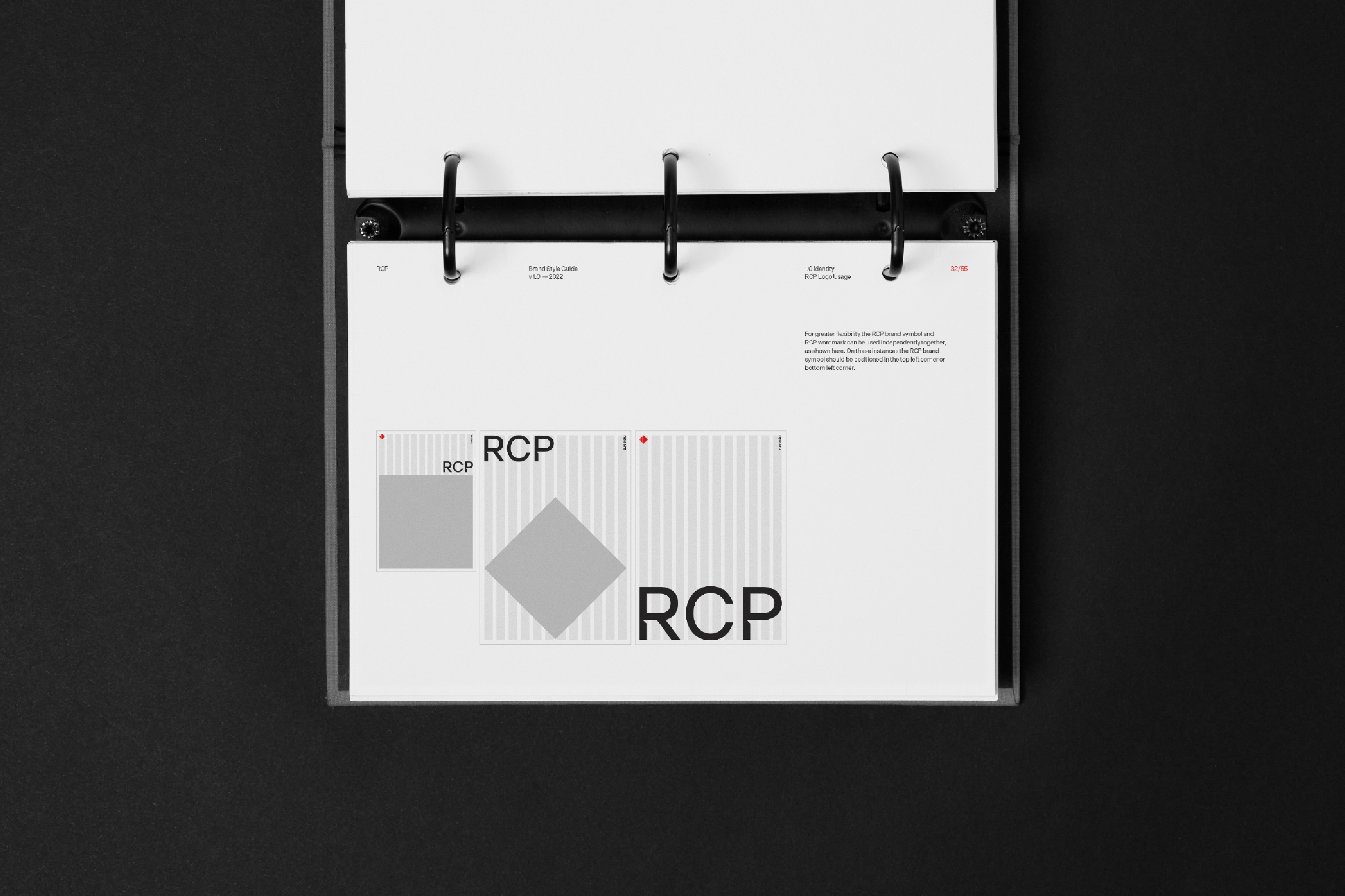
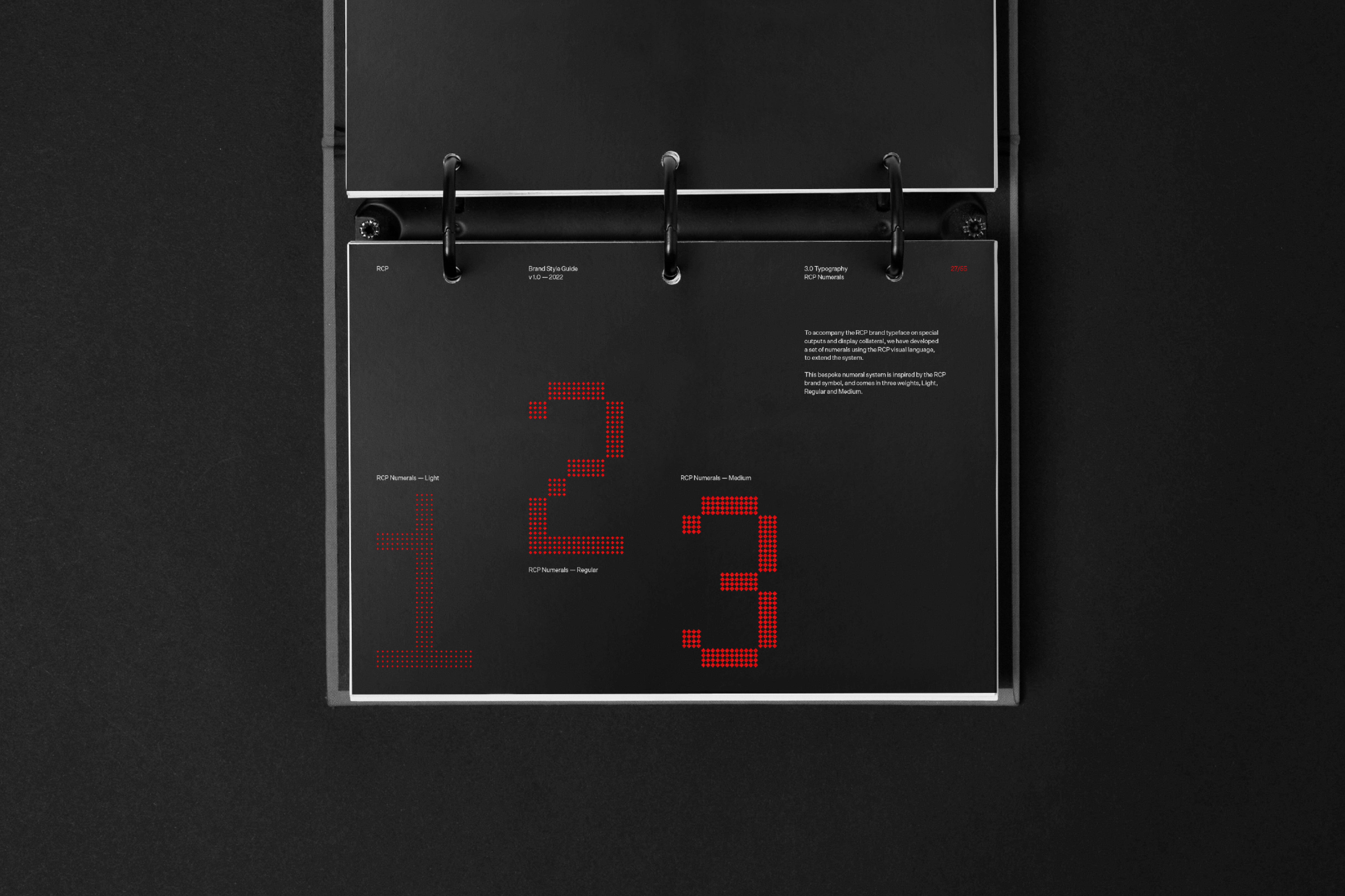
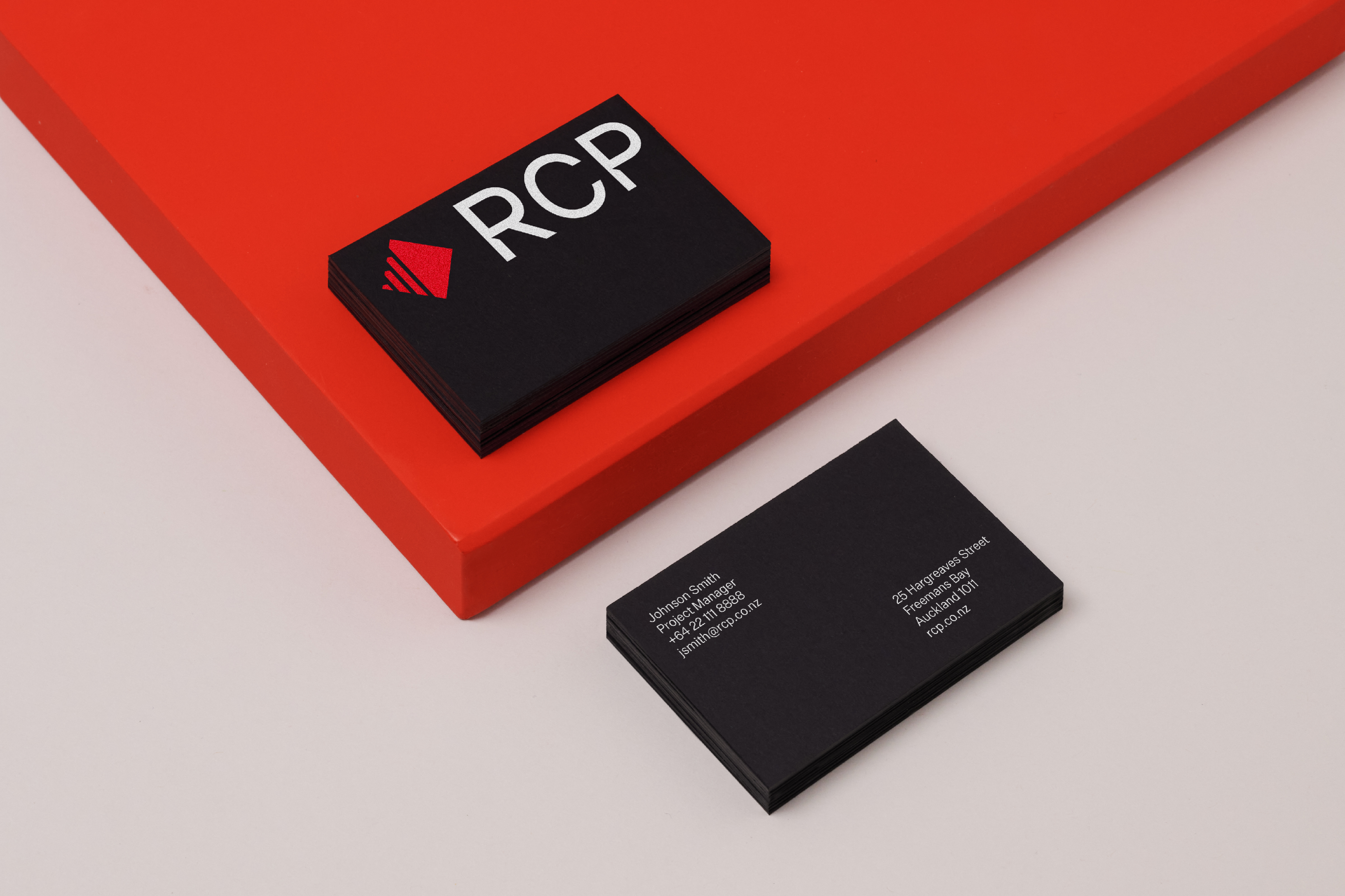
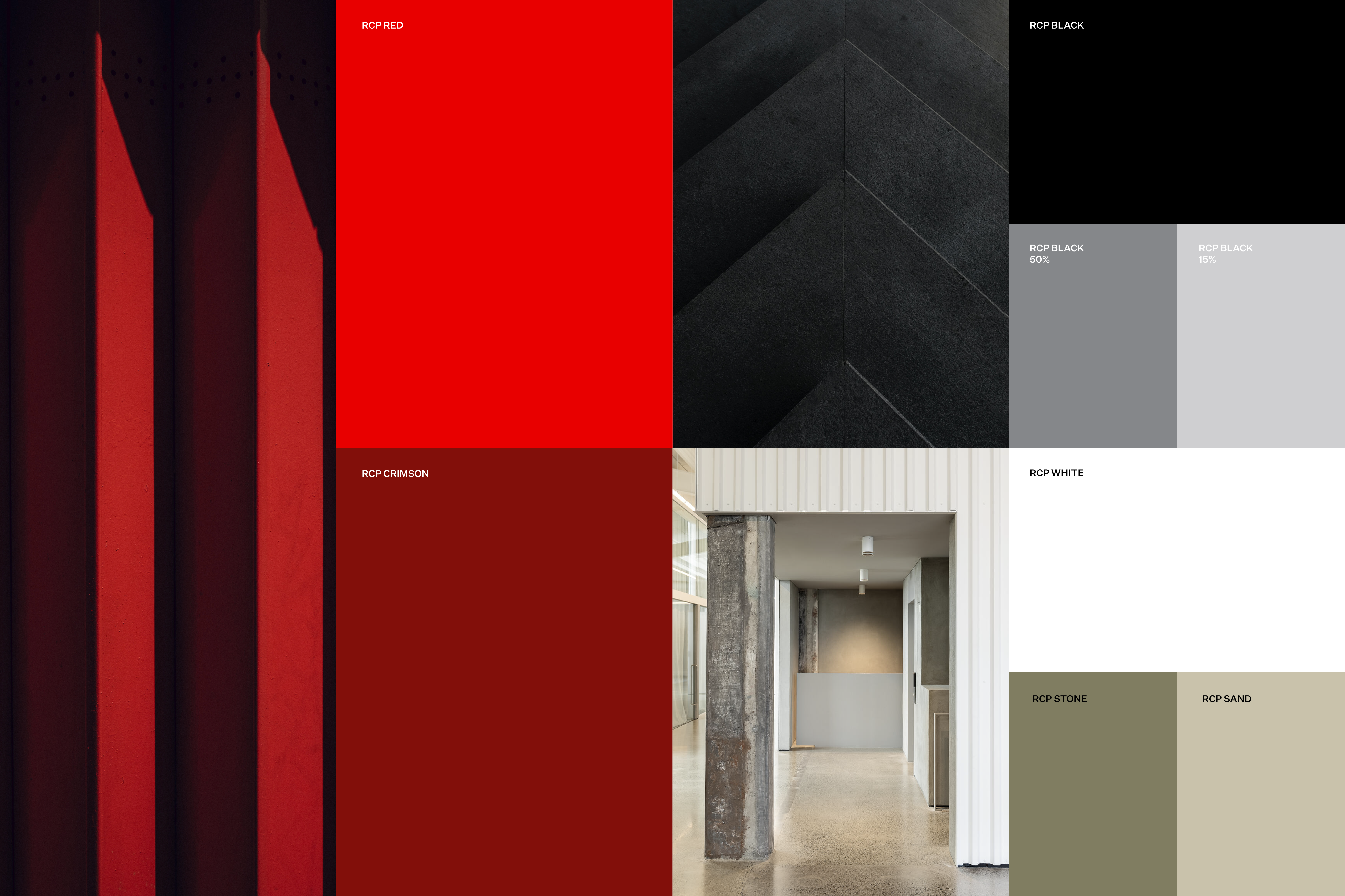
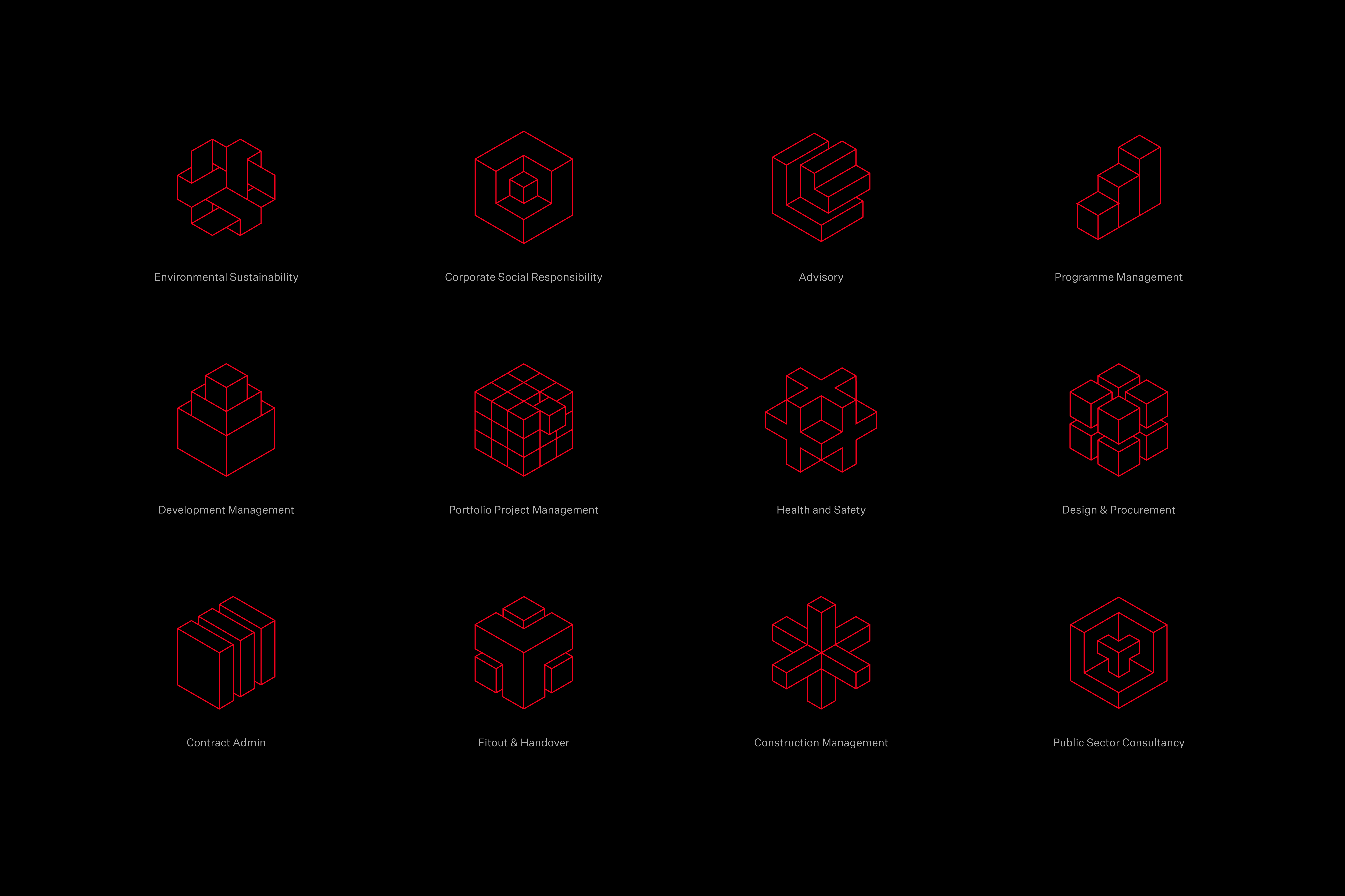
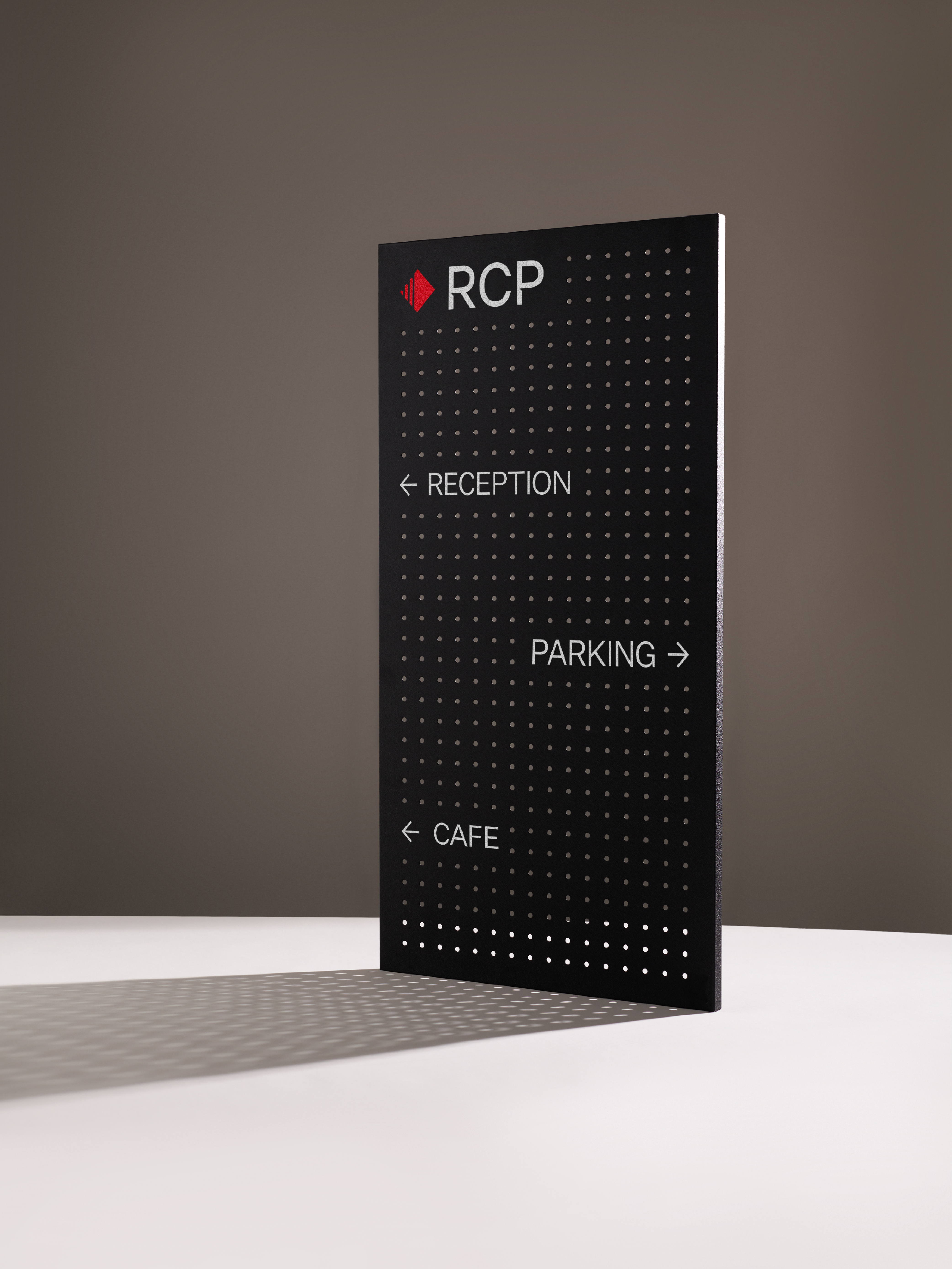
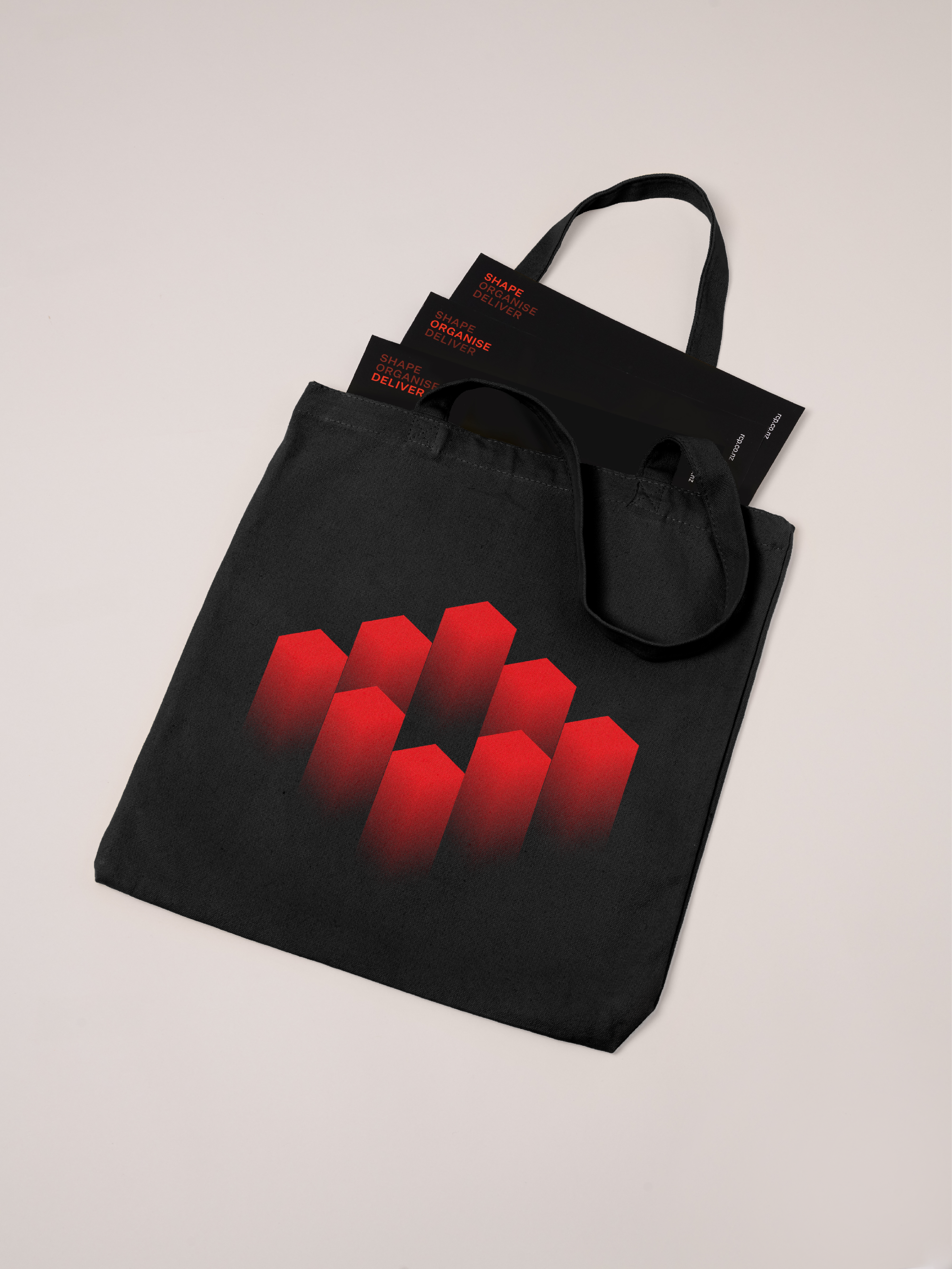
An evolution as opposed to a revolution, RCP’s refreshed brand encapsulates the past, present, and future of the company. Richards Partners developed a comprehensive and cohesive visual identity for RCP to reflect their next generation of people and services. Through grids, patterns, and the clever use of its recognisable red diamond, the visual language of RCP's new brand identity evokes the structure of the built environments they help to shape, organise, and deliver.

