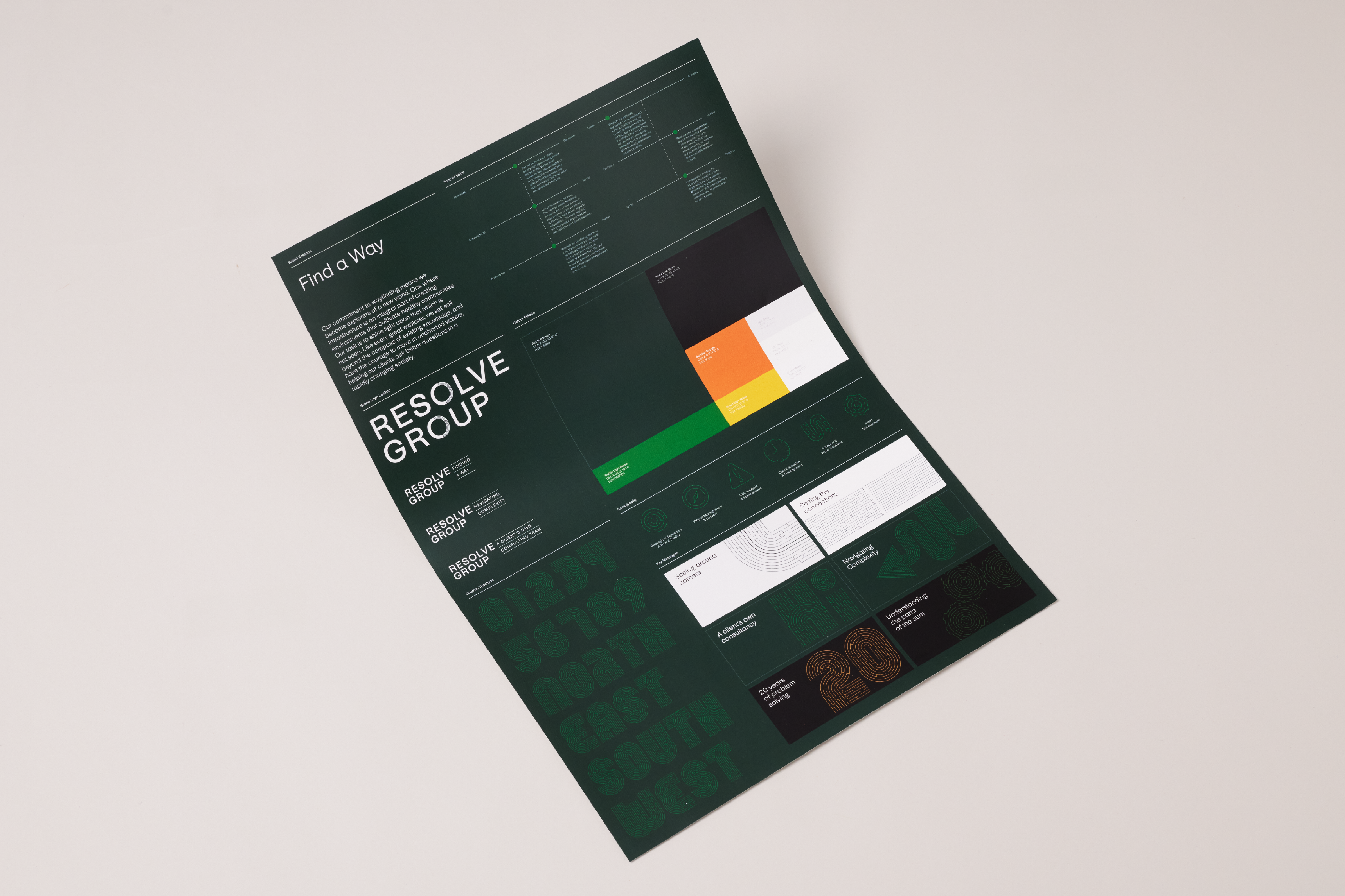
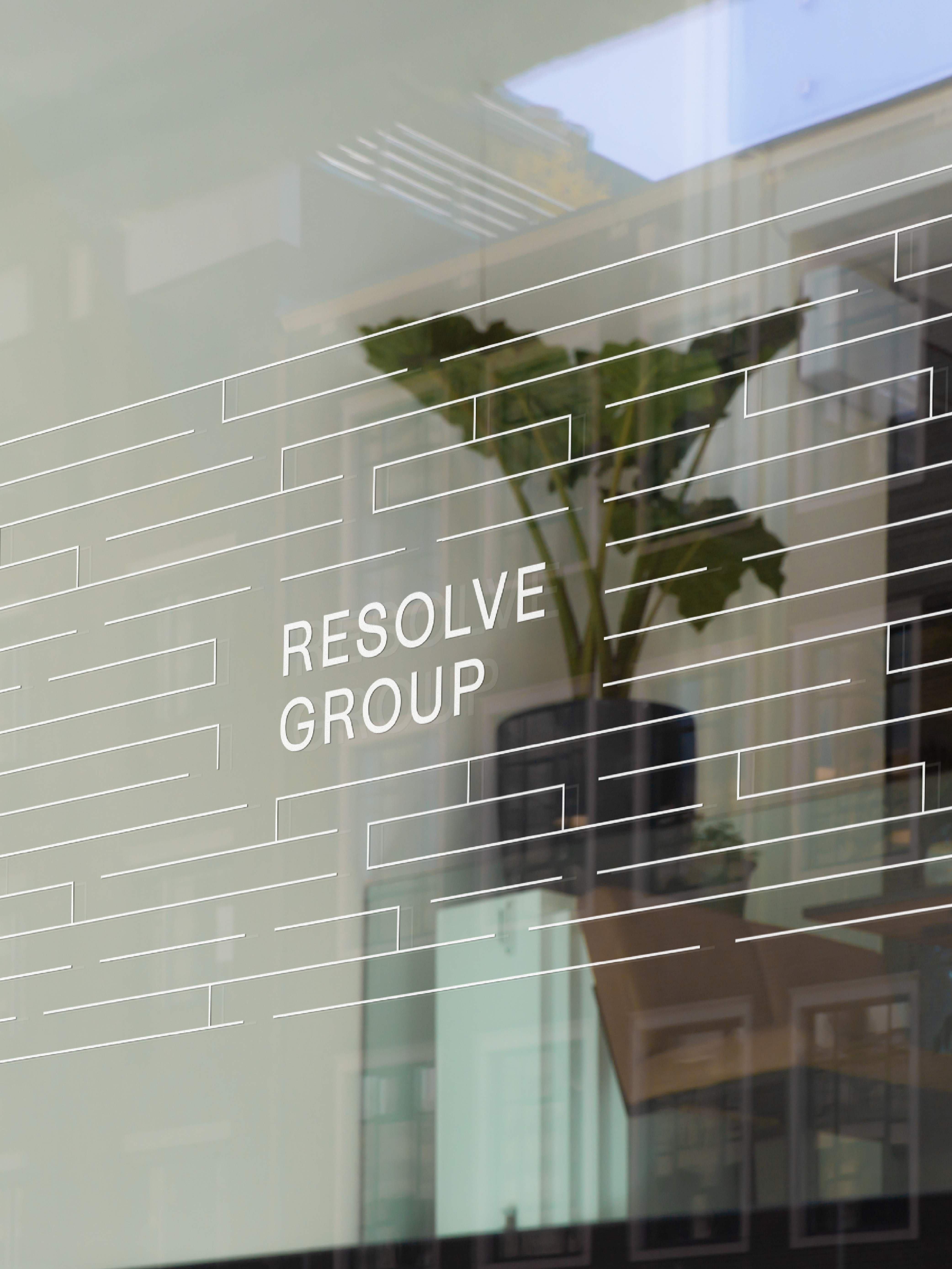
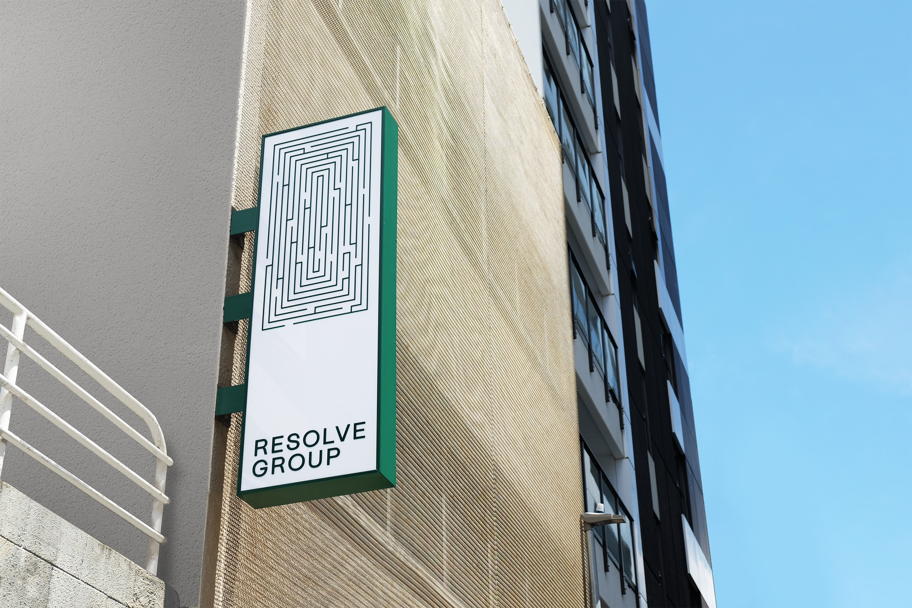
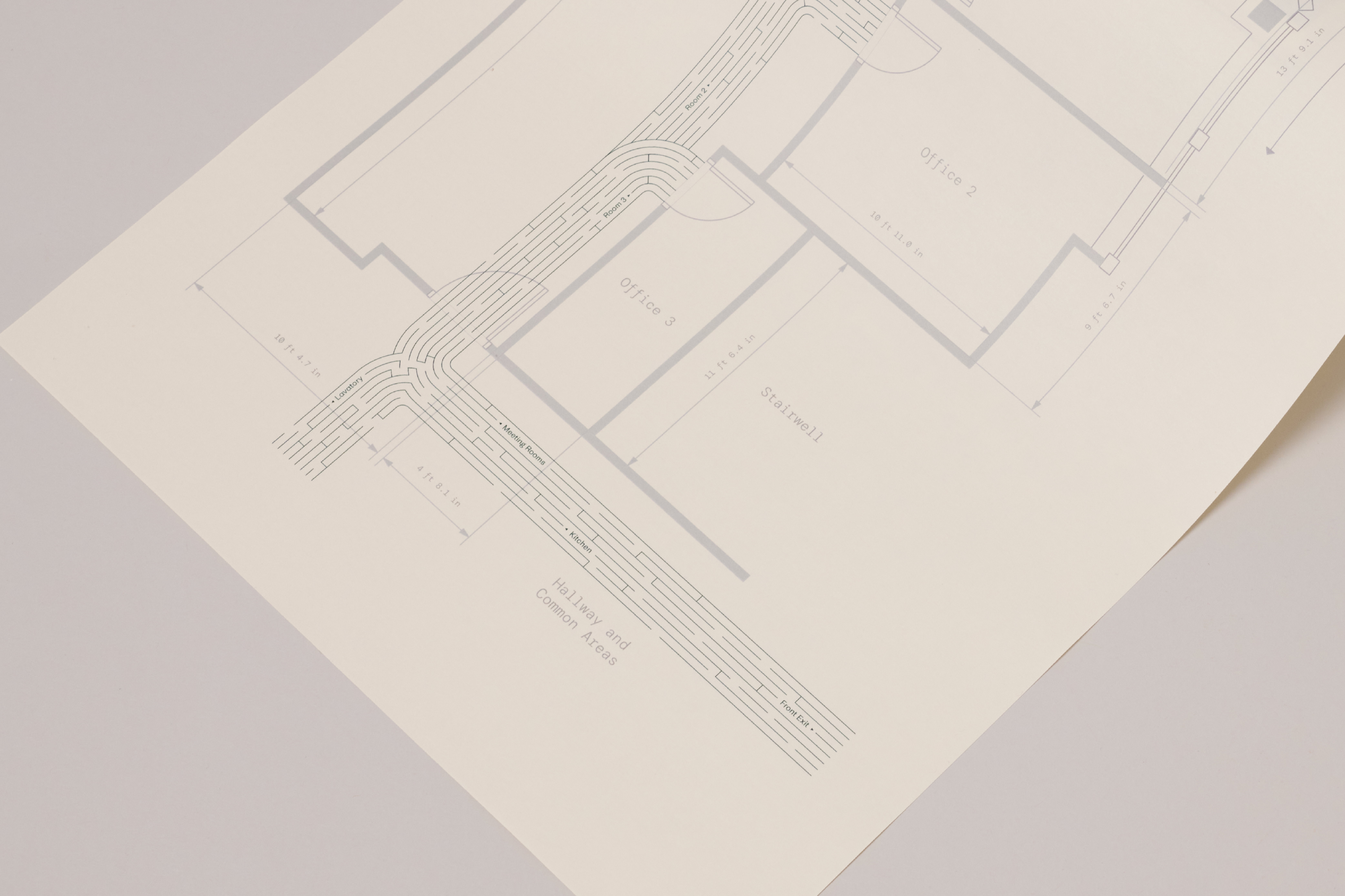
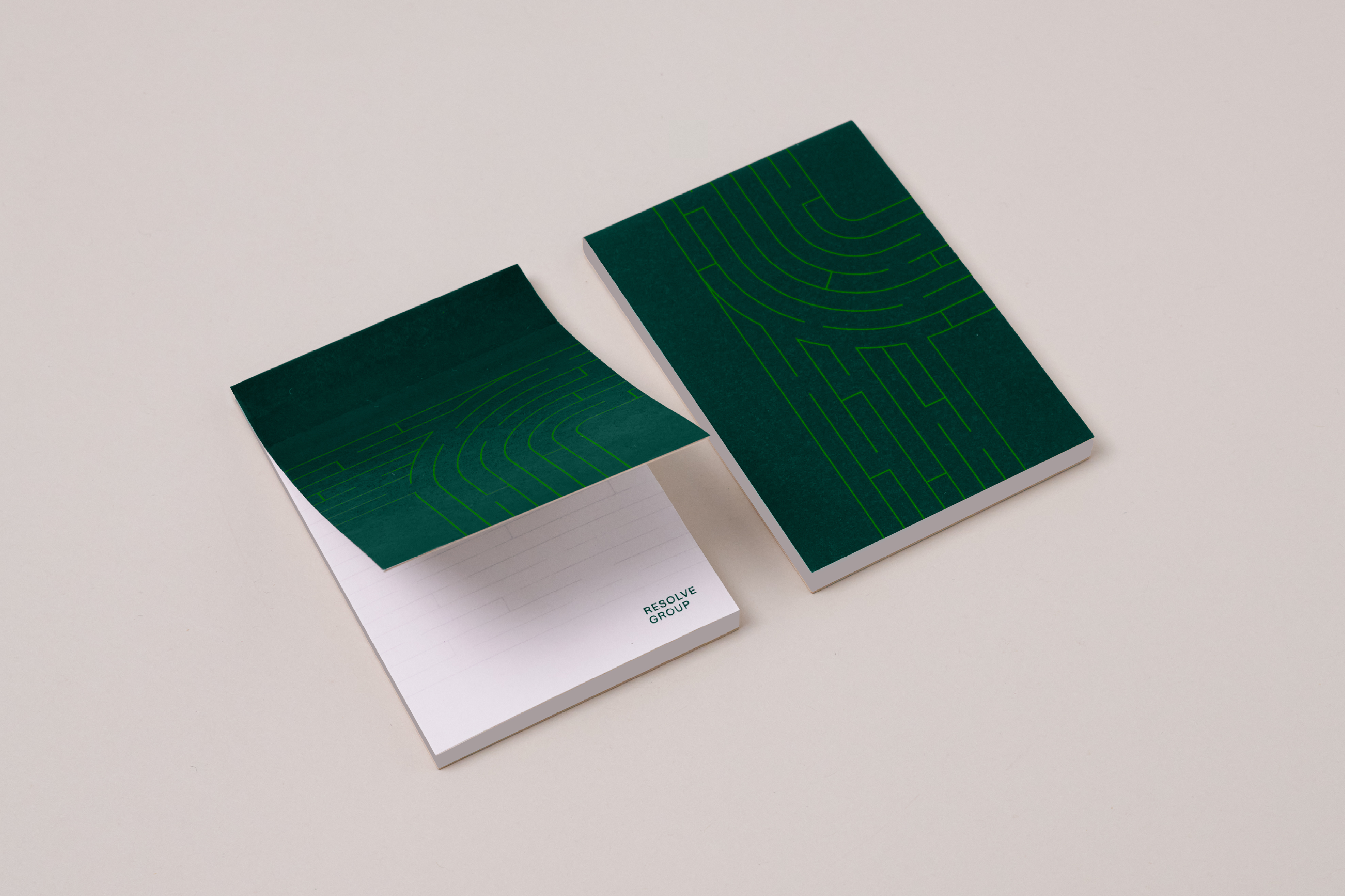
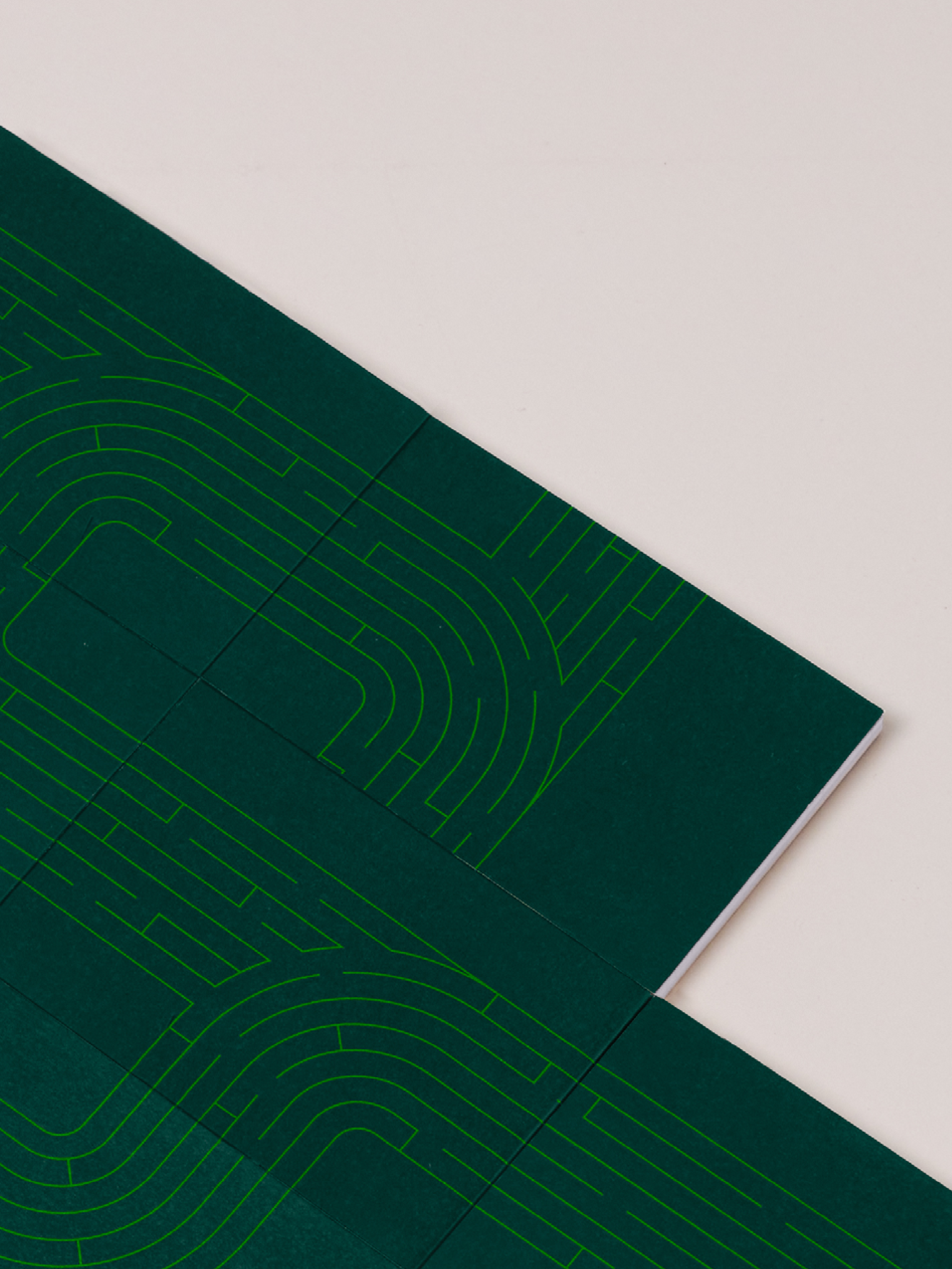
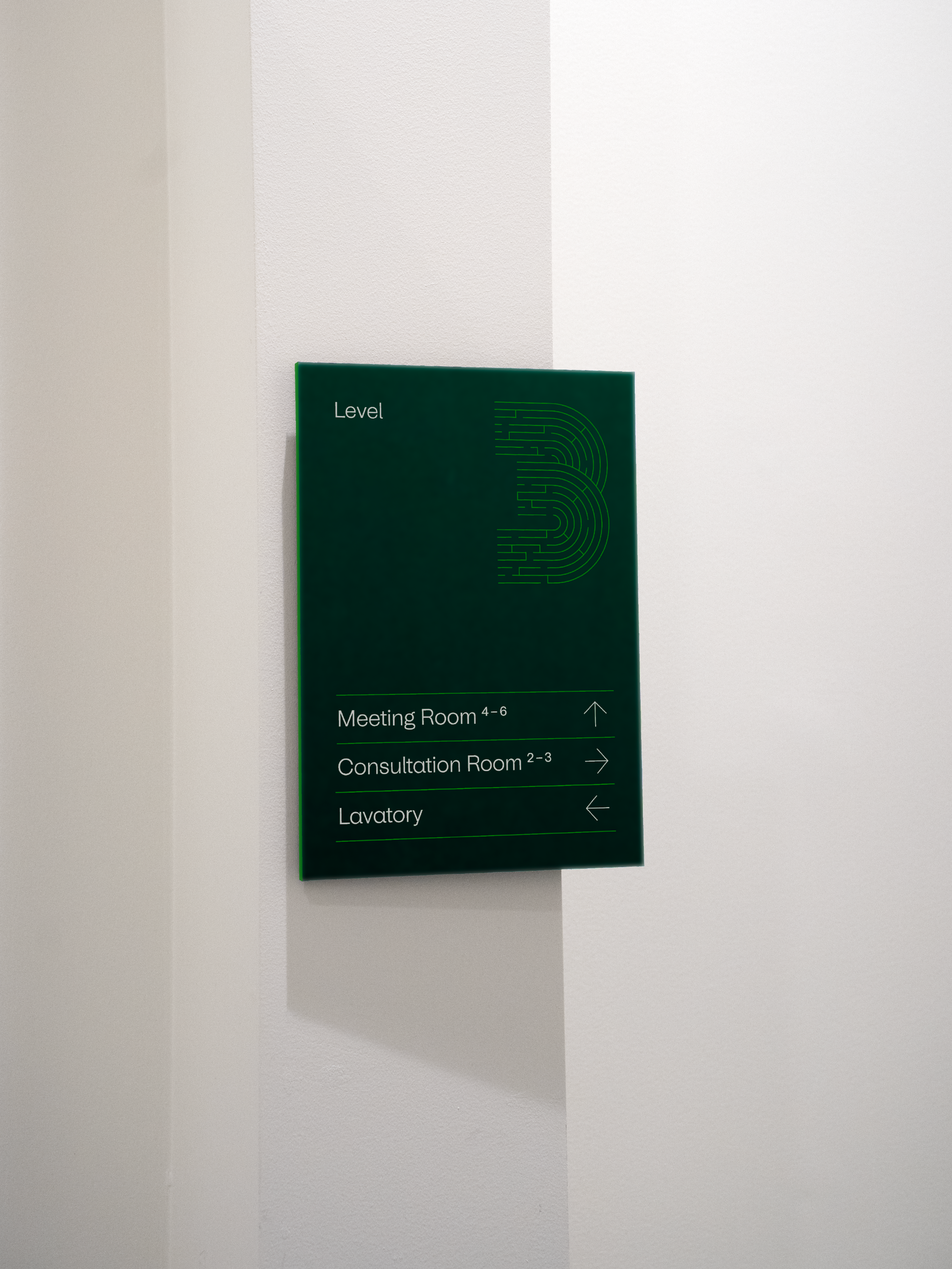
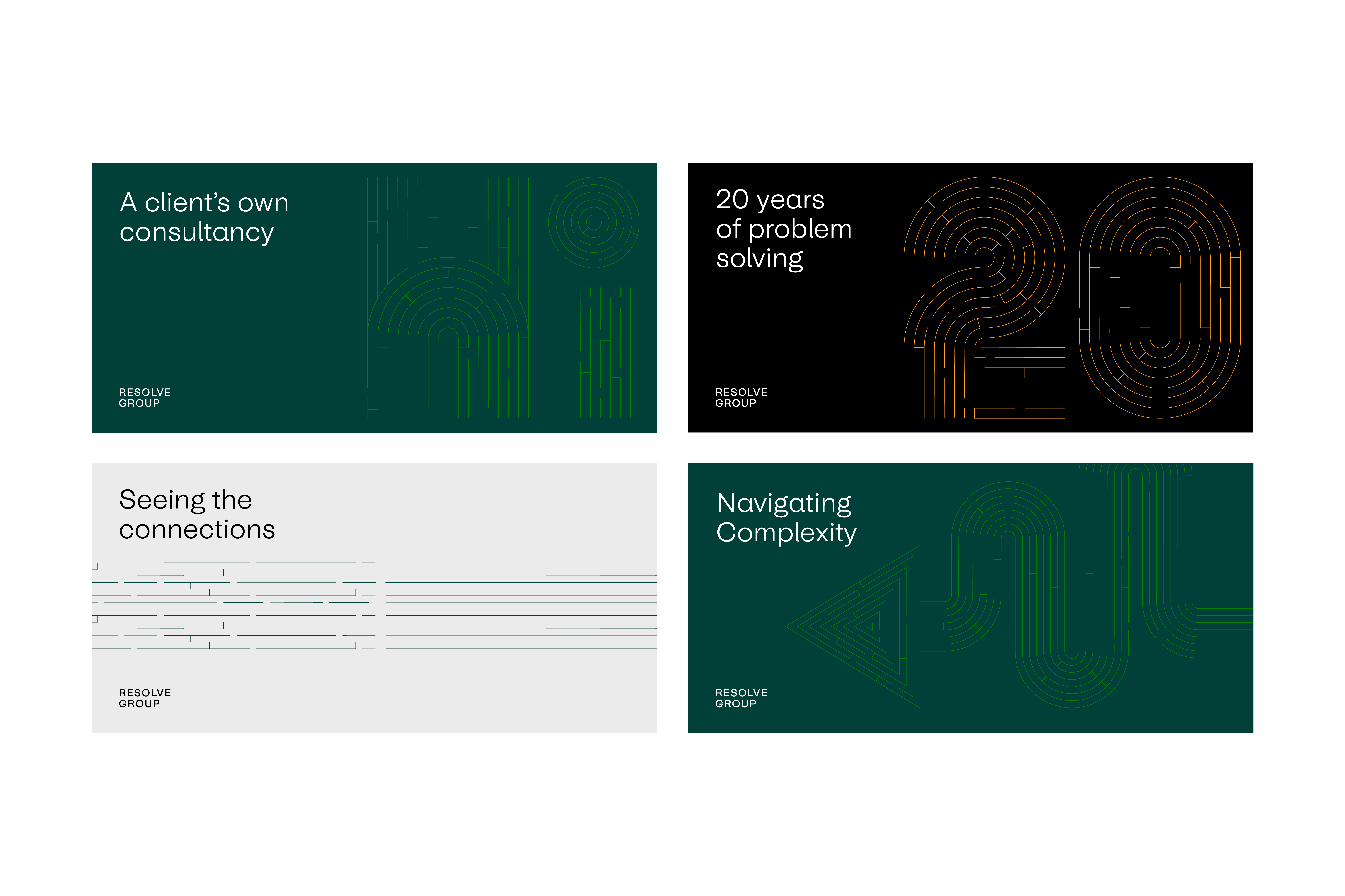
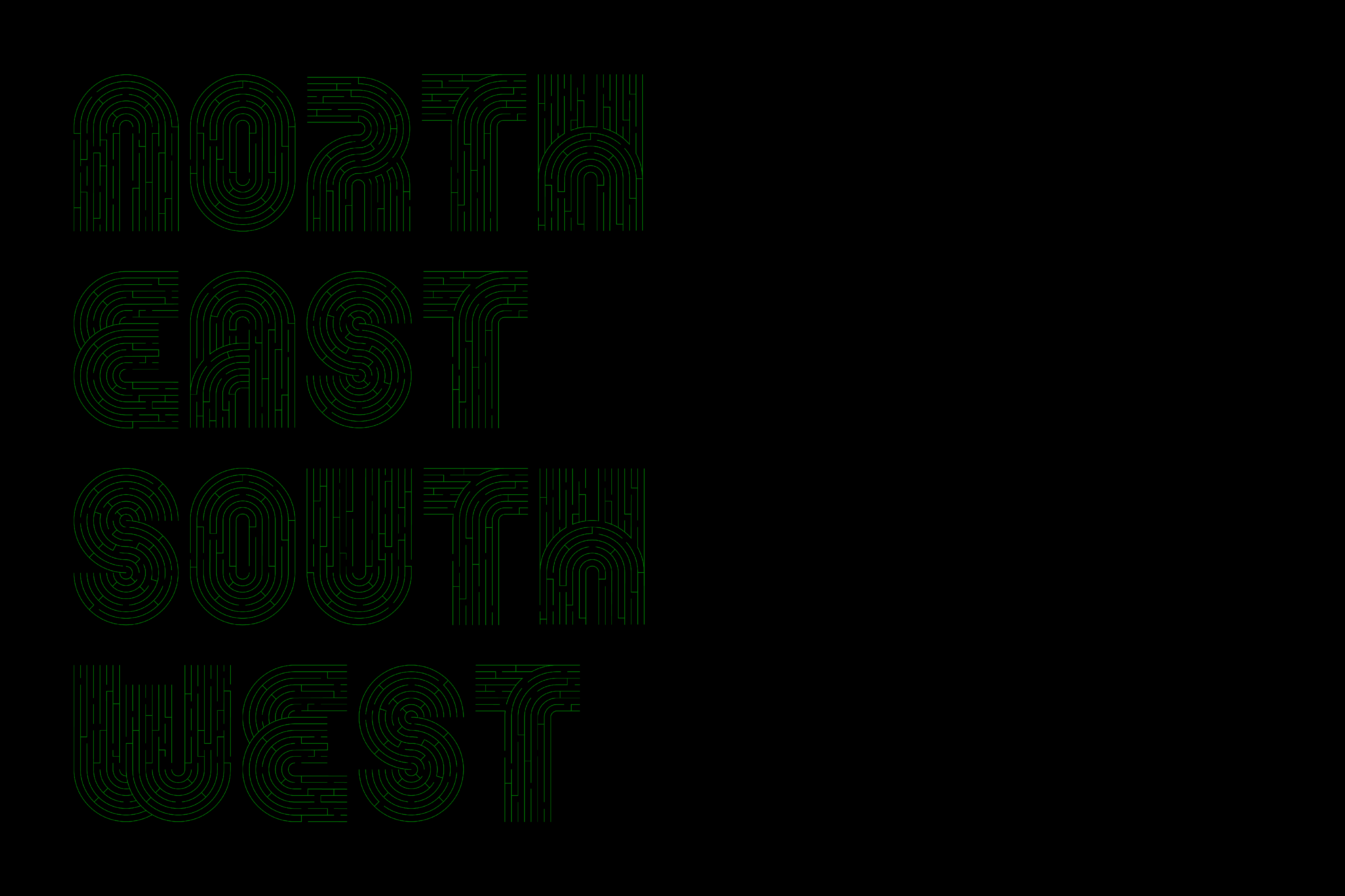
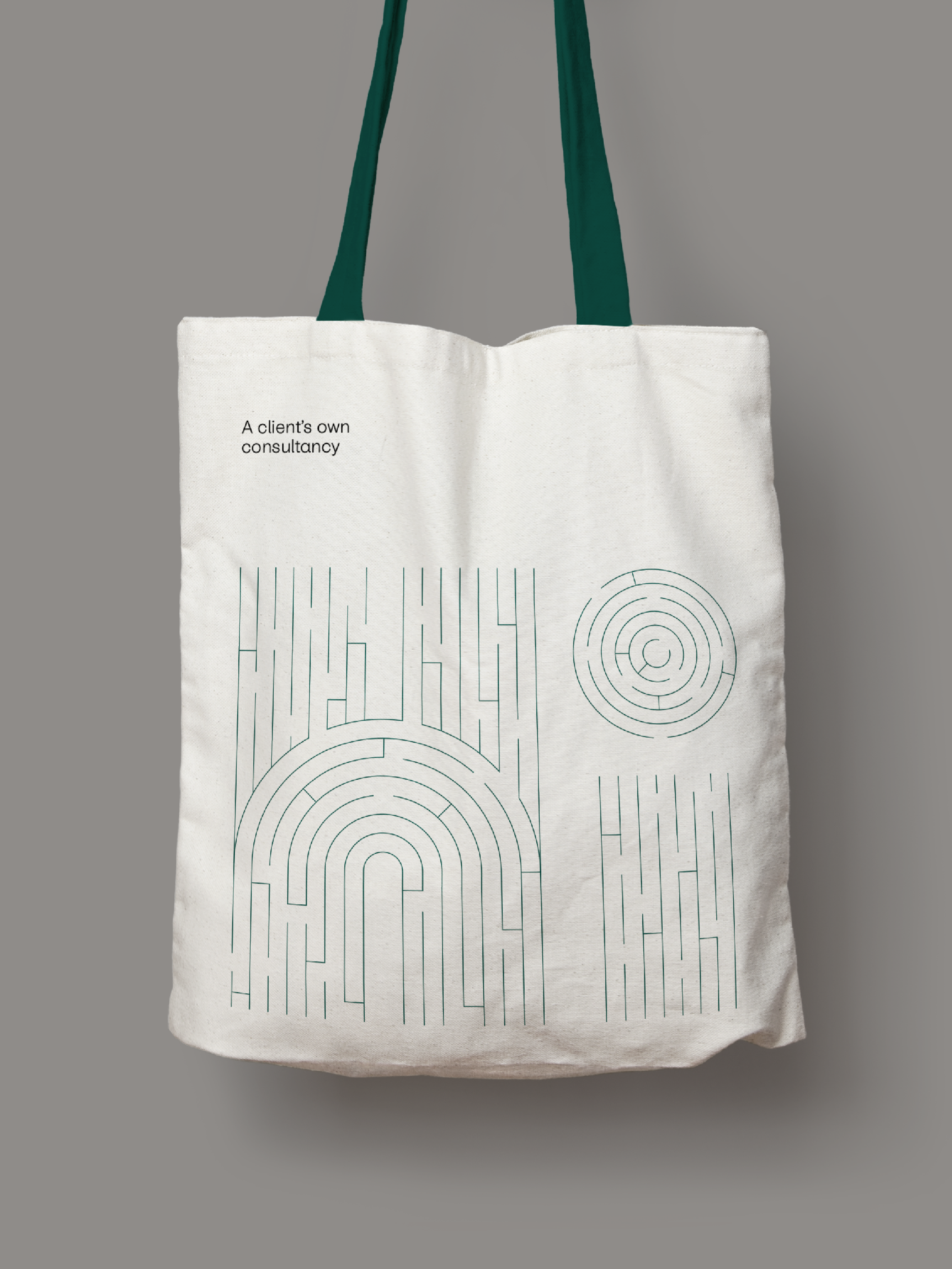
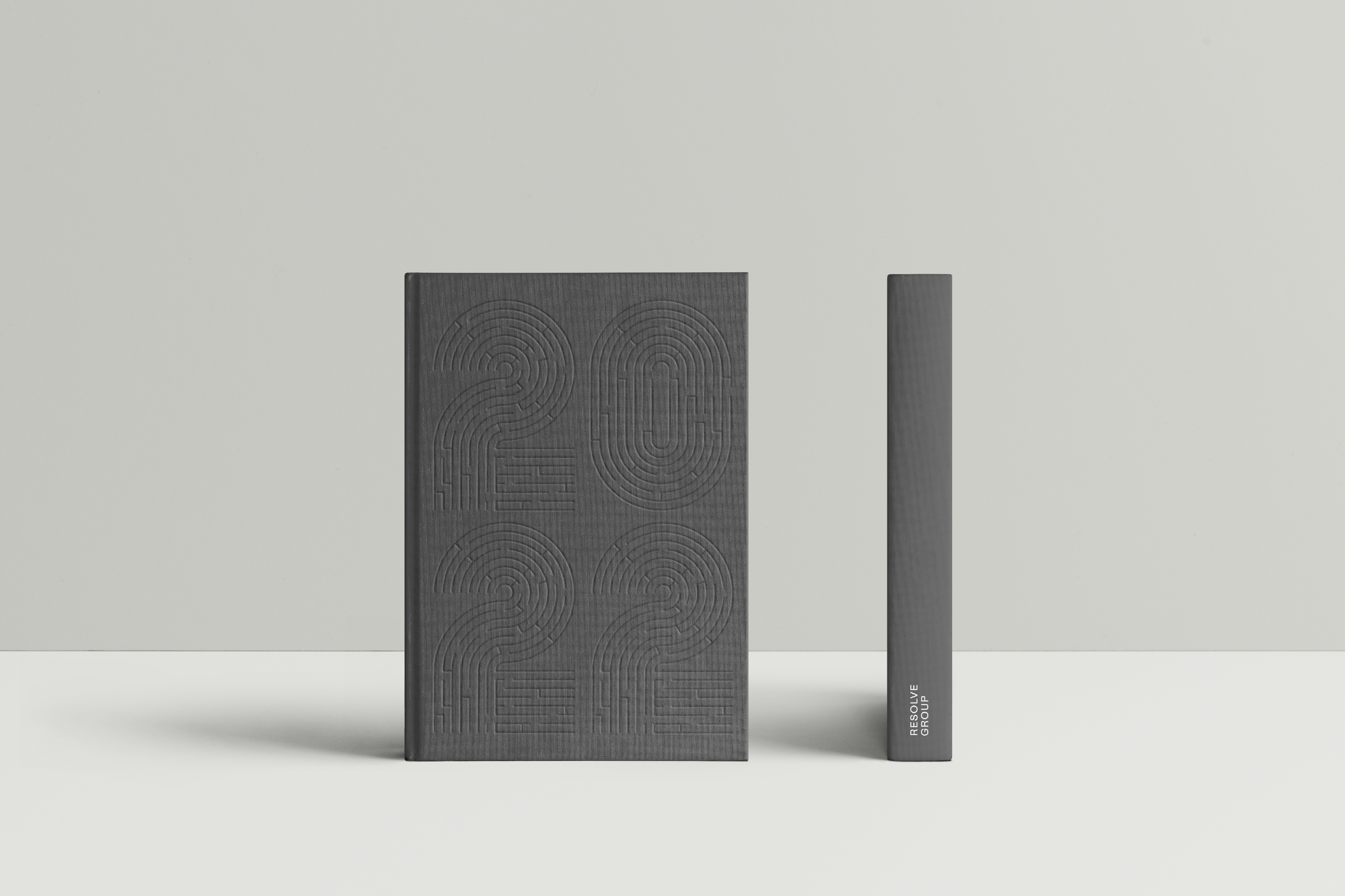
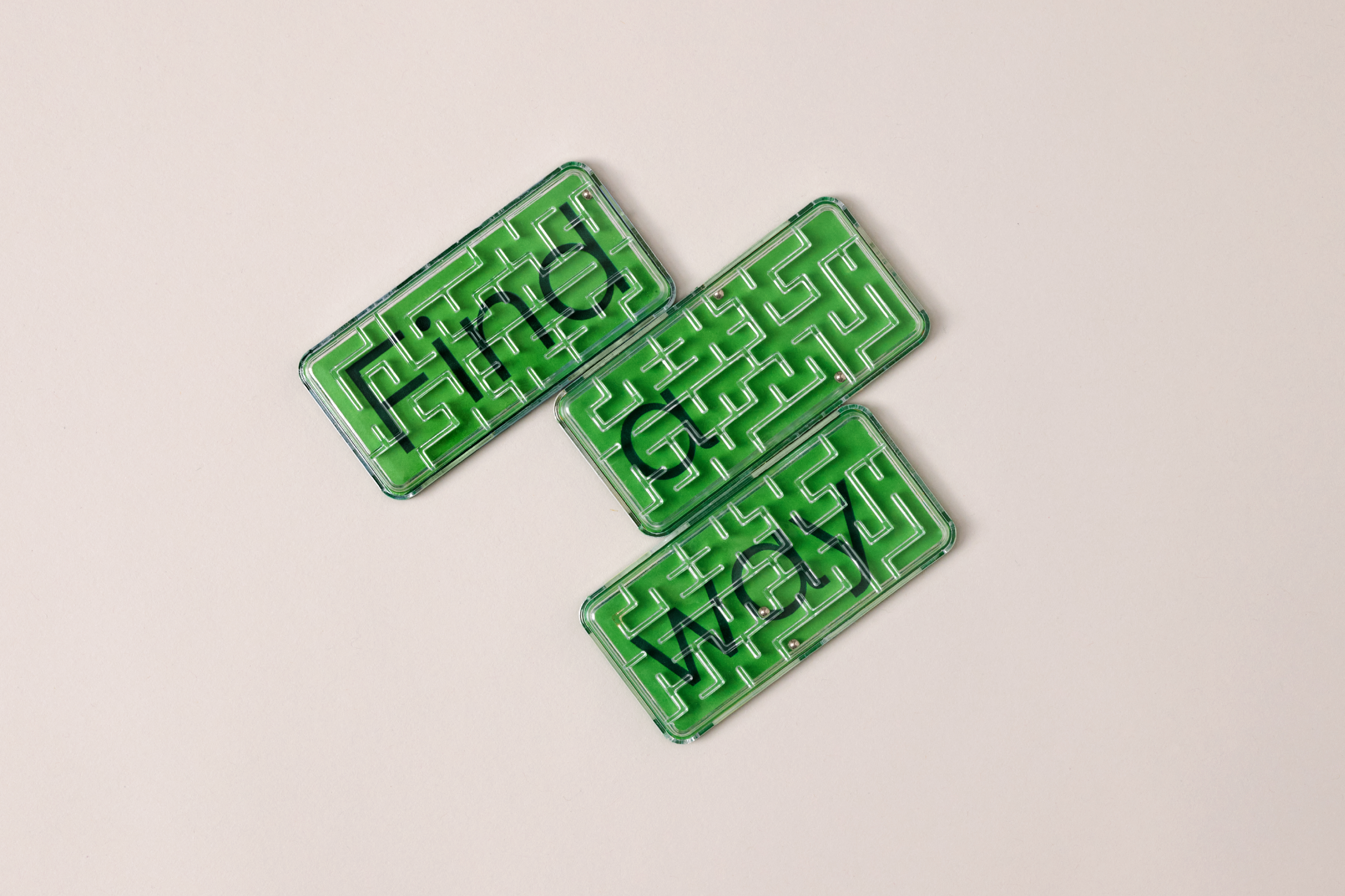
Their ability to navigate complexity with wisdom, and connect foresight with intuition, led to the development of the brand metaphor; the maze. Infrastructure projects are often complex, multidimensional and intricate, characterising many twists and turns, blind corners, and interconnected pathways. This metaphor acted as a visual cornerstone for Resolve’s refreshed brand strategy and visual identity.
Working alongside their experienced team, we developed an identity that captured the careful balance of complexity and simplicity. Relentlessly detailed visual elements paired with moments of approachable simplicity make for an identity that depicts Resolve’s unrivalled ability to guide clients to enduring, robust solutions.
Universal Sans serves as the brand’s primary typeface; friendly and functional, it is a highly-legible sans serif that has been customised for Resolve Group to include softened rounded geometric features, reflecting Resolve Group’s highly personable approach. The combination of understated letterforms with a custom maze-inspired display typeface creates a compelling visual representation of simplifying complexity.
The precision conveyed through the intricate metaphor of the maze, coupled with rounded letterforms and a warm colour palette, results in a distinctive visual identity for Resolve which reflects their unique and humble approach to solving important complex problems.

