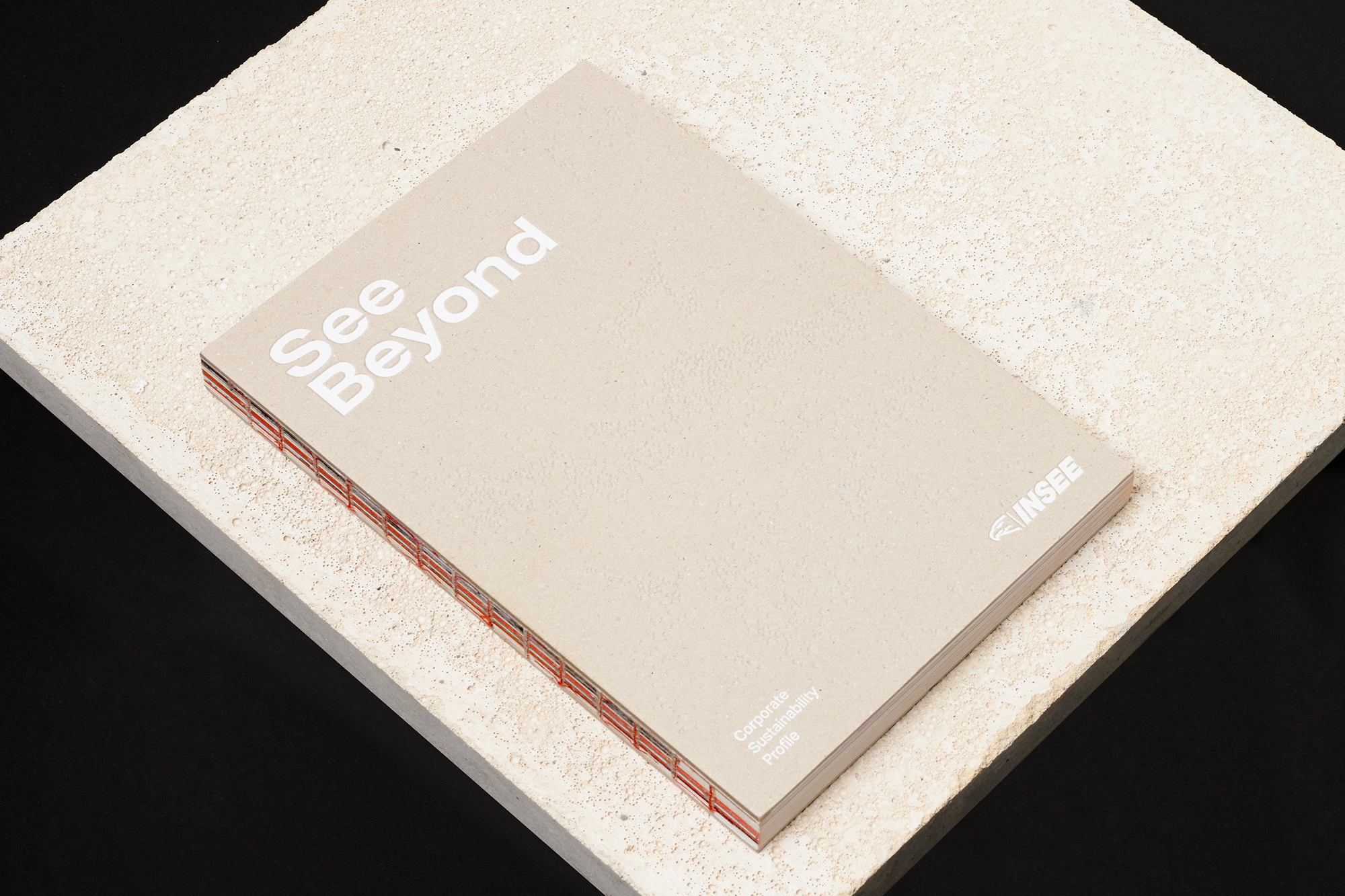
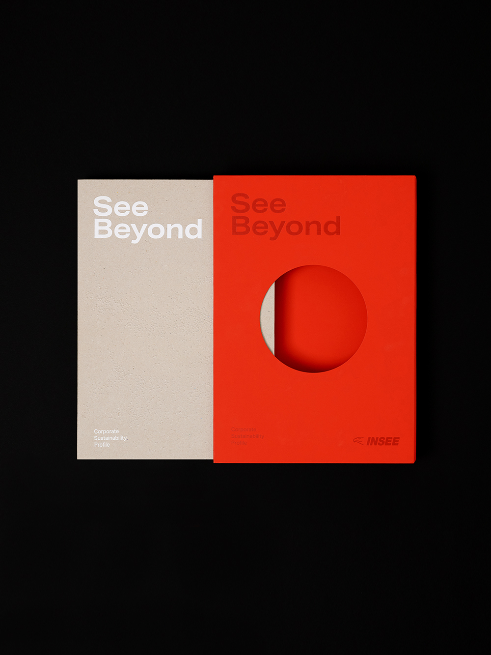
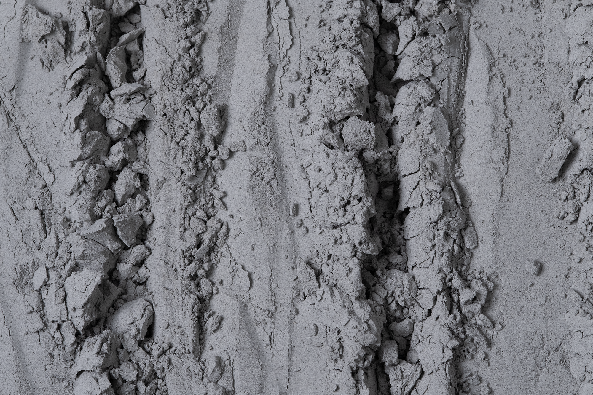
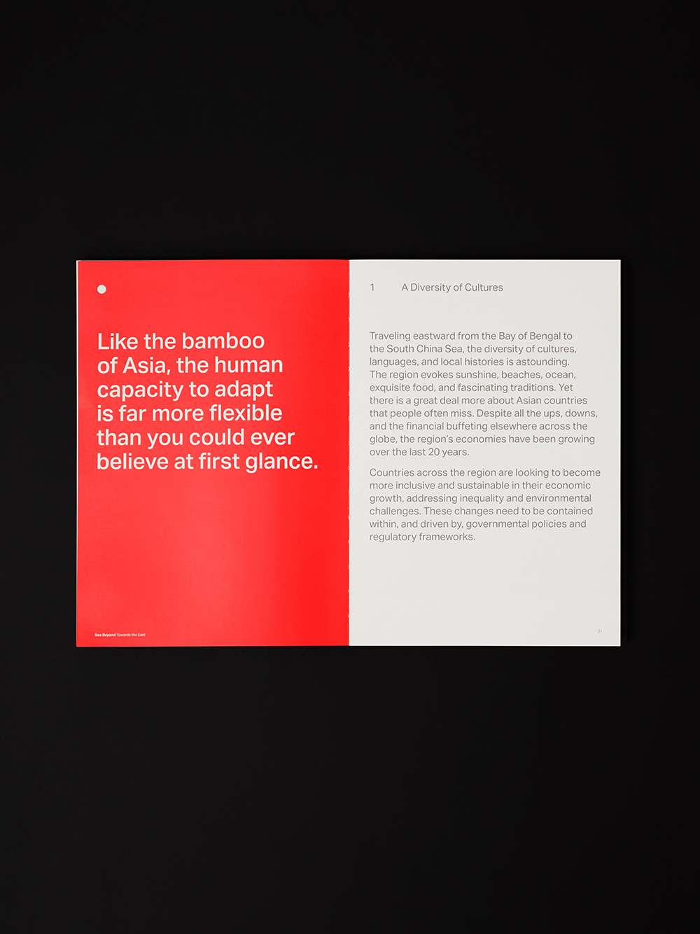
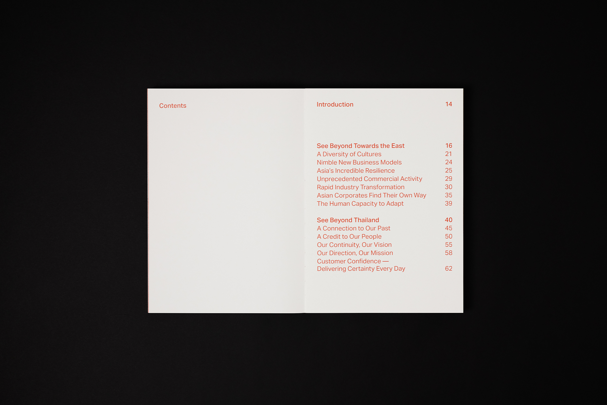
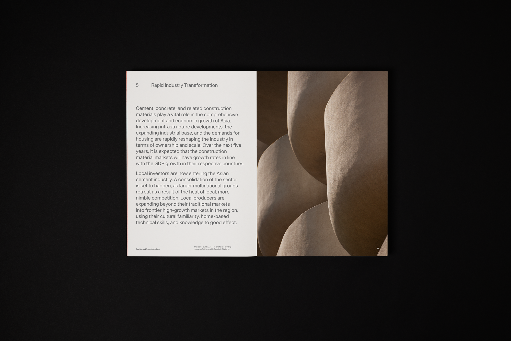
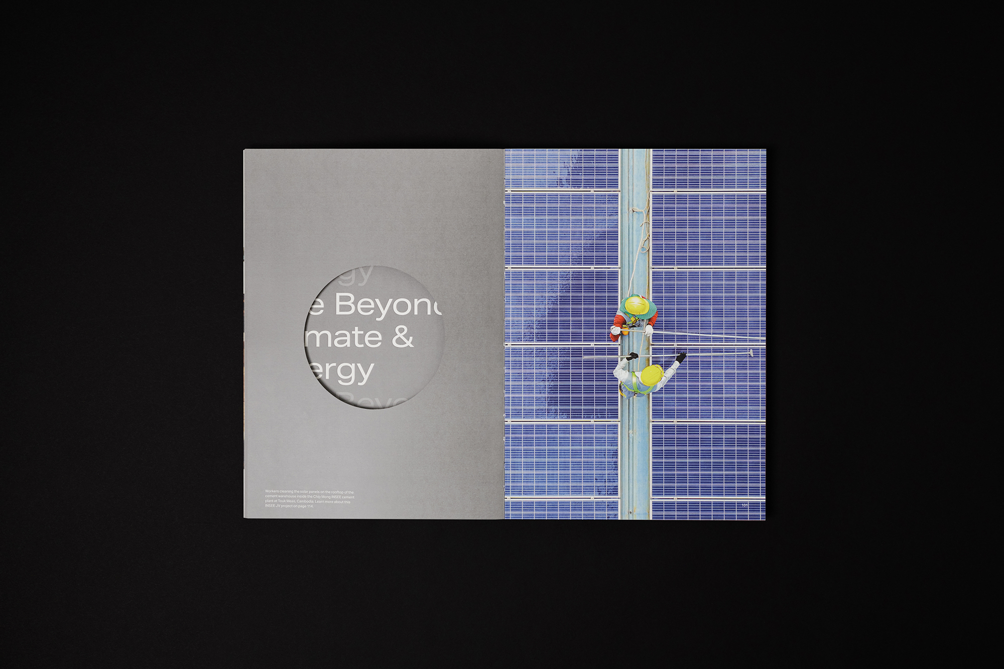
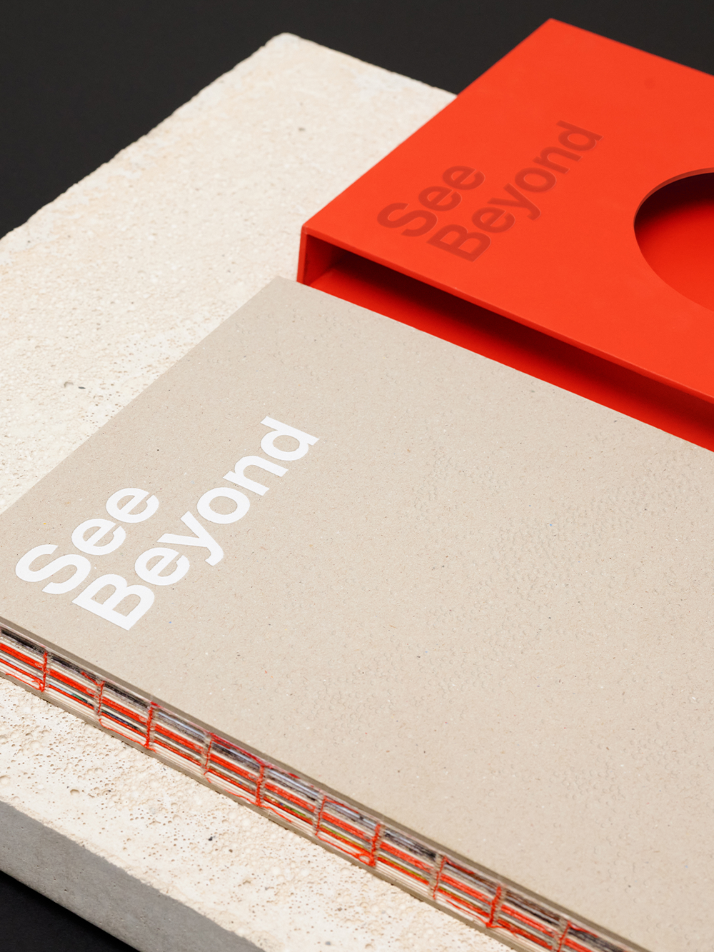
The book comes encased in a sturdy red casing which features a cleverly positioned cut-out circle. The circle element allows readers to “see beyond” the case and peek at the book’s cement-textured cover.
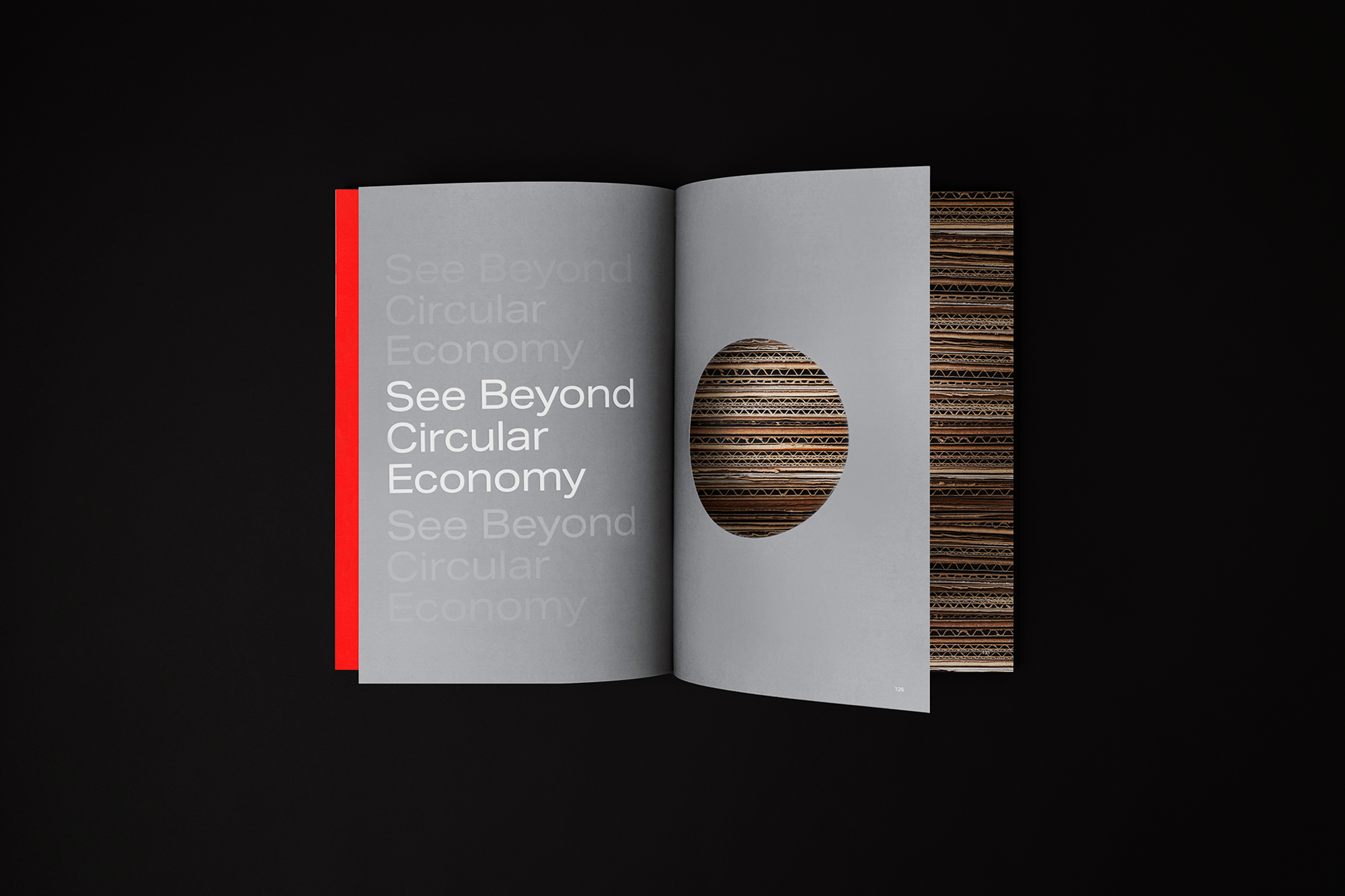
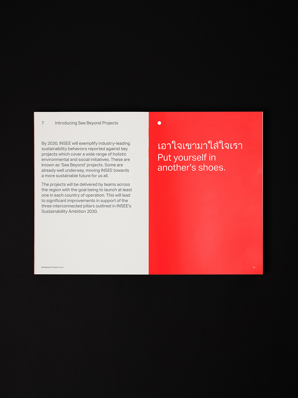
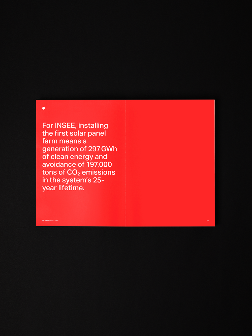
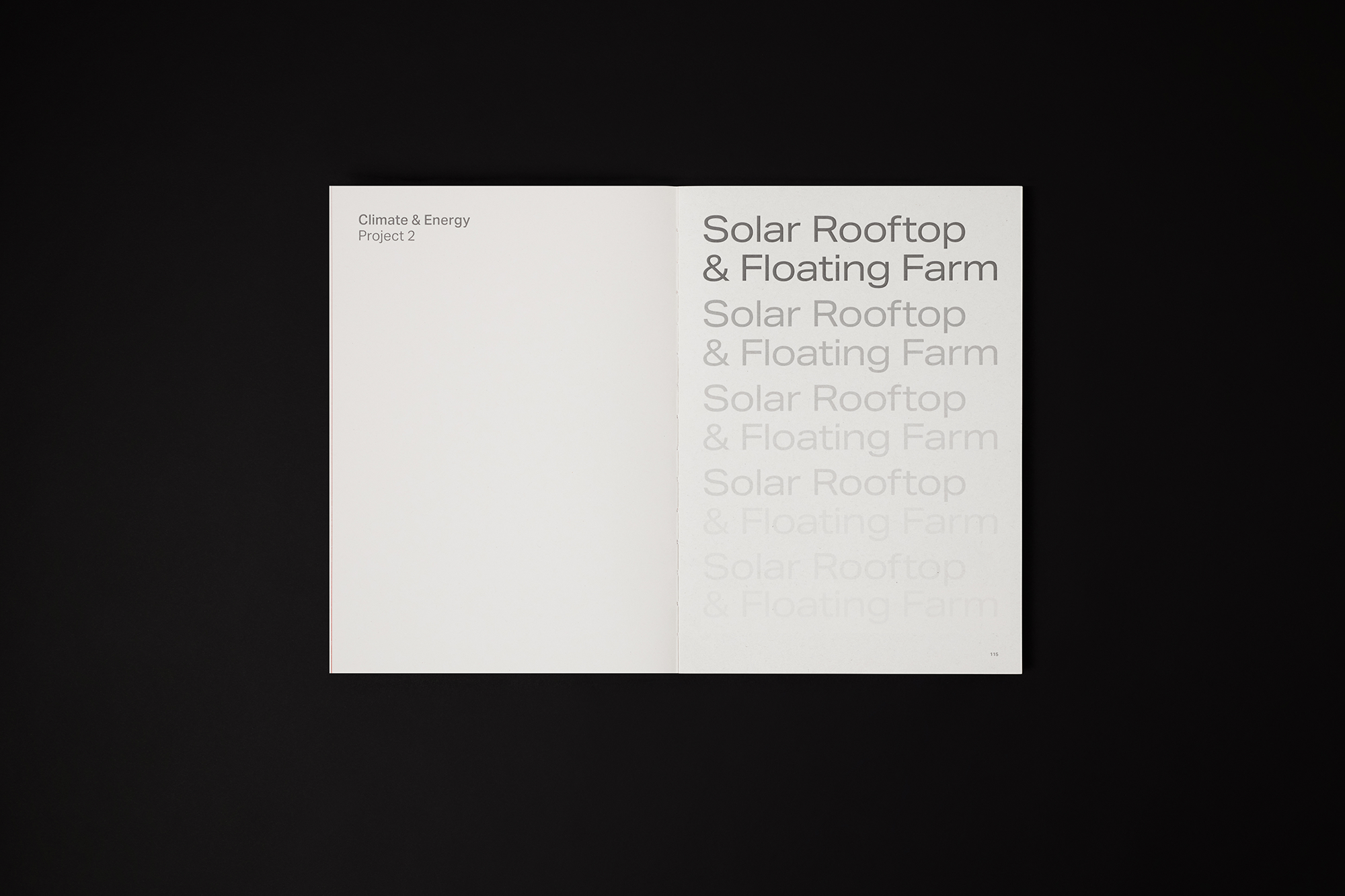
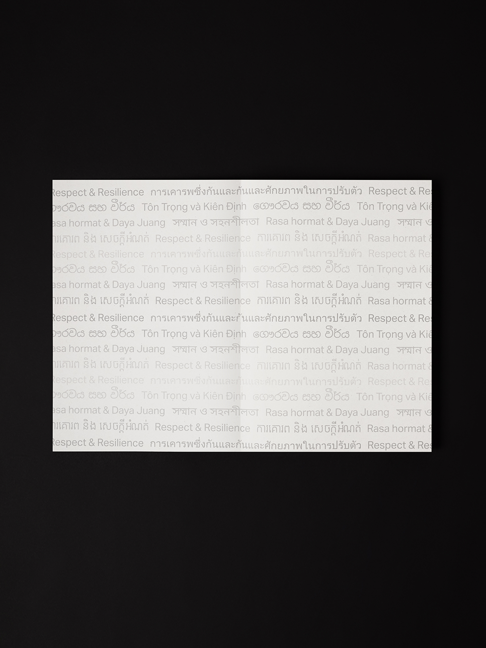
The circular motif extends to the chapter dividers, enhancing the reading experience and embodying the notion of seeing beyond. Additionally, gradient typographic treatments on section openers pay homage to the lighthouse, which illuminates the surrounding darkness with bands of light. The text transitions from light to dark, representing INSEE’s clear vision, while moving from dark to light symbolises the guiding light that leads the way forward.
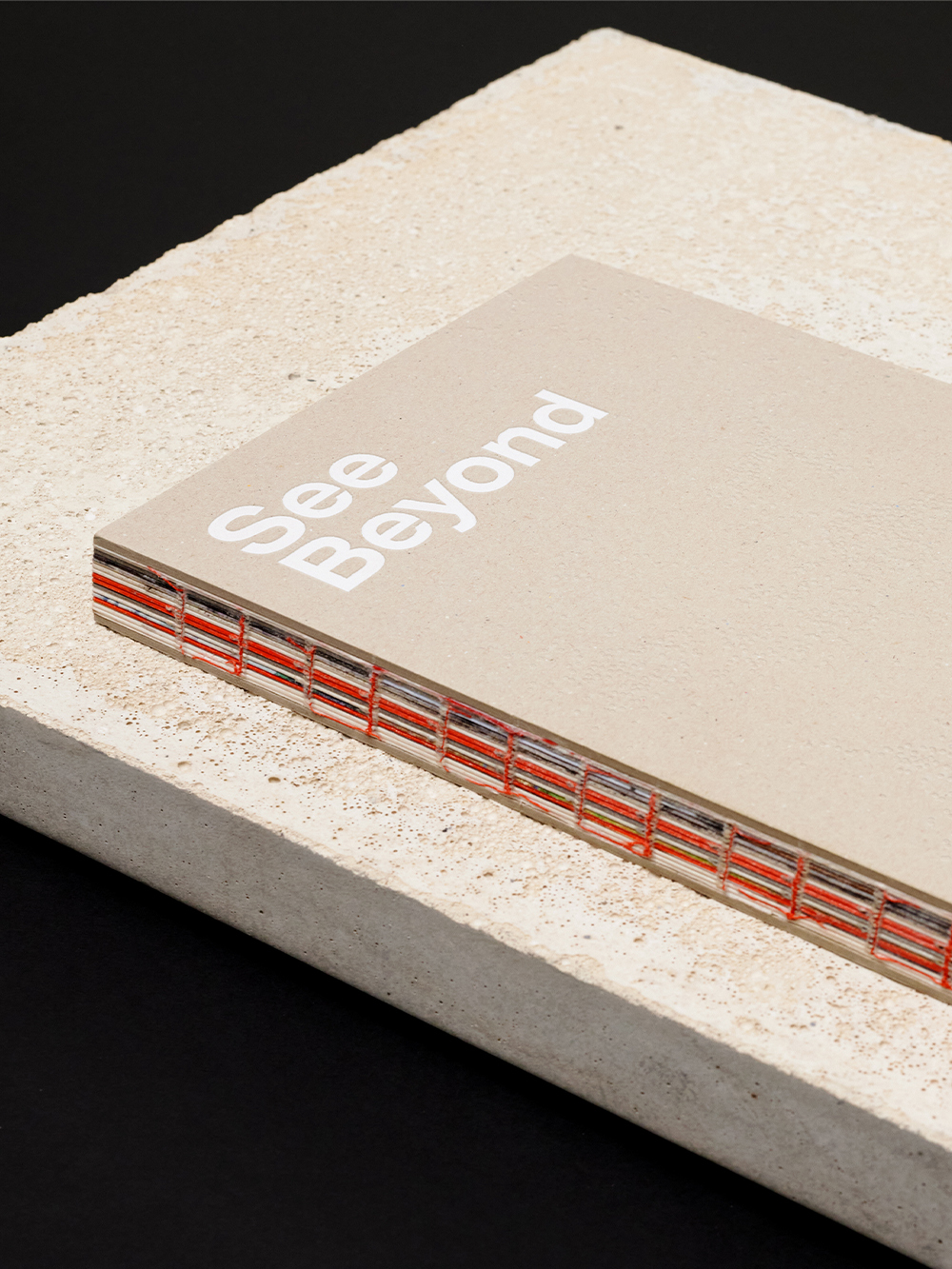
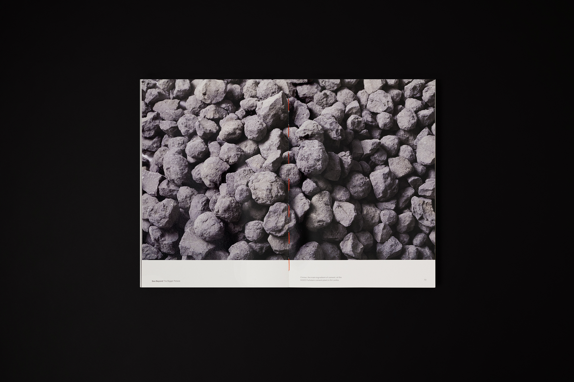
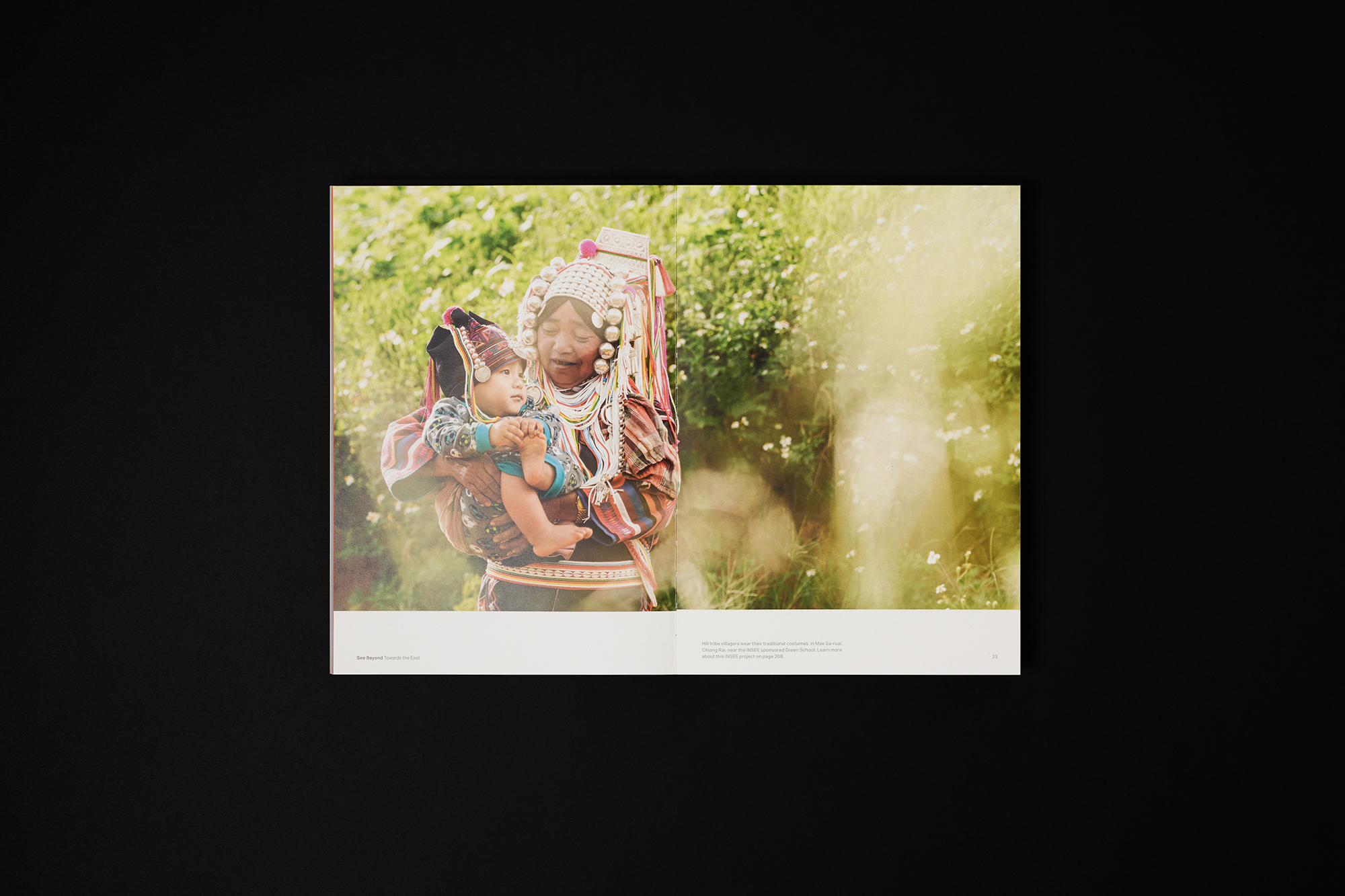
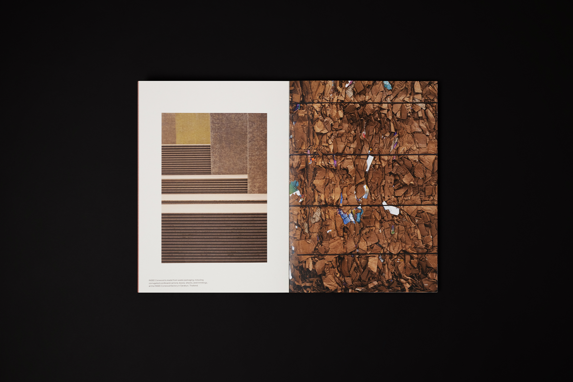
Environmental sustainability played a crucial role in our design choices. We prioritised eco-friendly materials like recycled paper, cardboard, and exposed stitch binding, ensuring the book not only speaks about sustainability but practises it.
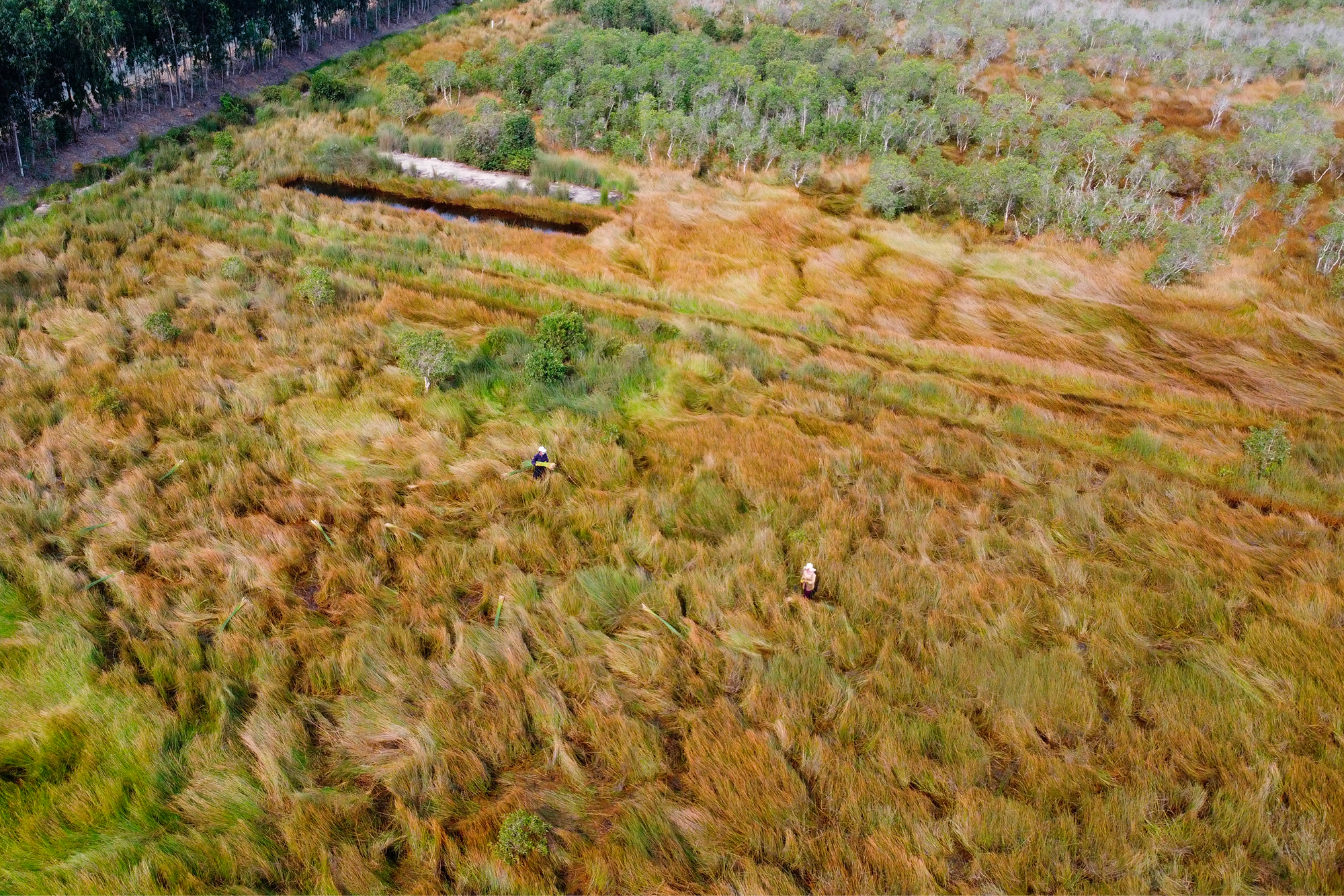
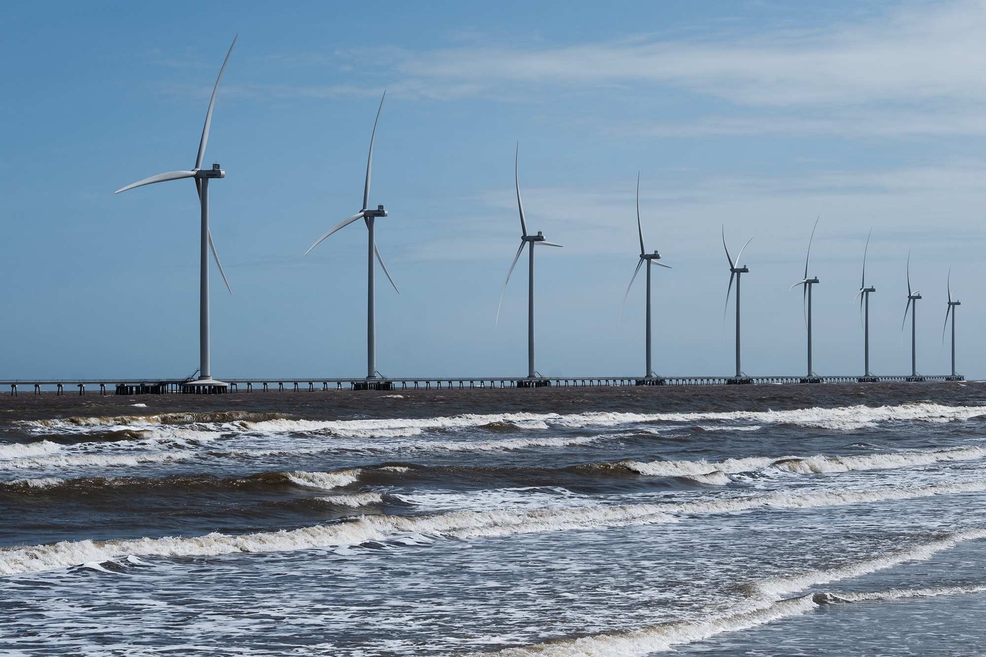
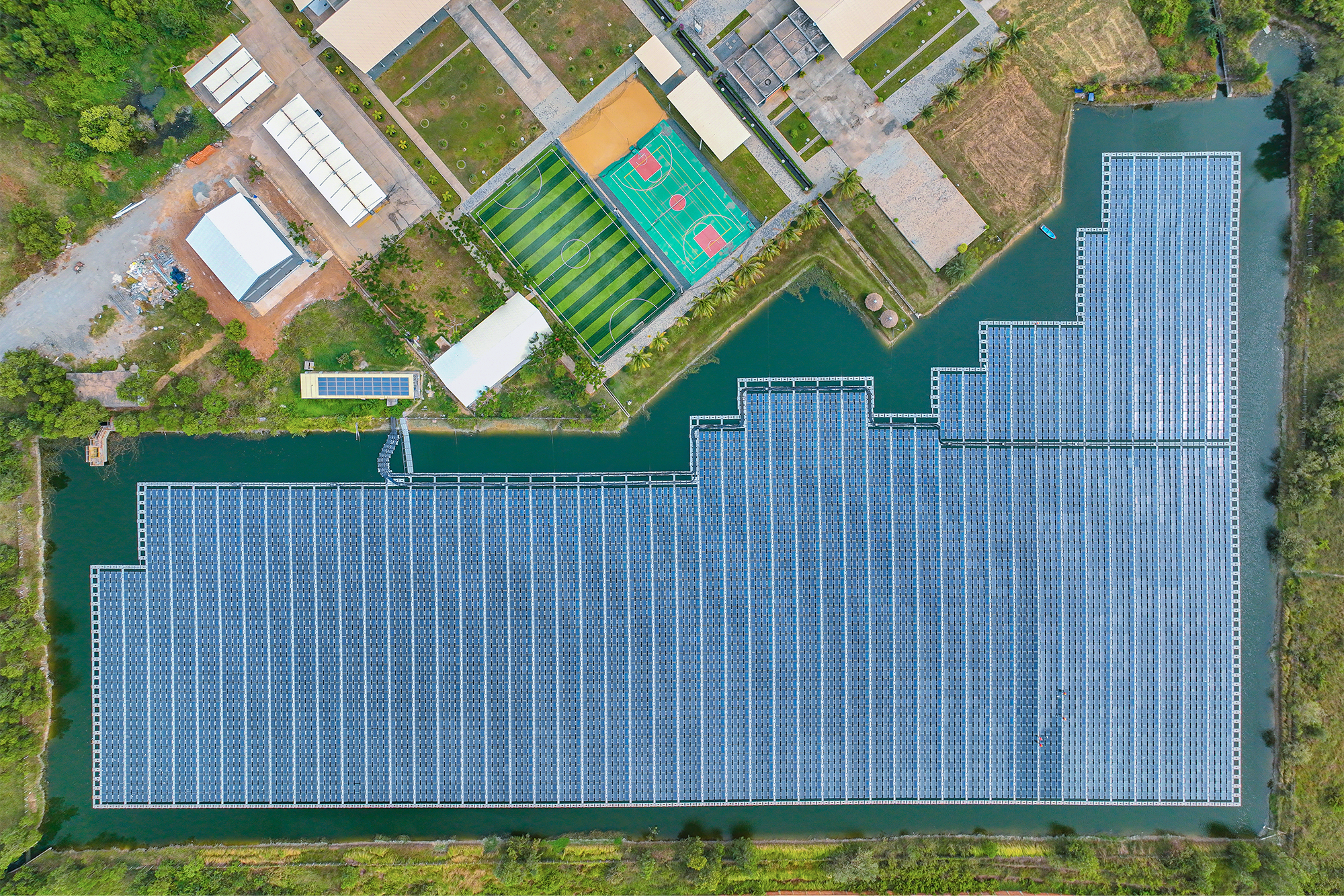
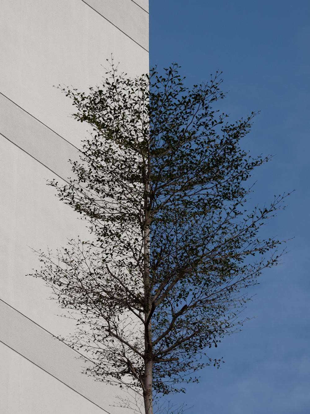
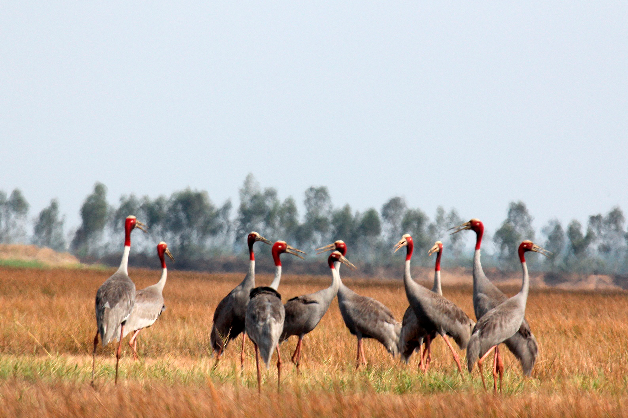
Despite the challenge of remote art direction amidst Covid-19 travel restrictions, we successfully guided the photography direction across the world over video call — from New Zealand to Thailand, Vietnam, Cambodia, Sri Lanka and Bangladesh. This collaboration with South East Asian photographers resulted in a stunning collection of images, showcasing the breathtaking architectural wonders created using INSEE’s products and the pristine natural landscapes they have helped preserve.
Together, we have crafted a Sustainability Corporate Profile that authentically portrays INSEE's progress and ambitions. Through innovative design, attention to detail, and a strong commitment to environmentally conscious methods, 'See Beyond' serves as a testament to their commitment to sustainability in a region of high growth. It illuminates INSEE’s remarkable achievements and paves the way for a brighter, greener future.

