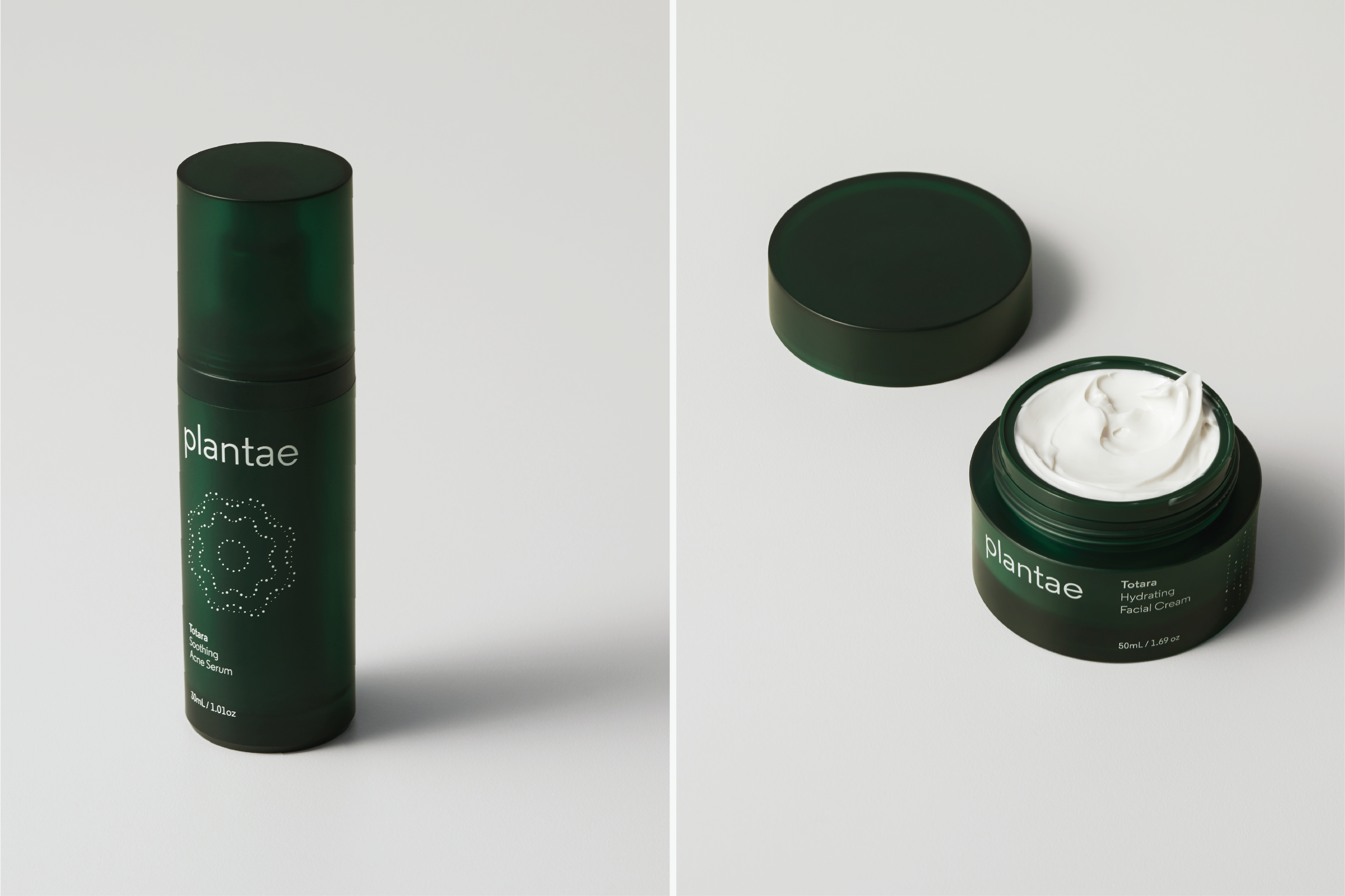
As climate change, pollution and urbanisation intensifies around the world, a preference for more eco-conscious products and synthetic-free formulations has seen the market flooded with a vast array of brands marketed as “natural”. We were tasked with refreshing the Plantae brand to create differentiation in a crowded market.
When Gondwanaland broke apart 100 million years ago, Aotearoa separated from its main landmass to become a jewel of biodiversity in the South Pacific. Our native flora is unique in the world; 80% of our trees, ferns and plants are found nowhere else except in Aotearoa. Our approach was to build on Plantae’s legacy as a natural skincare brand and emphasise the ancient restorative powers of Aotearoa’s endemic flora, which forms the basis of their new range of products.
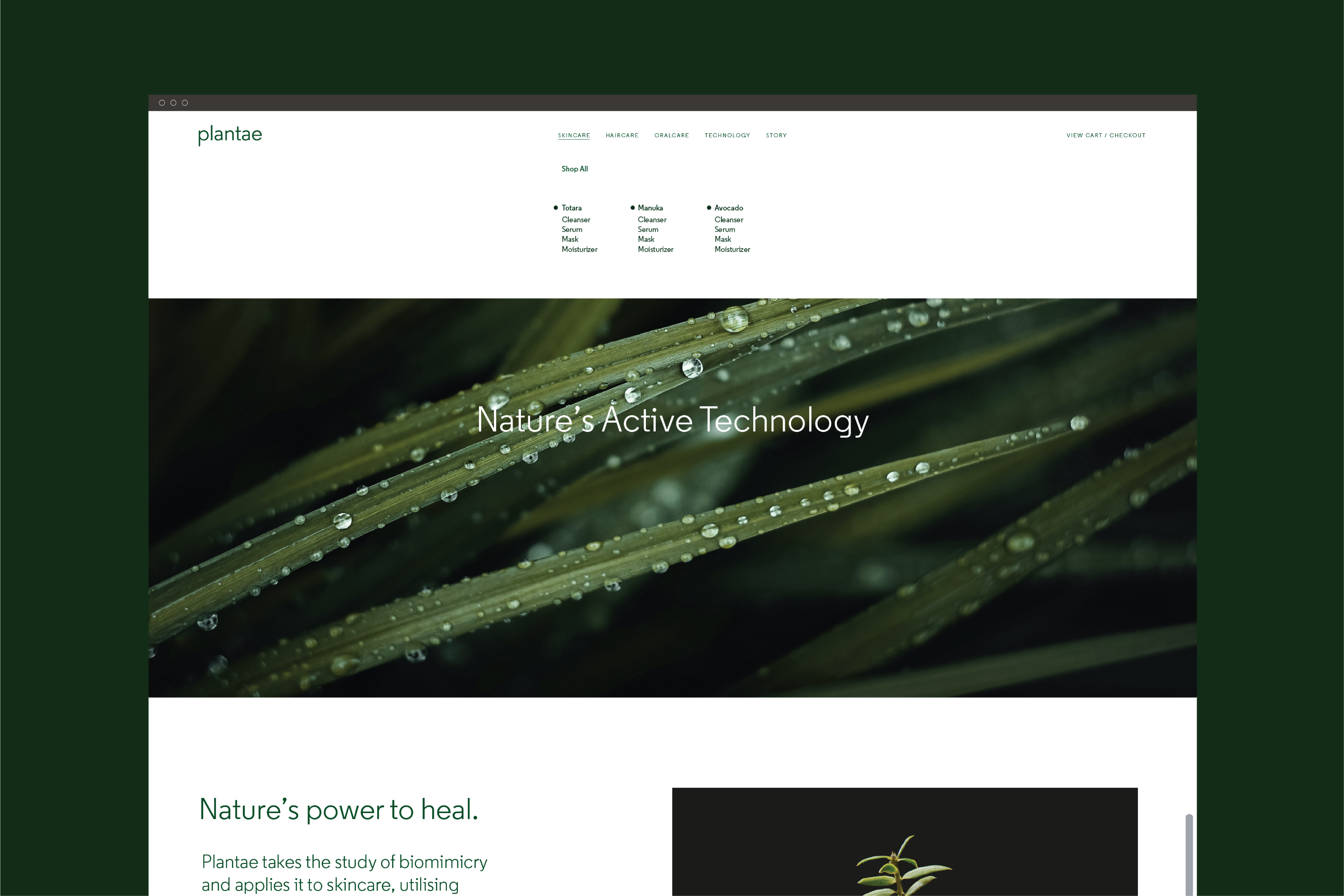
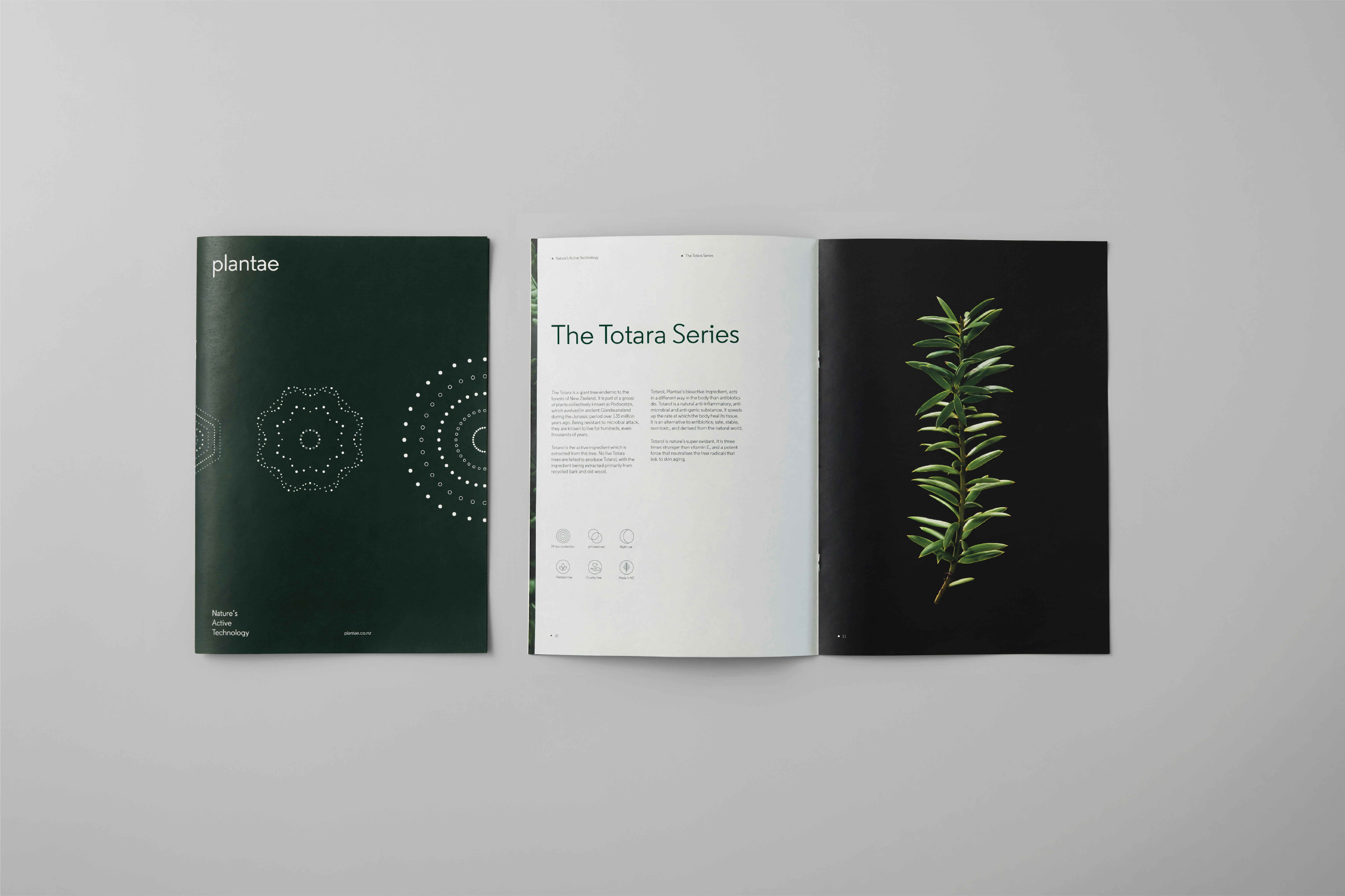
“Nature’s Active Technology”, the newly developed brand essence, reflects Plantae’s place at the intersection of science and nature. From Manuka to Totara, Plantae products harness the healing properties of our native flora, using scientific processes to distill natural formulations that are safer for the environment, and safer for people’s skin.
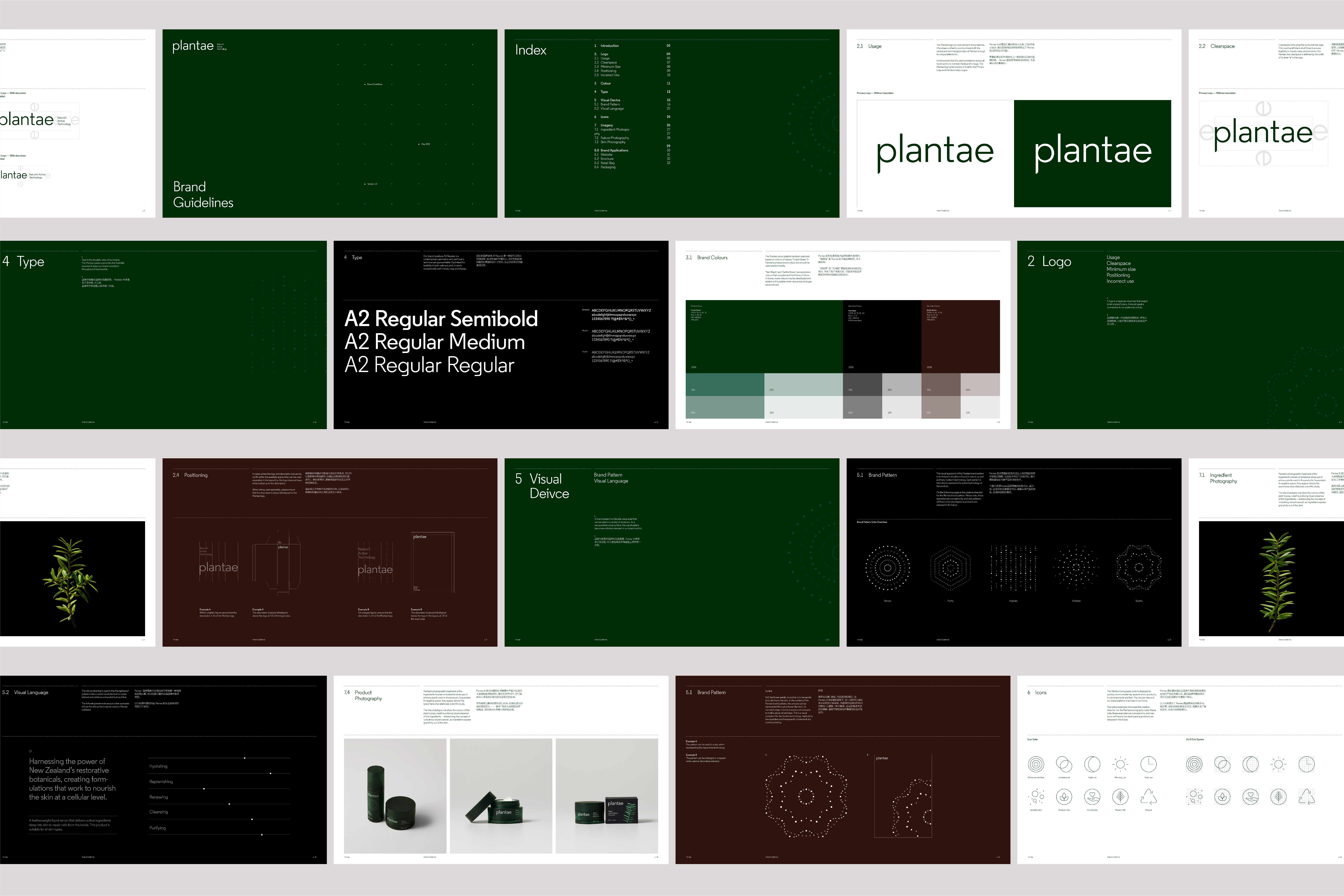
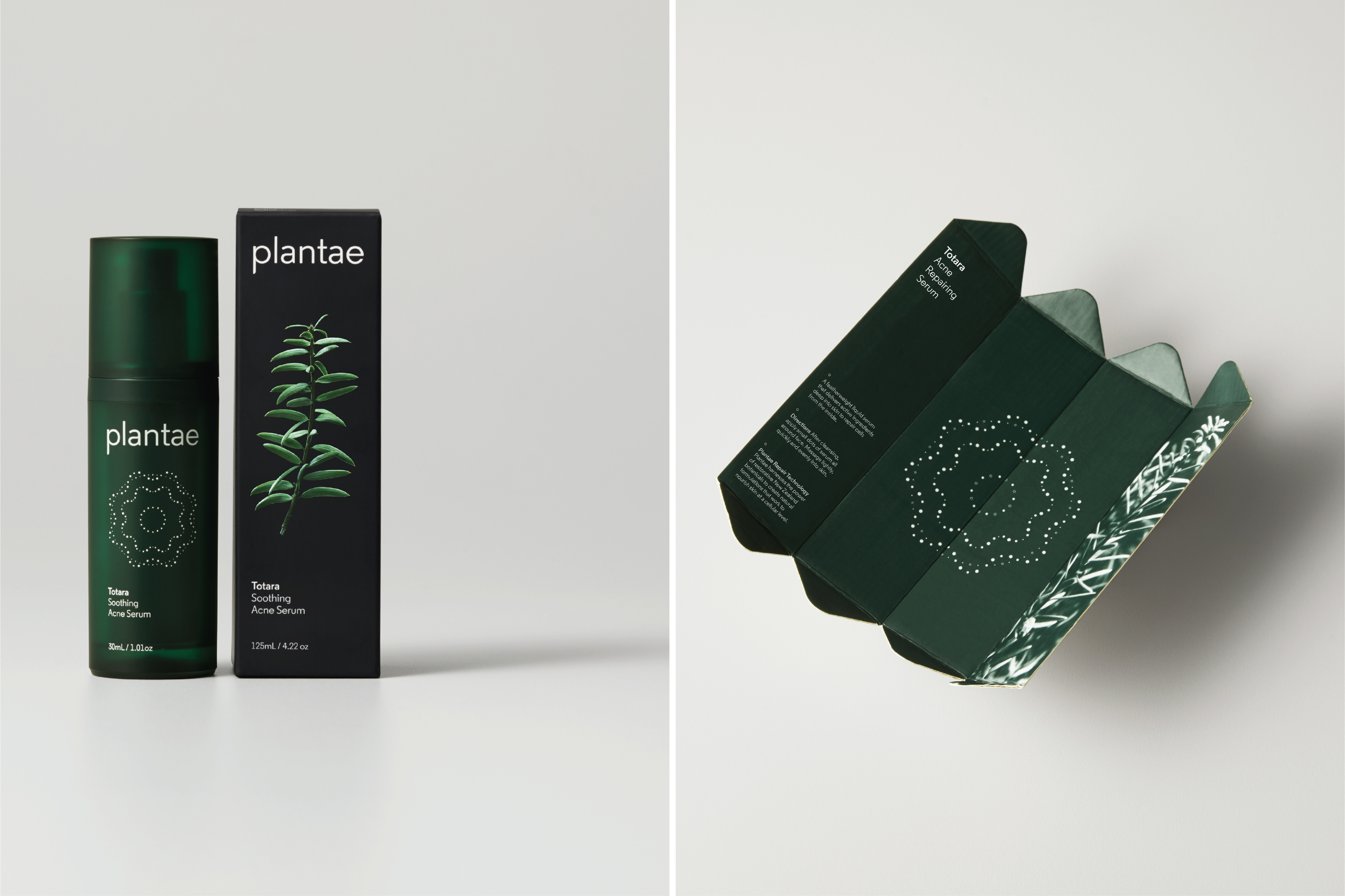
The result is a strategically-led identity evocative of the intersection of nature and science. The packaging isolates the main ingredient (Totara, in this case) as a scientific specimen, combining natural motifs with a tech-inspired, clean and clinical visual sensibility. A competitive analysis of the natural skincare category revealed an overwhelming bias towards white, cream and lighter-green colour palettes. This inspired the selection of the primary brand palette; moss green and scientific black, creating differentiation in the category at a glance.
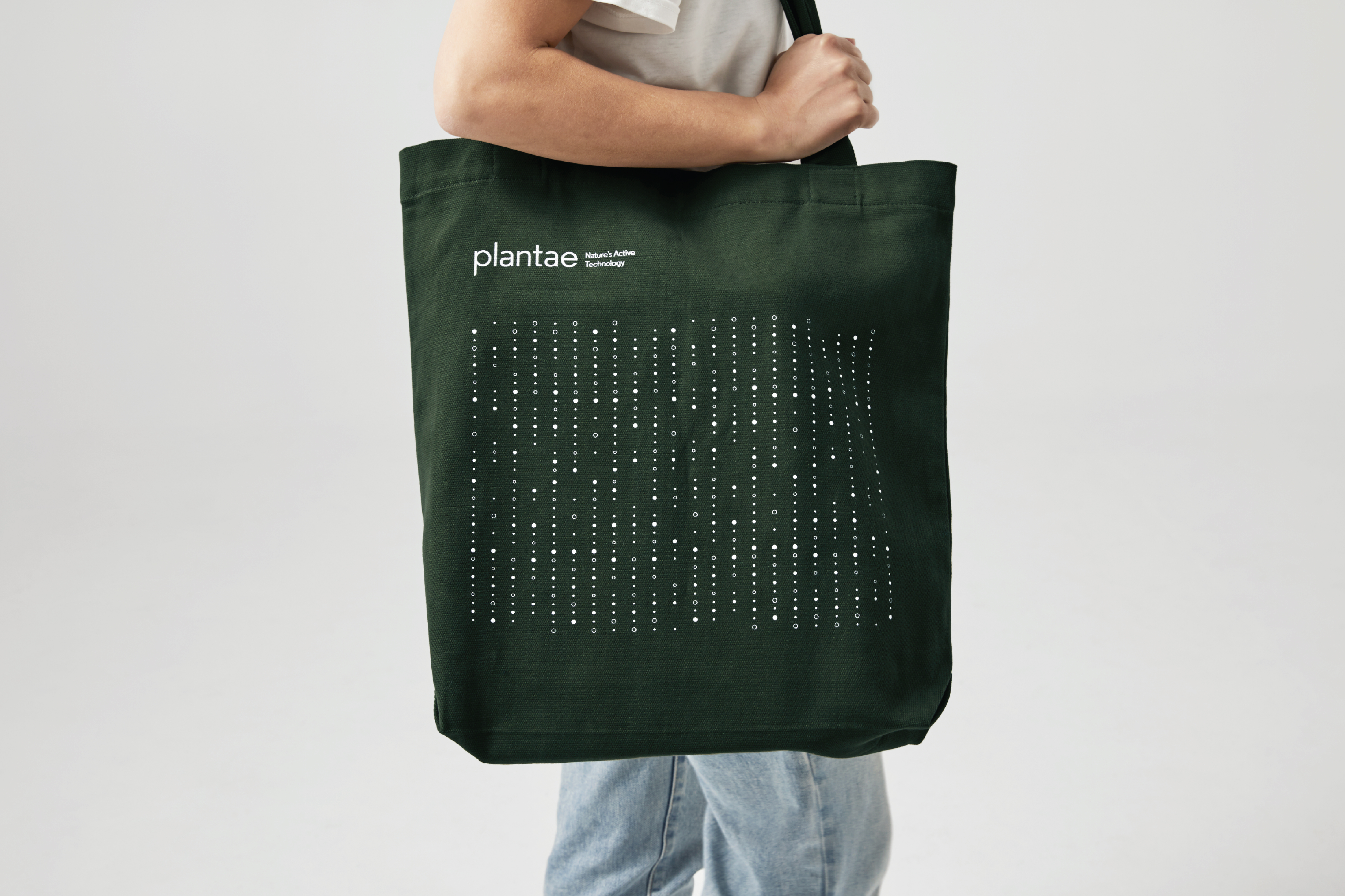
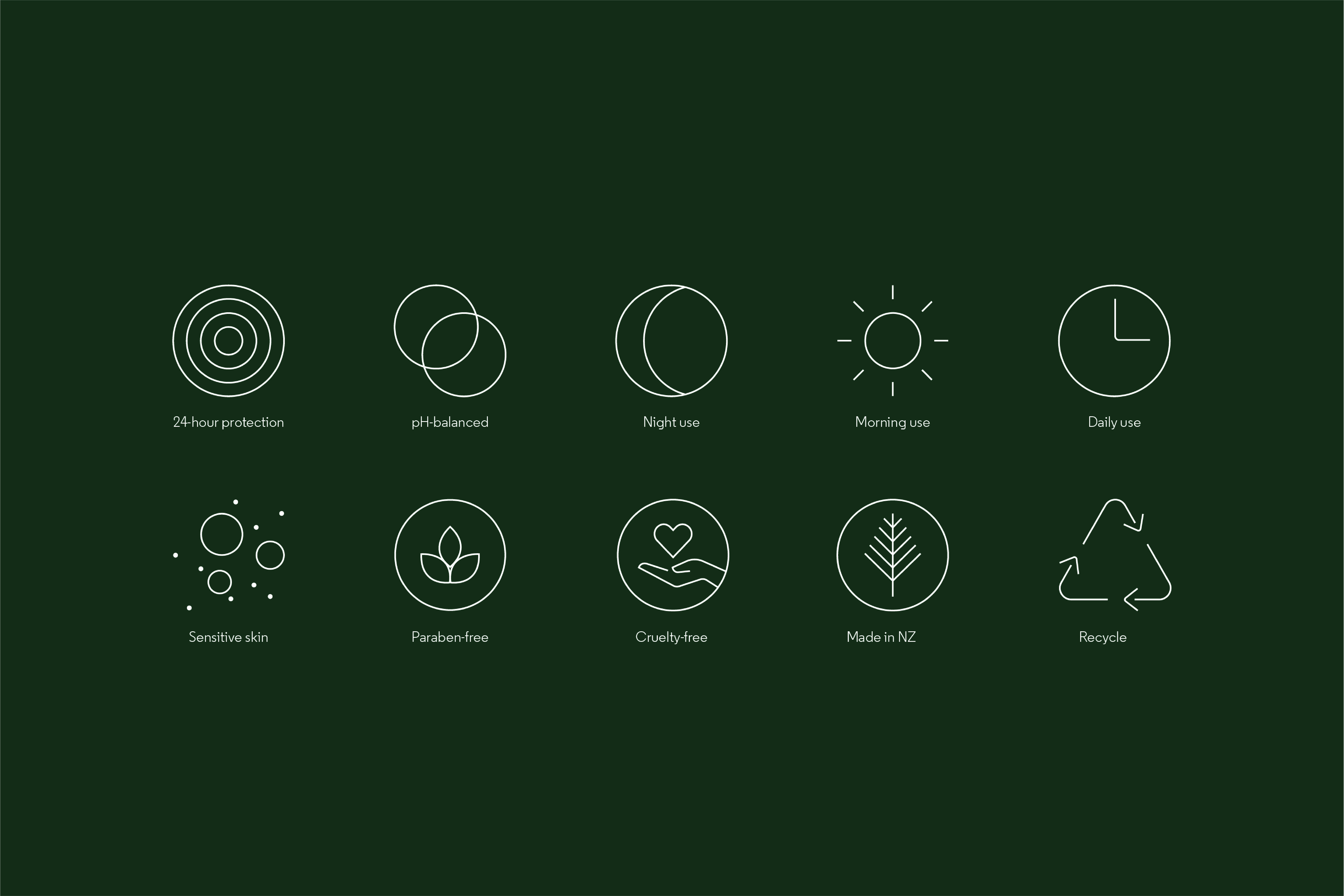
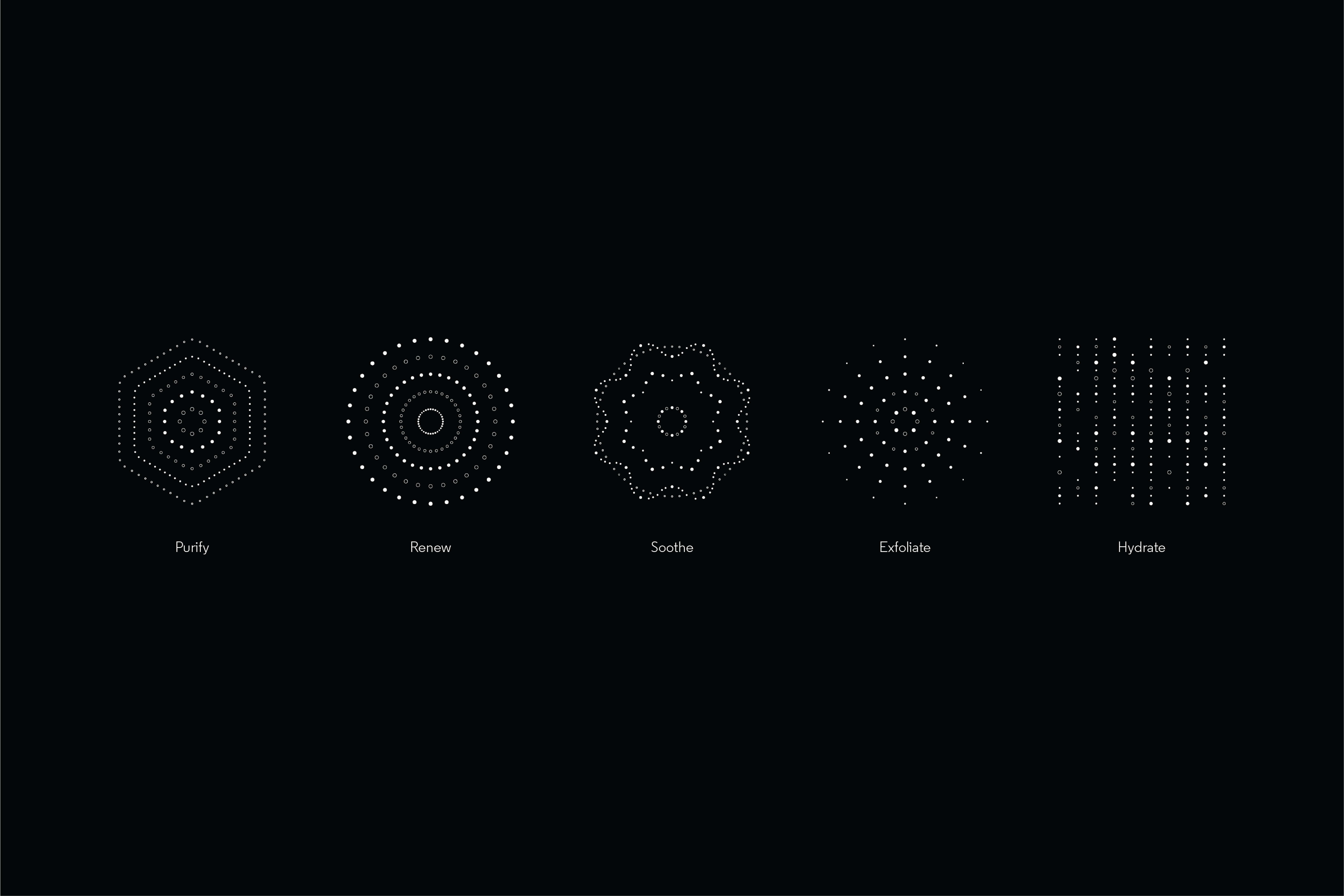
The visual identity is supplemented by a set of brand patterns that are linked to the five hero “technologies” that will be used throughout their range; Exfoliate, Hydrate, Purify, Renew, and Soothe. Inspired by nature but tech-oriented in execution, these patterns simultaneously imply the behaviour of skin cells under a microscope, and biomimicry in the way that the Hydrate pattern evokes rain, and the Soothe pattern evokes floral patterns. The identity is further supported by a set of stylised, easy-to-understand icons designed to visually communicate each product’s benefits and intended use.
The overall impression is a refreshed brand that sits at the confluence of nature and science, whilst looking forward to a future that will see science supporting the journey back to nature.

