Previous Project
Chasing Epic
Mobile Navigation Button
Work completed
Discovery Workshops, Brand Strategy, Visual Identity Design, Website
FGC+
Igniting Possibility

FGC+ is an outsourcing company that believes people and organisations yearn to fulfil their potential. At the heart of the FGC+ brand is the idea of “igniting possibility”. It recognises that work can be a great catalyst for both personal and professional growth.

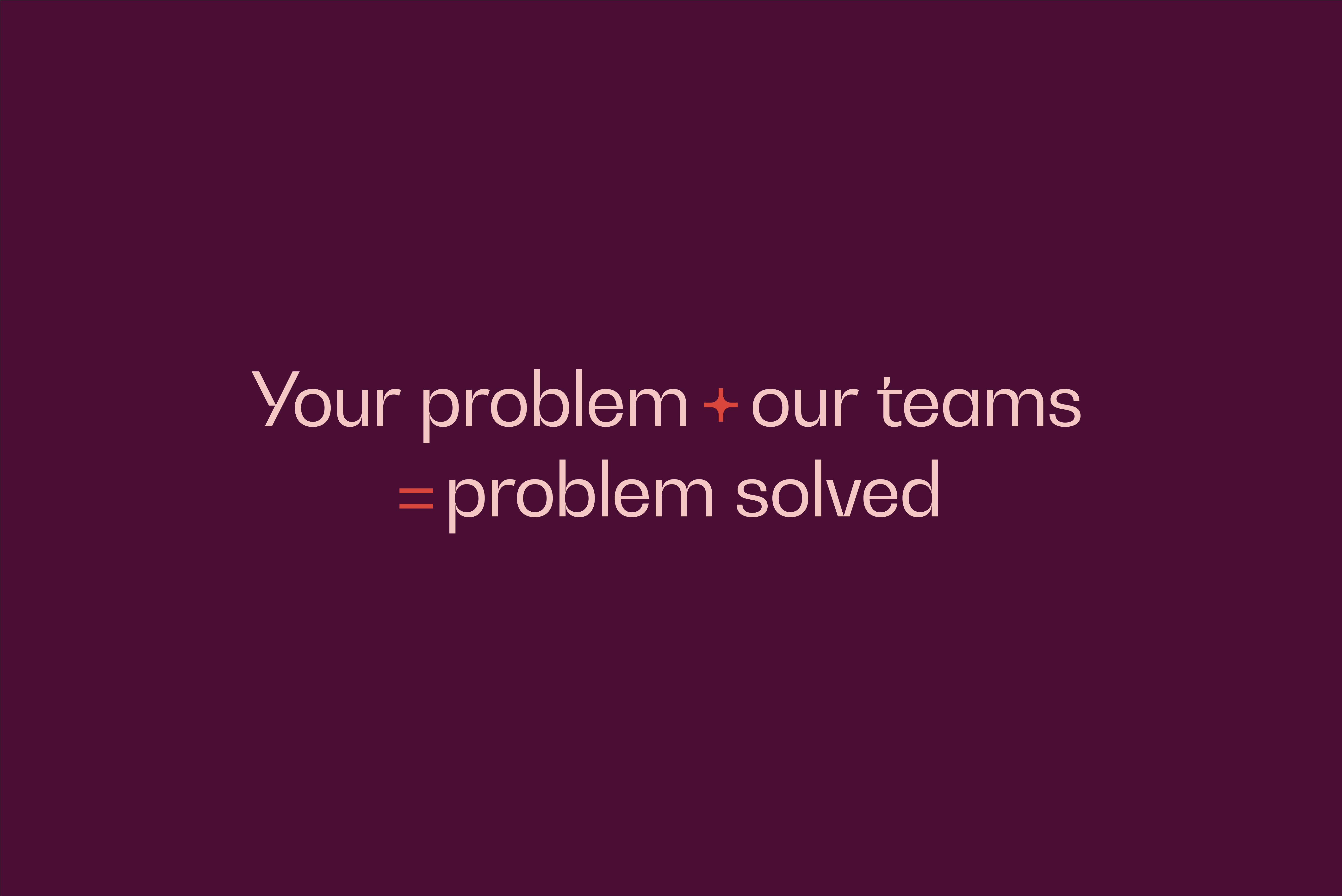
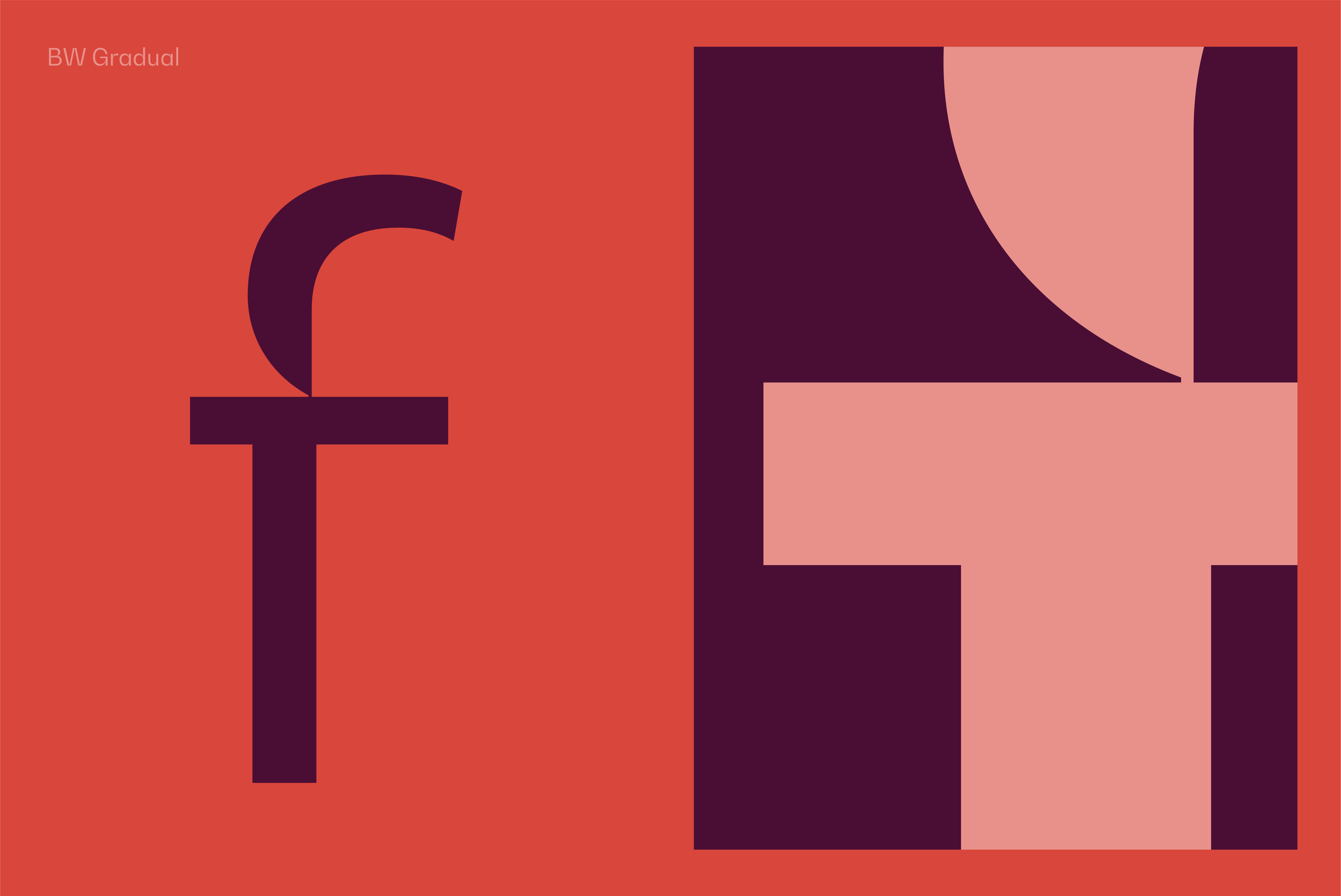
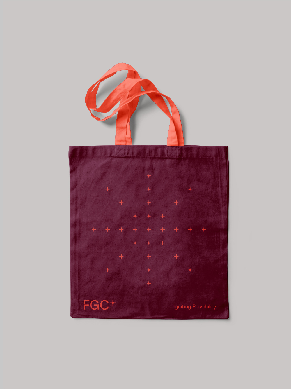
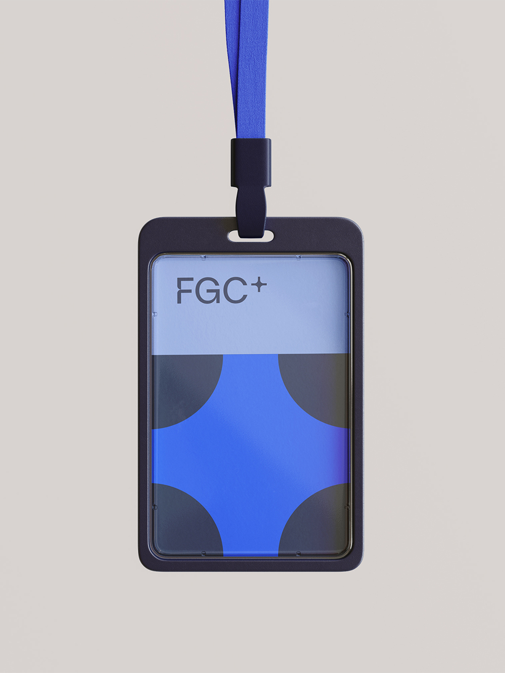
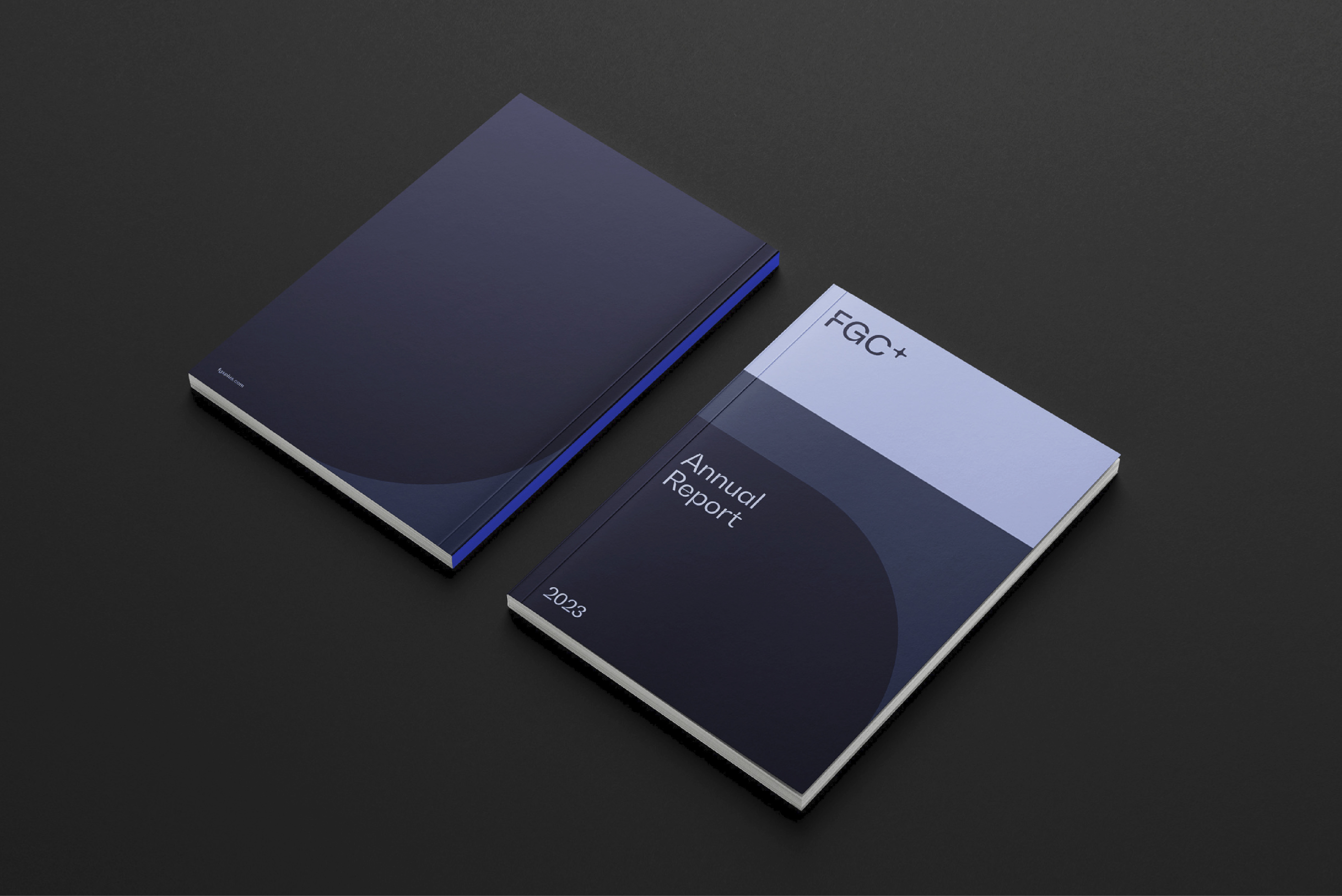
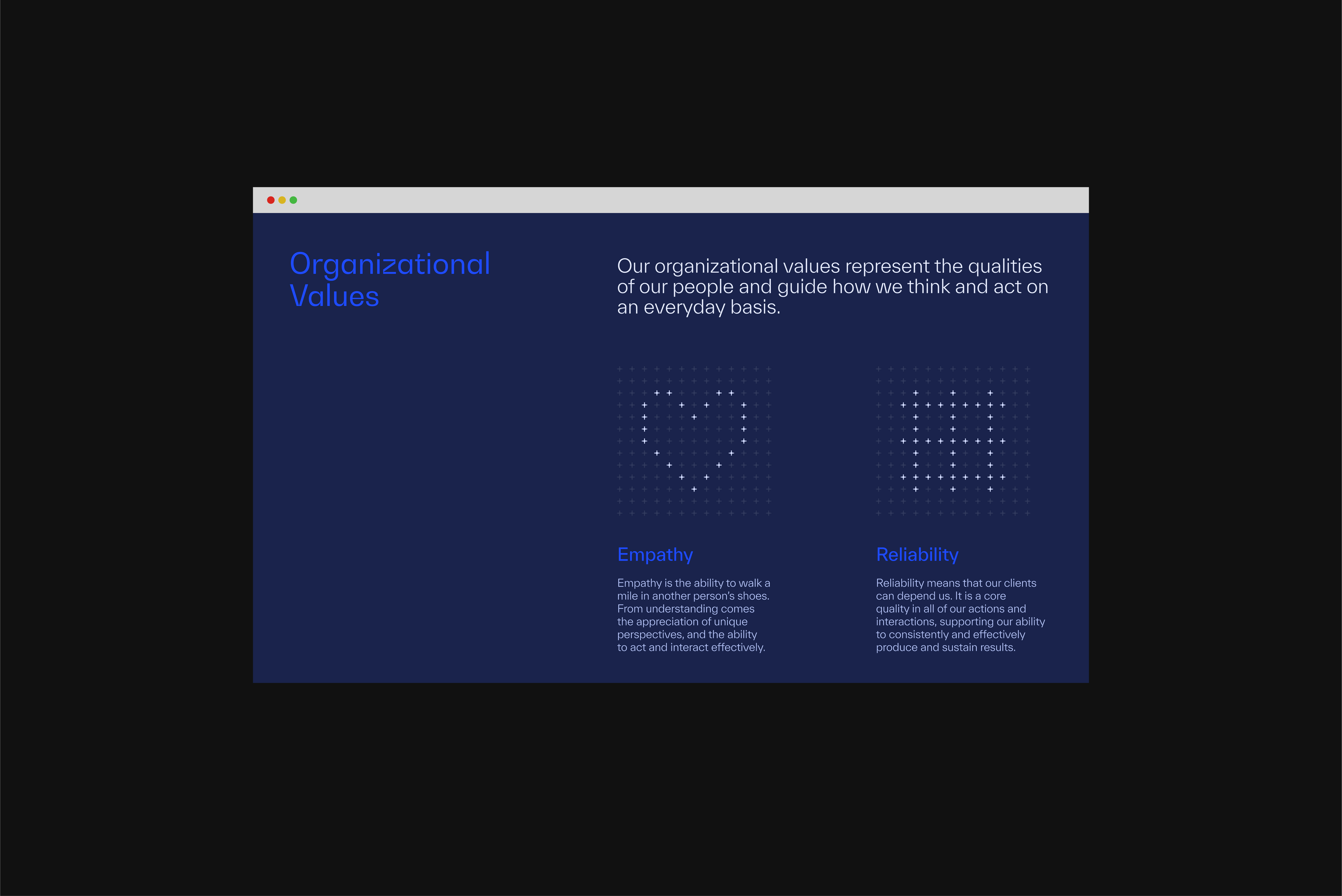
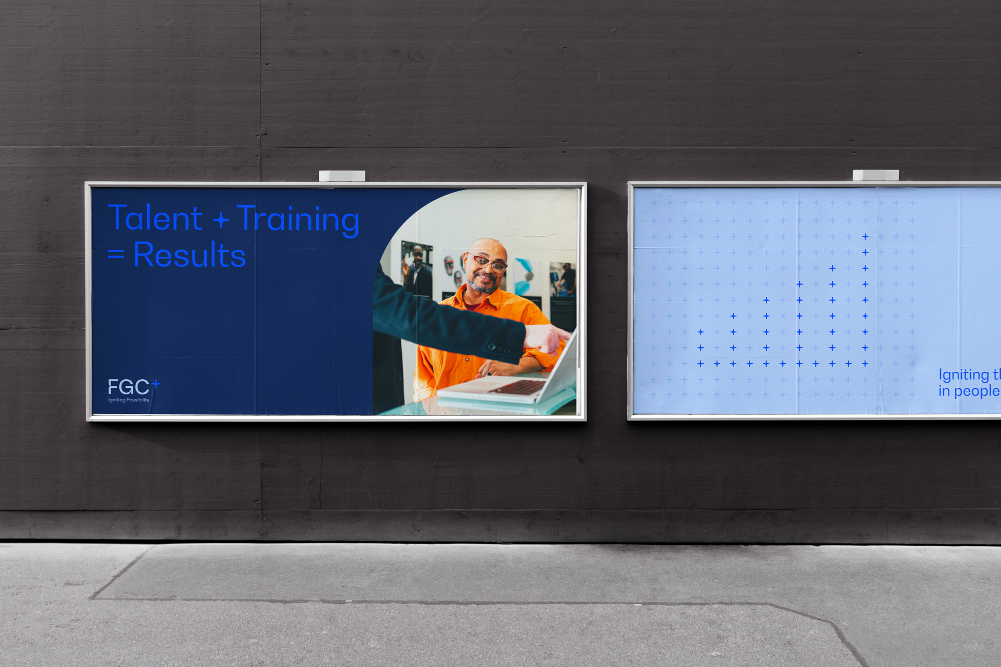
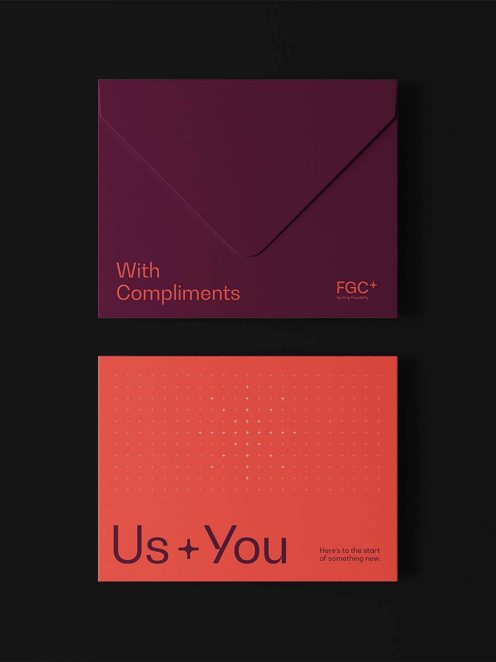
The FGC+ brand identity leverages the plus symbol, transforming it into a spark to represent the idea of “igniting possibility”. It is locked up as an exponent on the logomark to communicate the growth of FGC+, its people, and its clients.


The spark/plus symbol also forms the basis for FGC+’s brand patterns, graphics, and even the brand’s tone of voice for creating distinctive headline copy.


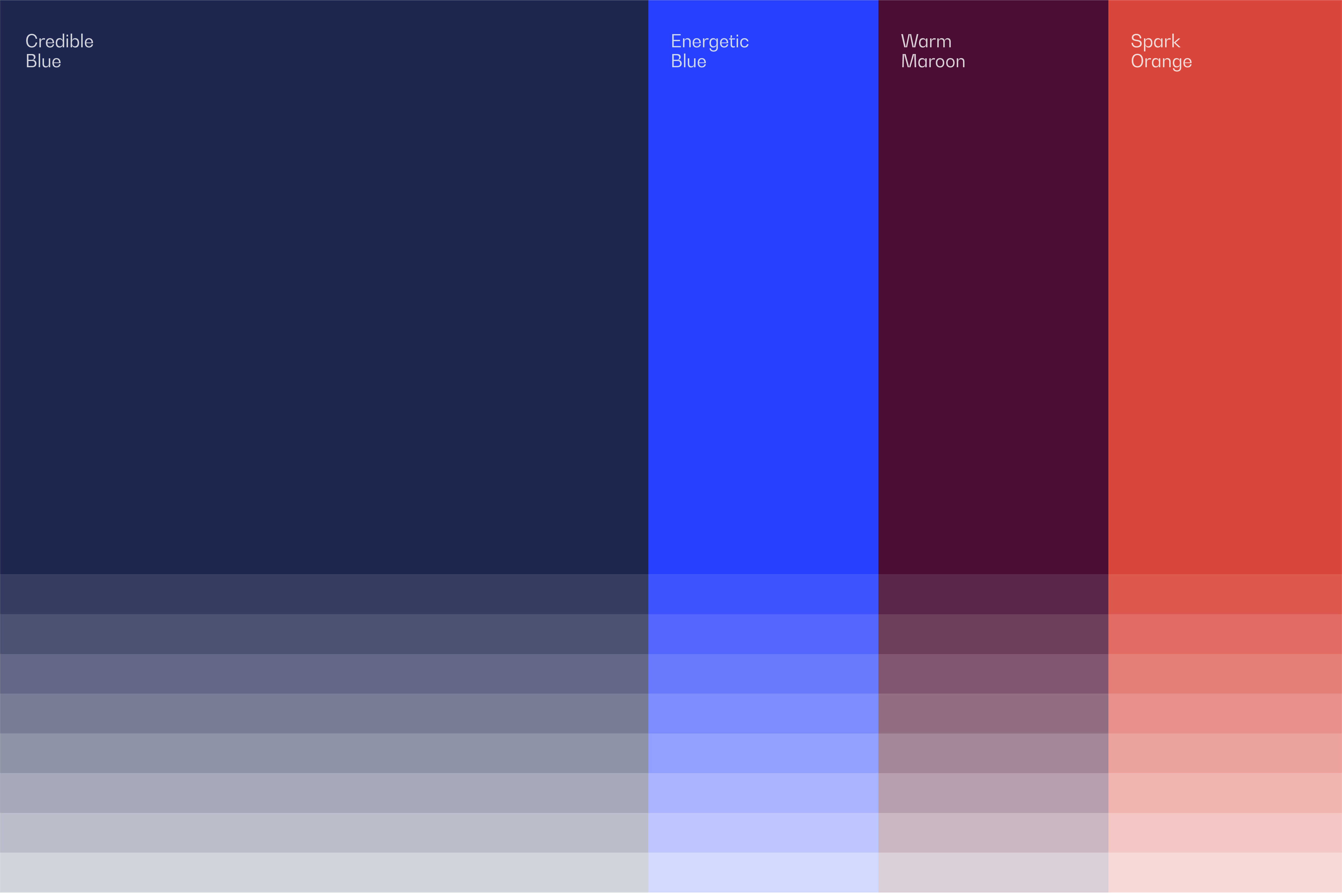
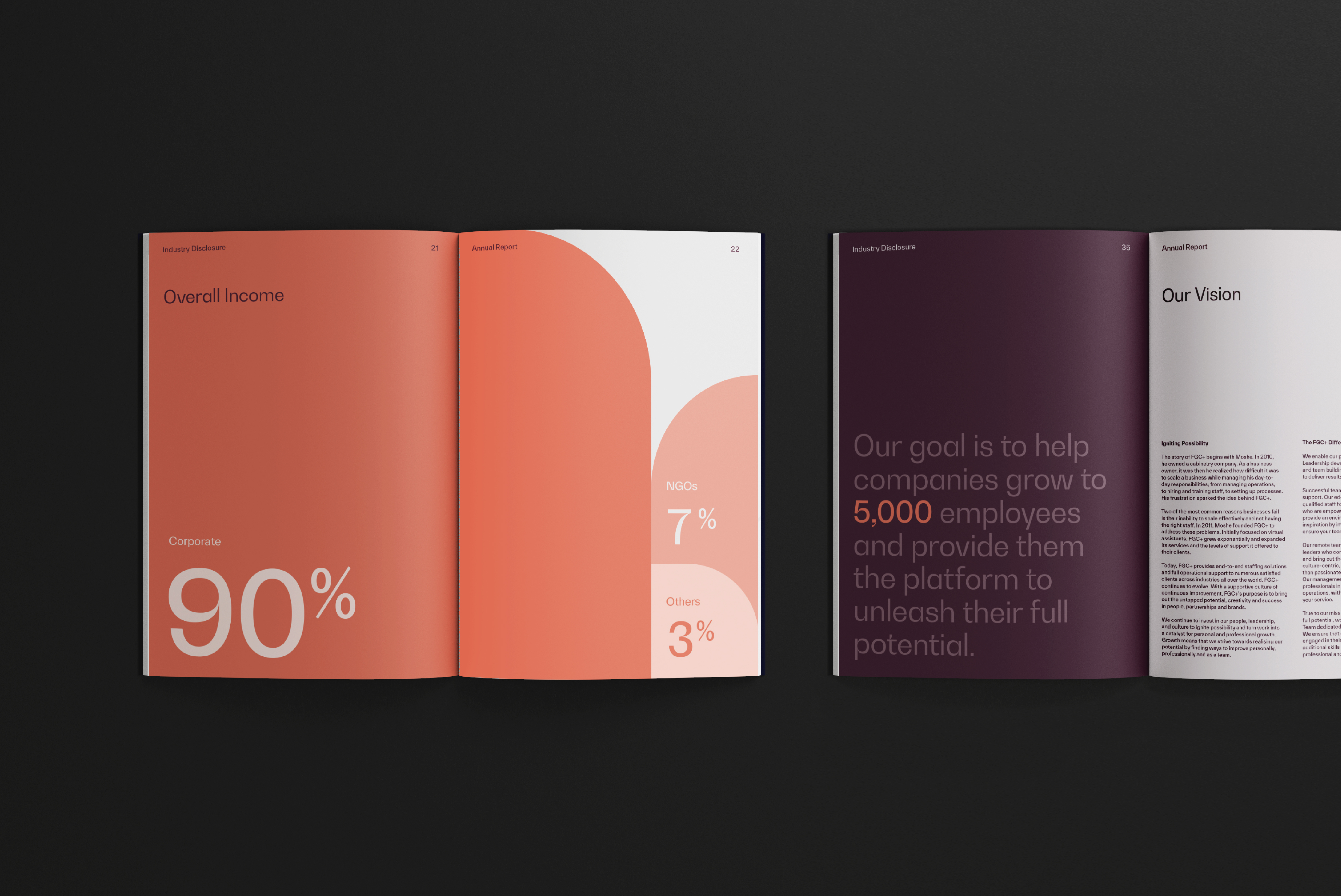
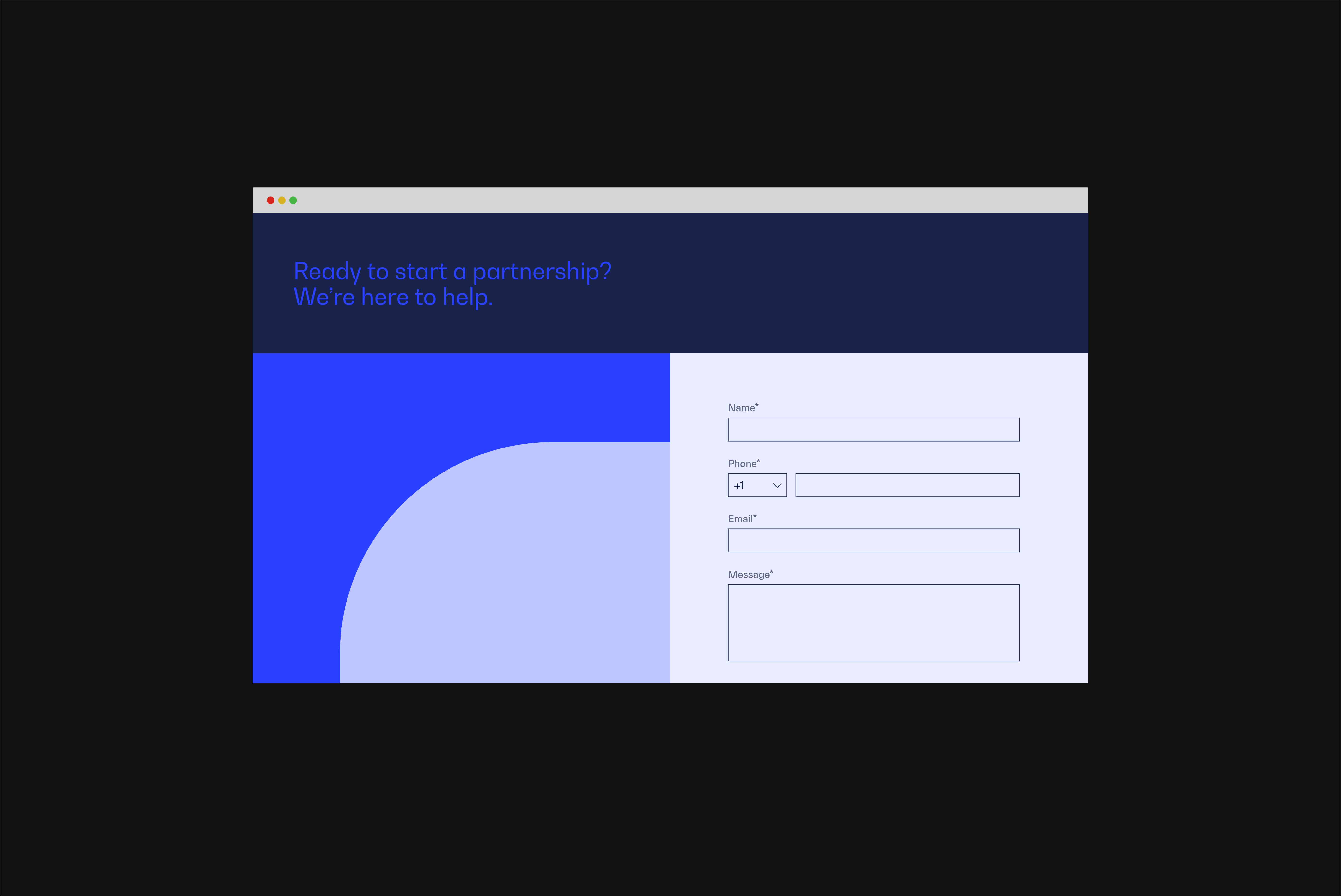
Tying all the brand elements together, FGC+’s colour system pairs darker, credible-looking colours with brighter and livelier colours. While the credible colour palette is comprised of blue hues that communicate confidence and trust, the empathic colour palette uses maroon and orange for visually striking accents that represent FGC+’s warmth and approachability.

Read more
Plus Icon
FGC Key Messaging Maroon
FGC Typography
FGC Colours
FGC Business Card Blue
FGC Tote
FGC Swipe Card Light
FGC Annual Cover
FGC Annual Spreads
FGC Website 1
FGC Website 4 Blue
FGC Icons 2
FGC Banner 2
FGC Complimentary Slip
FGC Complimentary Champagne
Work completed
Discovery Workshops, Brand Strategy, Visual Identity Design, Website