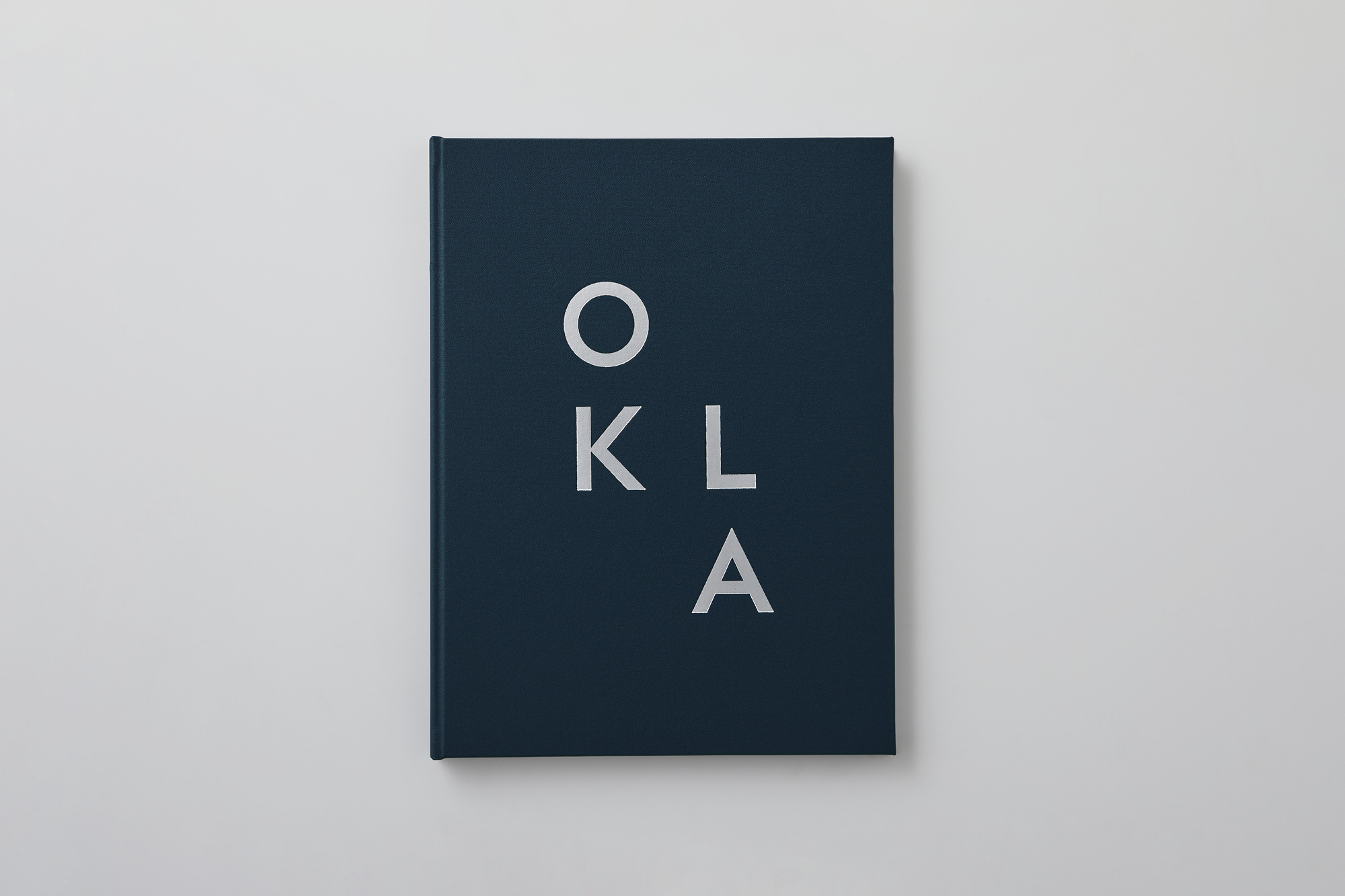
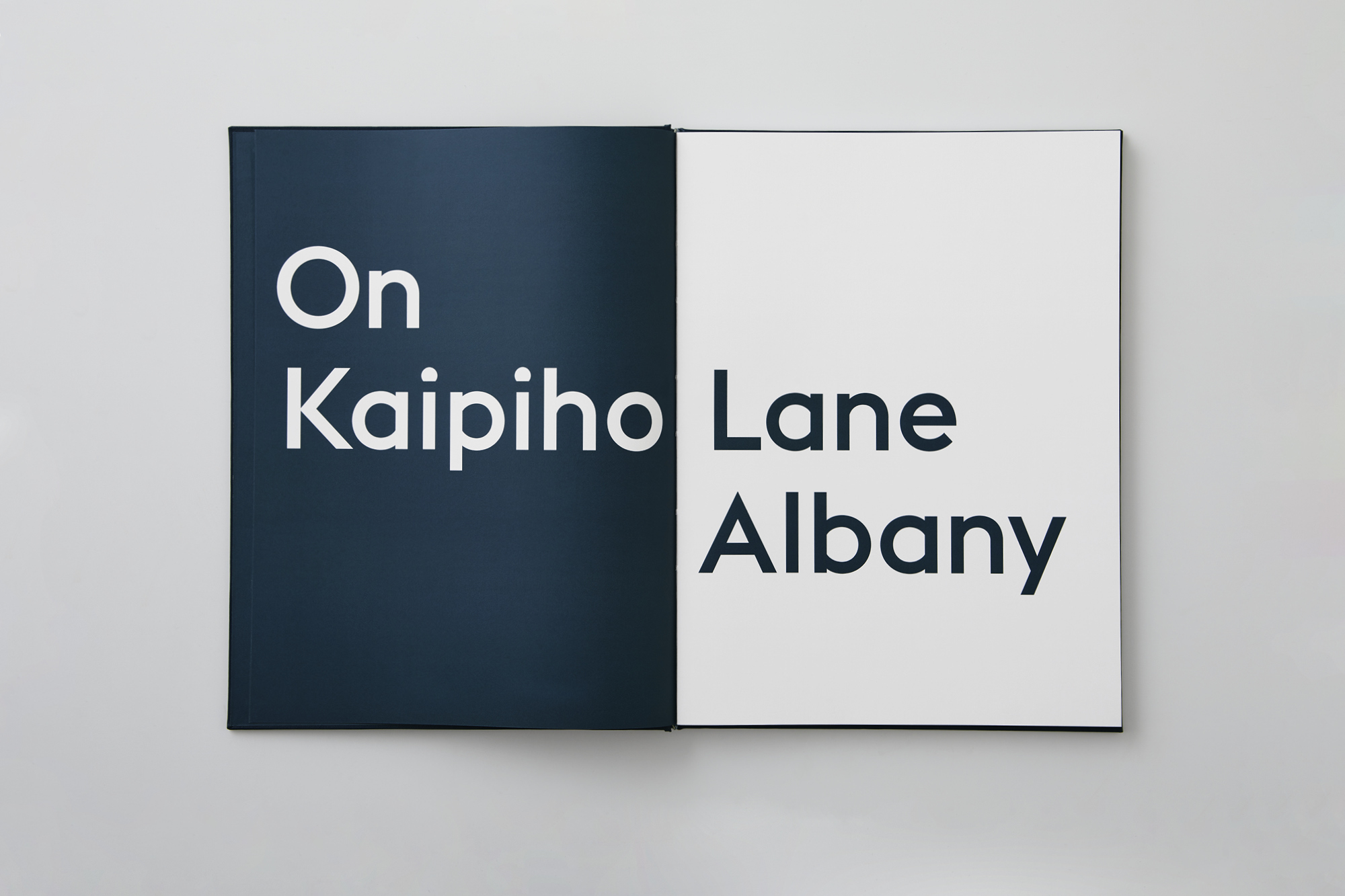
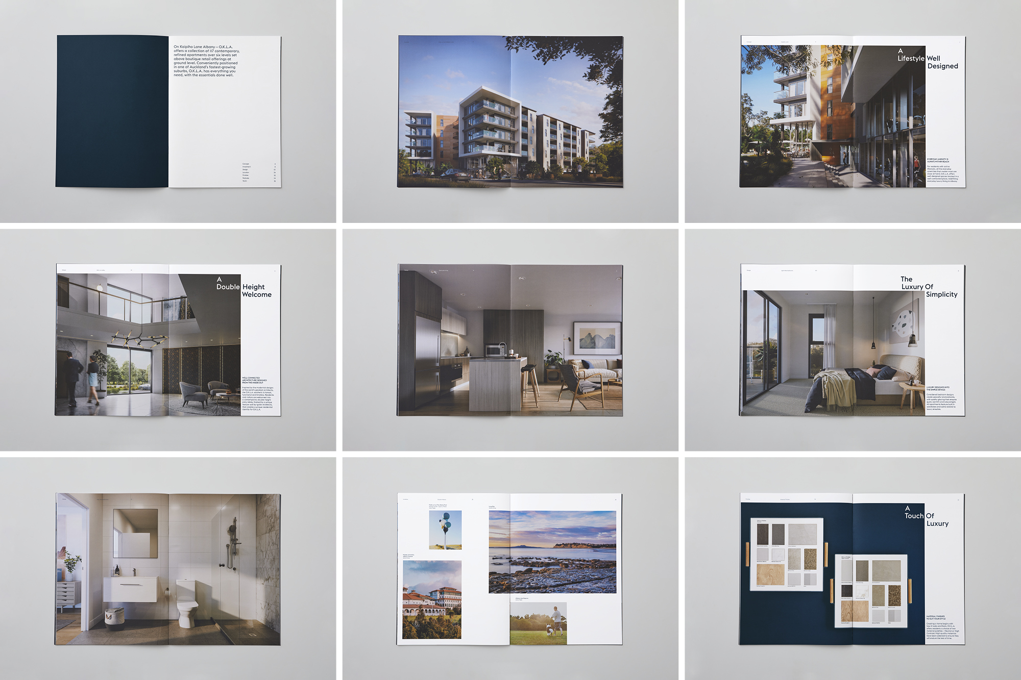
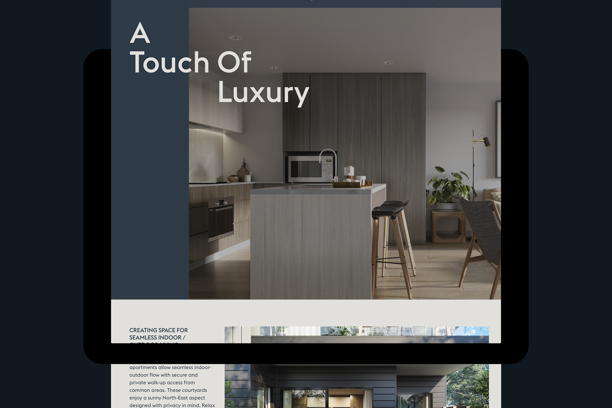
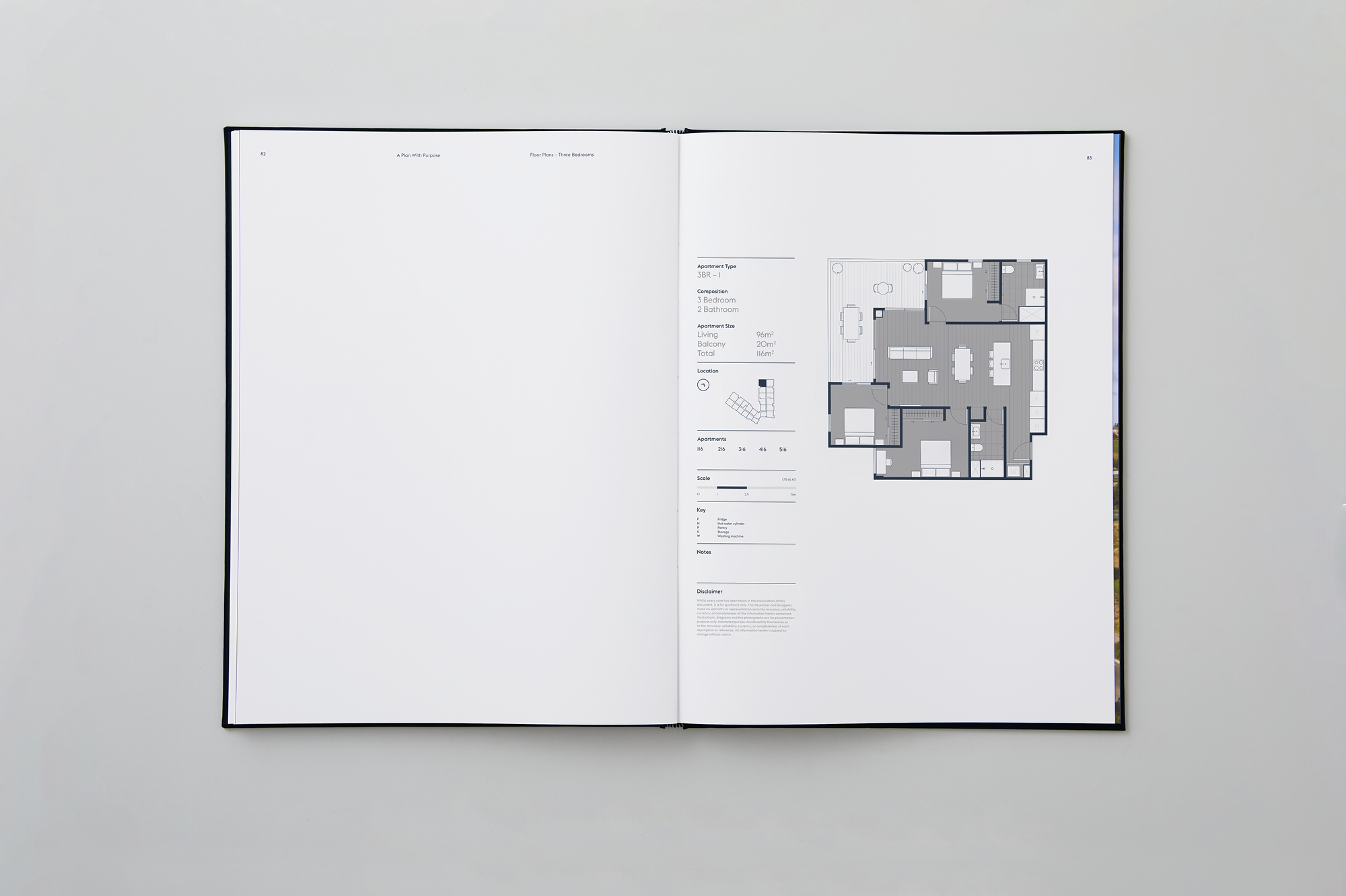
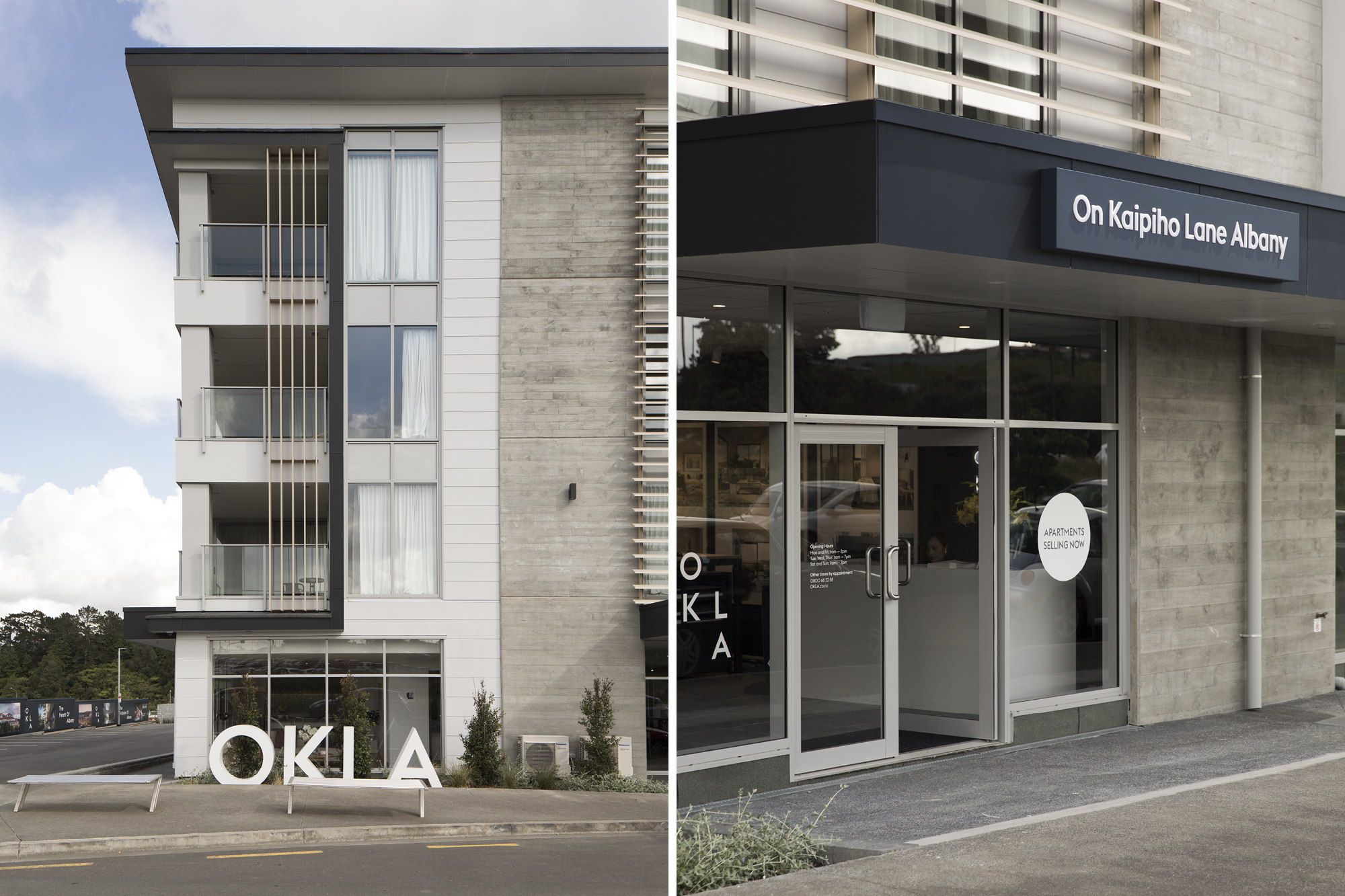
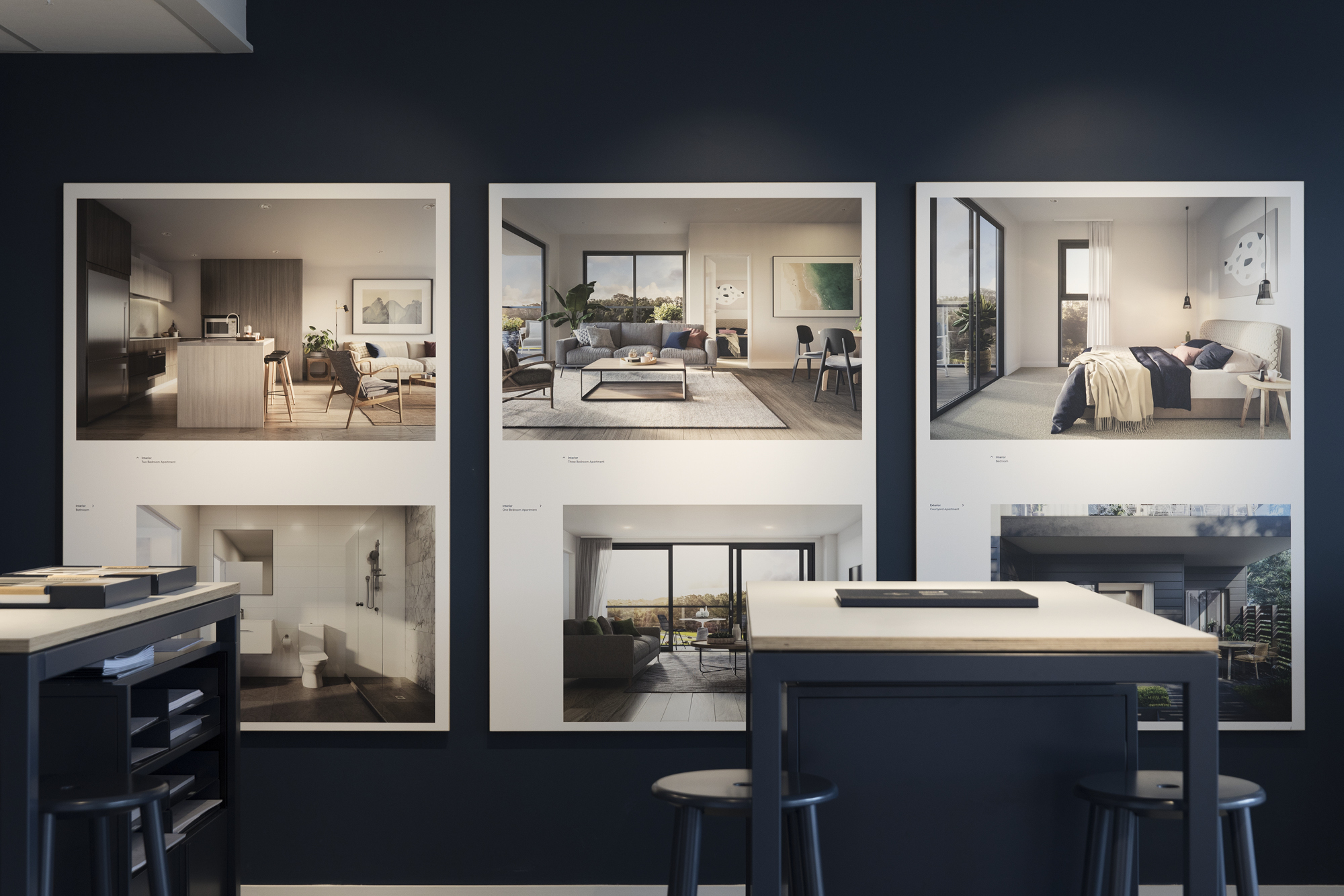
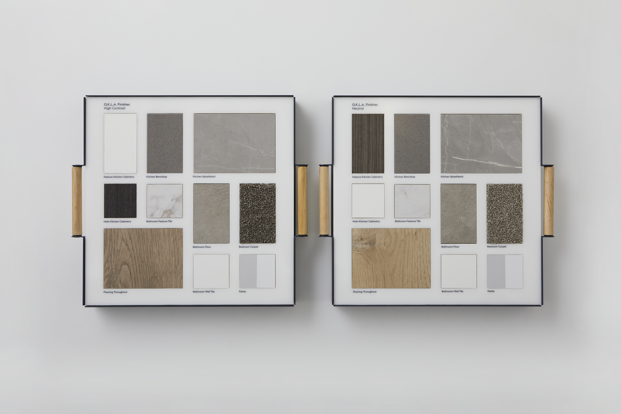
A restrained colour palette and generous use of clear space in design communications support an identity system that feels elegant and refined. On the contrary, friendly, scattered typography adds a necessary informal tone—creating an approachability that stays true to the concept of ‘everyday’.
The result is a brand identity constructed in a way that echoes the ethos of the apartment construction itself. Last year, the O.K.L.A. development was the best-selling apartment project in Auckland.
Recognition
DINZ Best Awards Finalist 2018
Small Brand Identity

