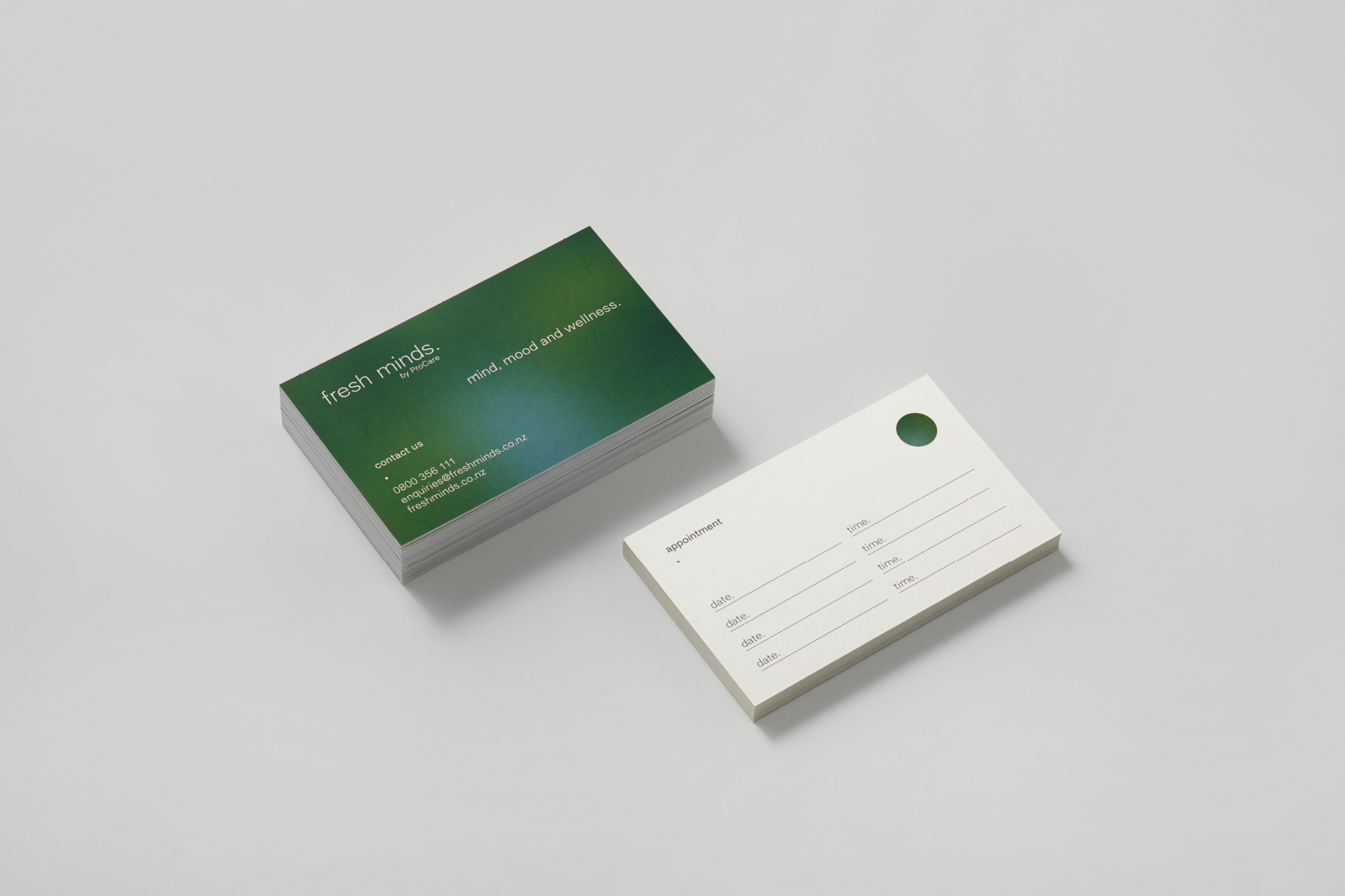
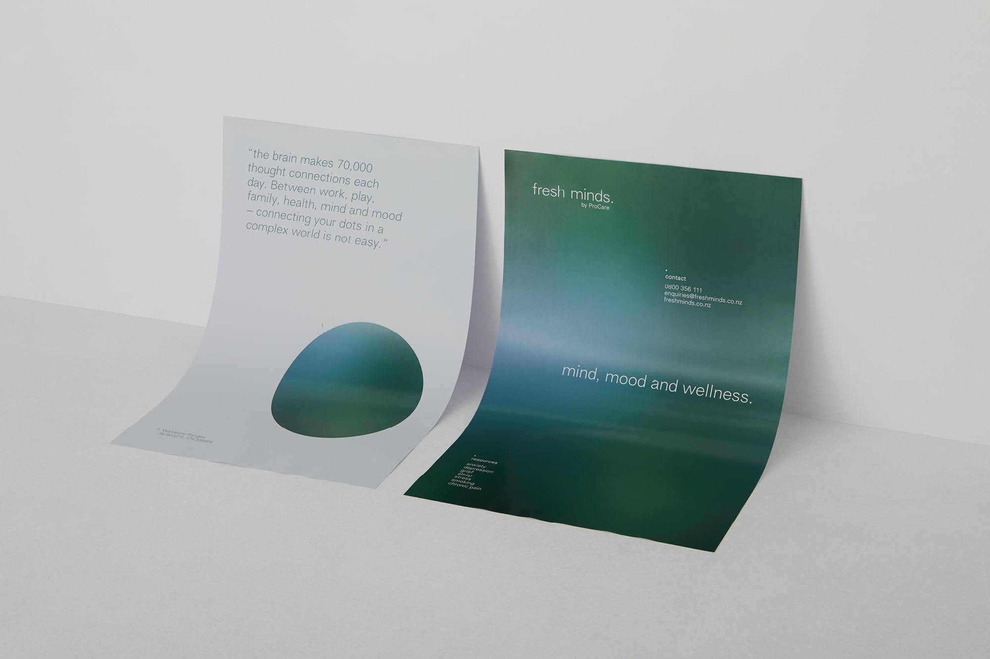
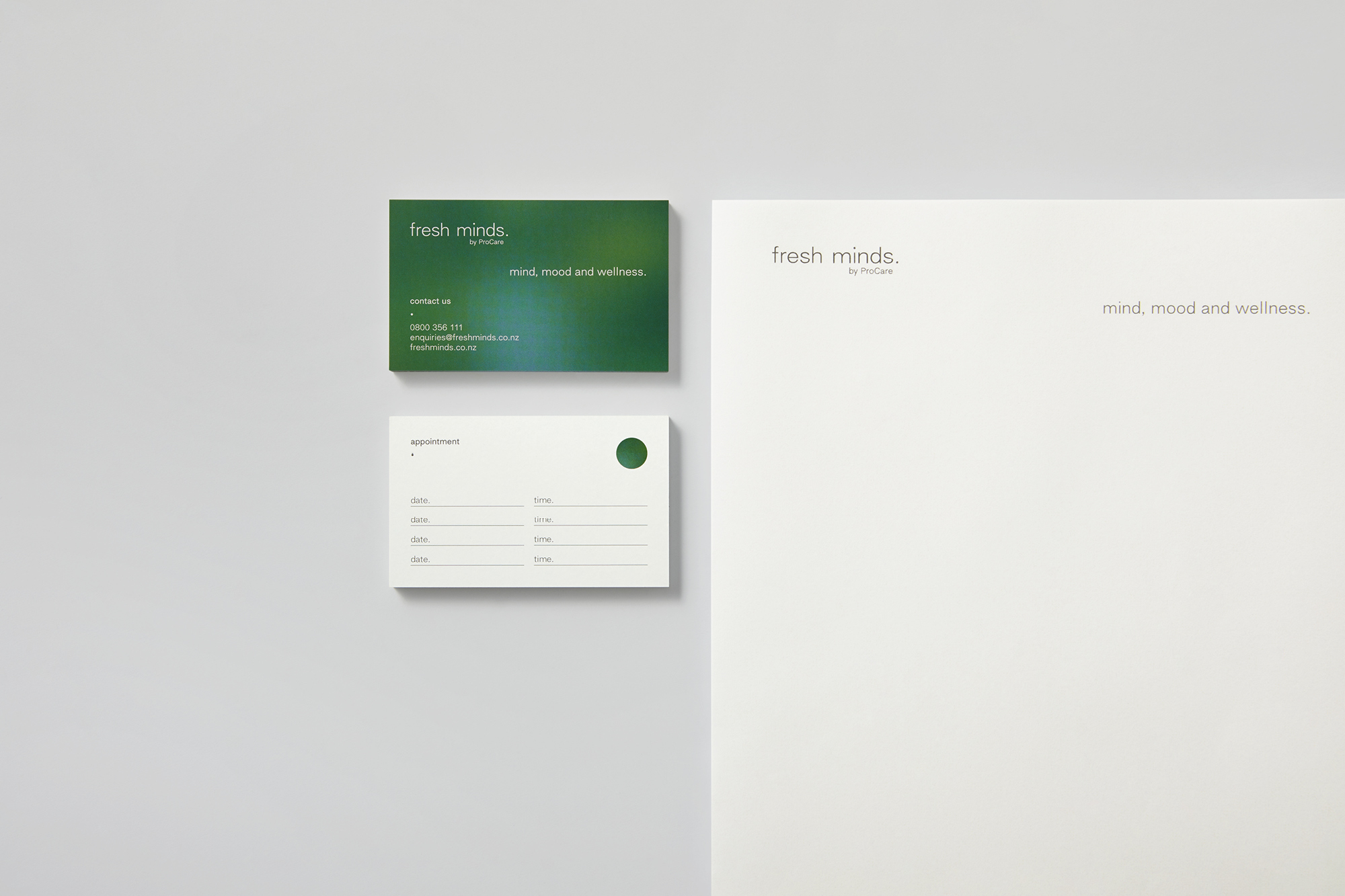
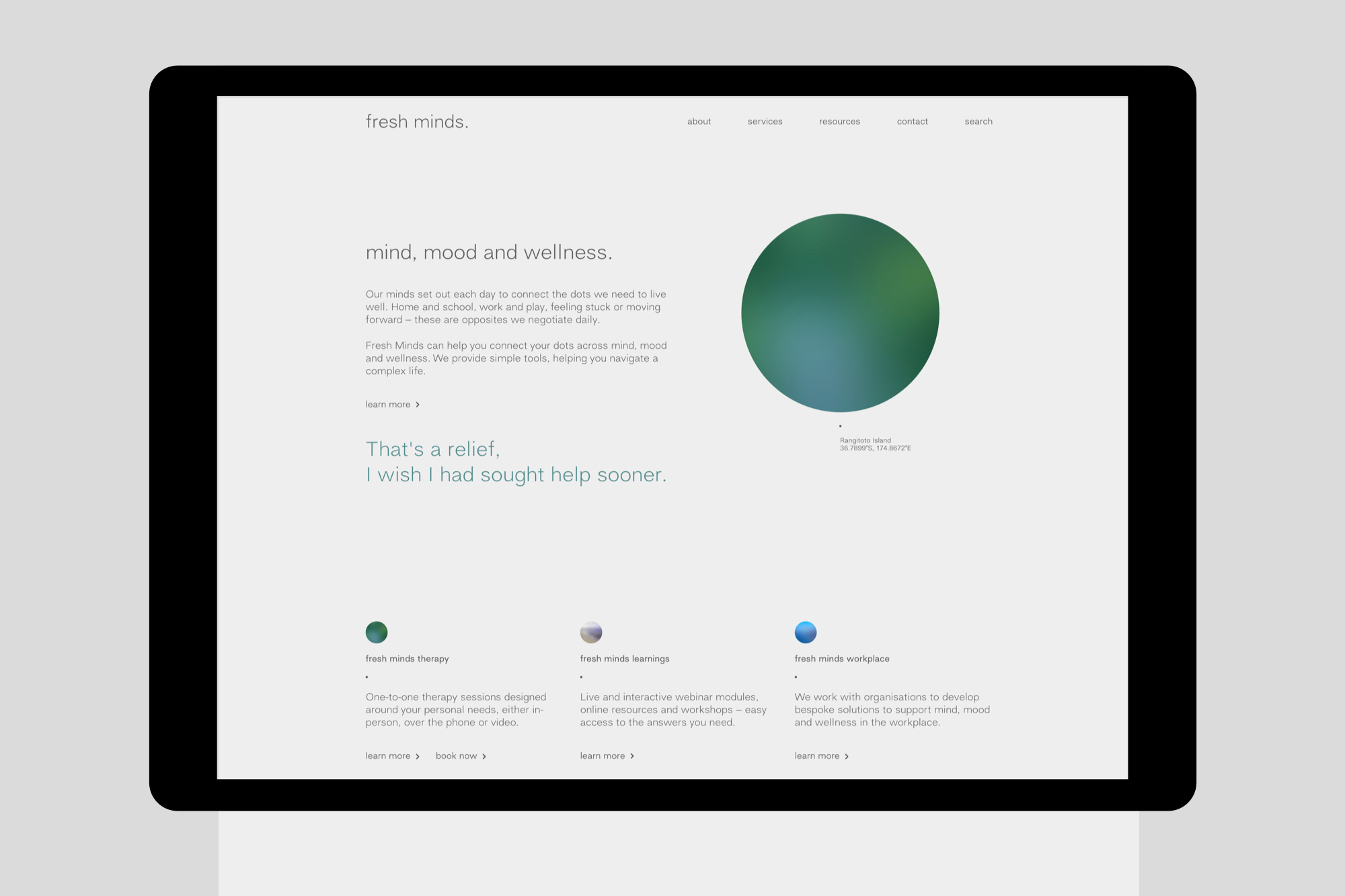
Mental health in New Zealand is an ambiguous and polarising topic. The landscape is historically inundated with diagnosis-driven language and companies whose visual identities look and feel clinical and cold. Finding a way to communicate about mental health is about breaking down the barriers, using plain, human language, normalising the topic and making it accessible to all Aucklanders alike.
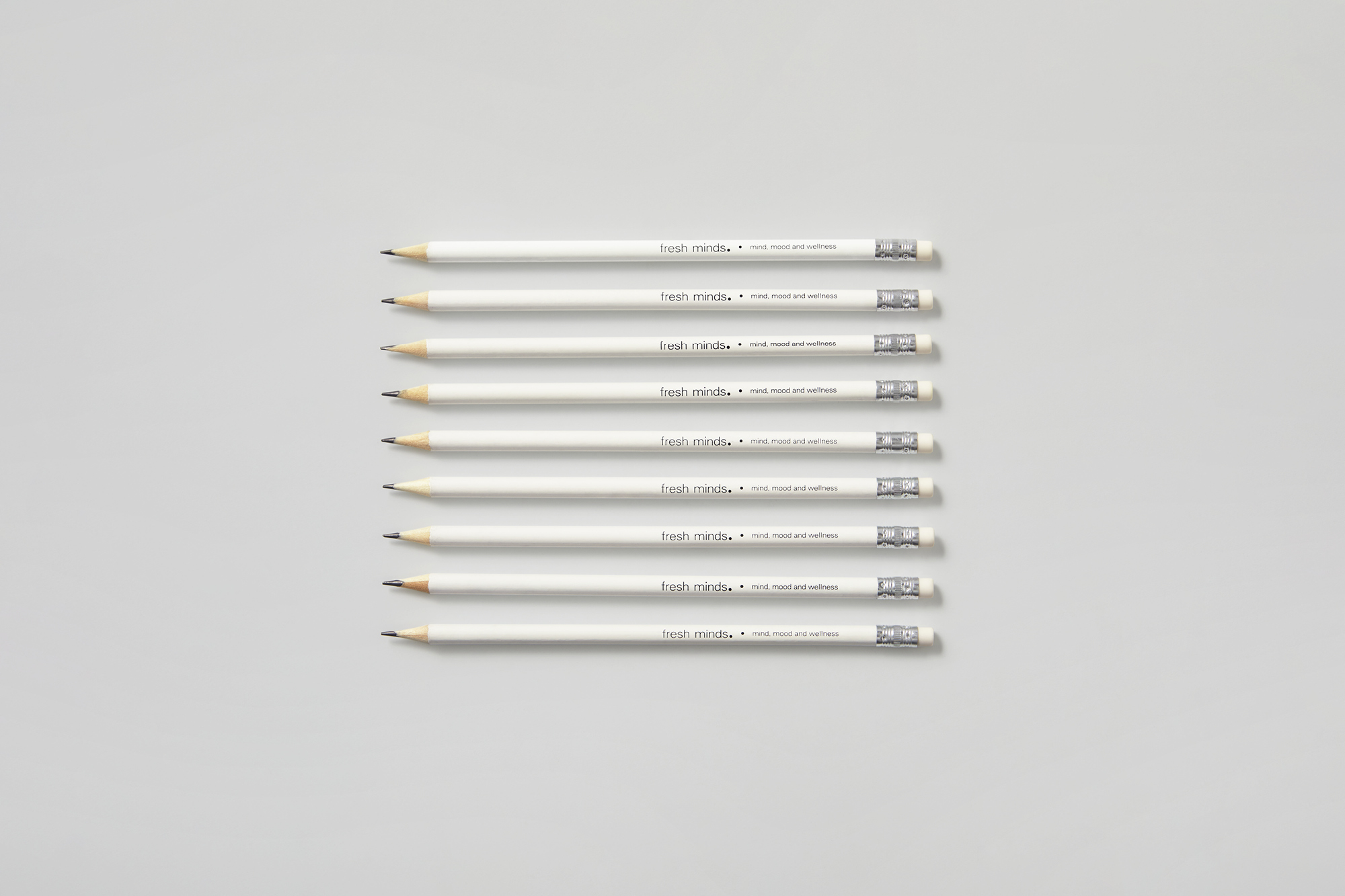
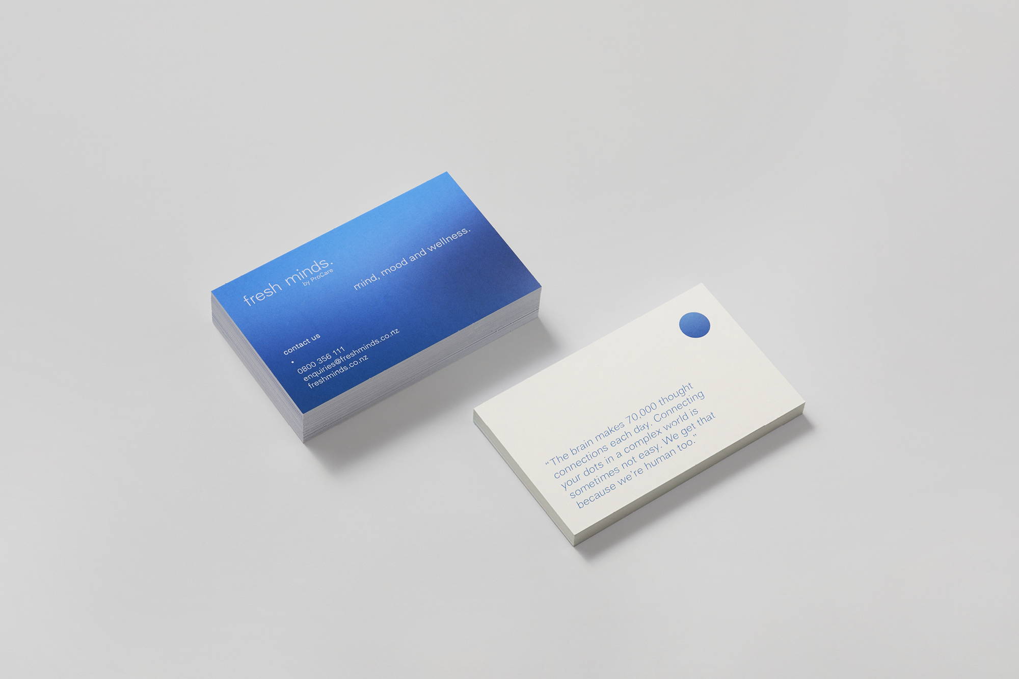
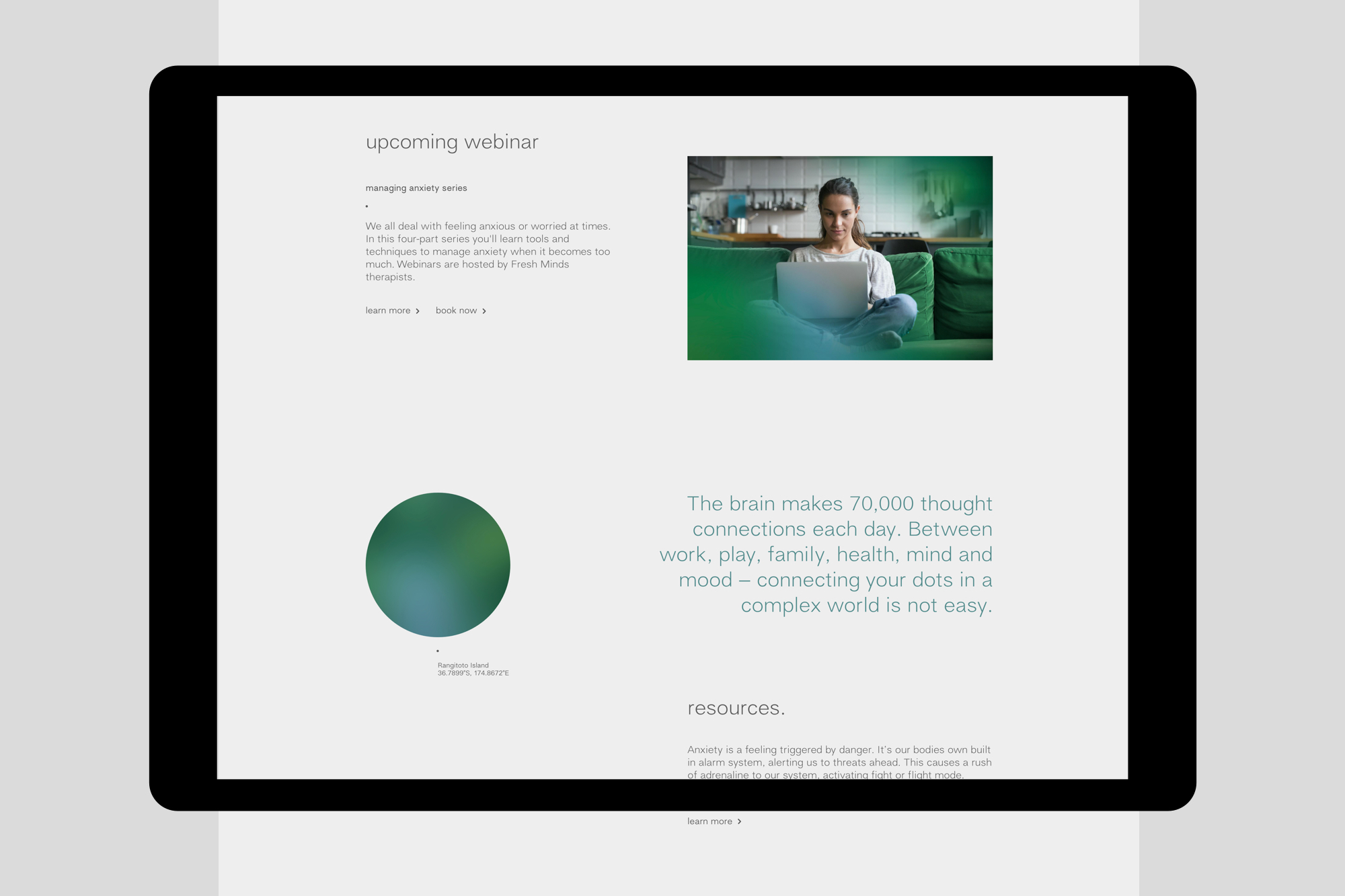
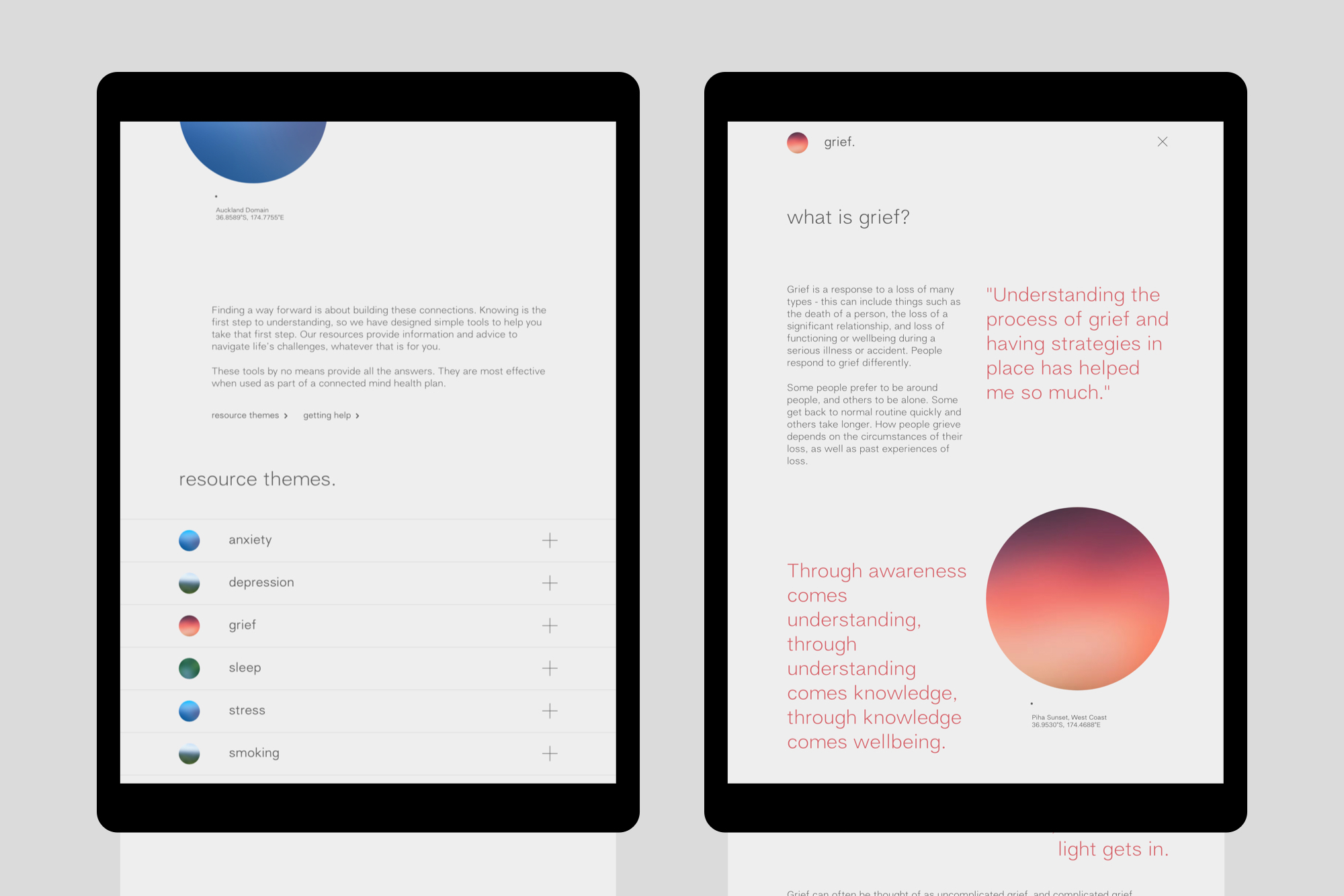
The brain makes 70,000 thought connections every day. This insight, played against the often alienating identities and language of mental health organisations sets the precedent for the Fresh Minds brand. The dot – used throughout – is a visual device to represent thought. In conversation, it also represents pause; a moment to take a breath.
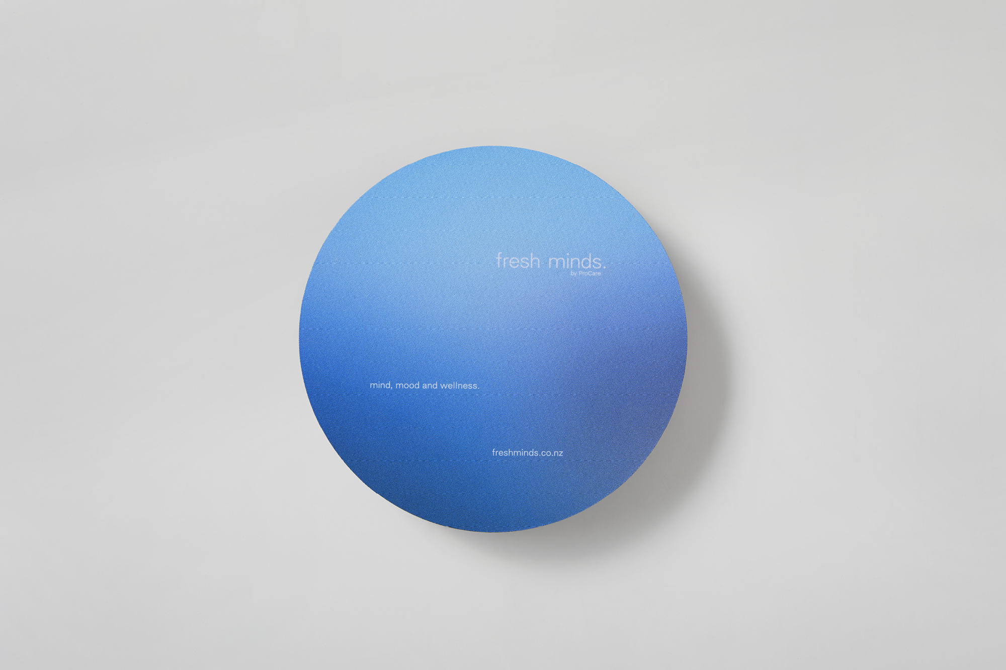
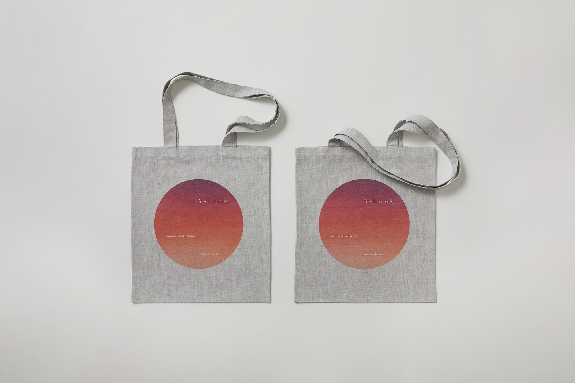
The visual identity combines this concept with a soothing colour palette inspired by nature, the openness of negative space, and a conversational tone of voice to create an identity that is warm and inviting. Richards Partners intentionally avoided portrait photography and depicting people of a particular culture or race. In doing so, Fresh Minds bypasses the issue of representation (or lack thereof) and opens the conversation to the experience of Auckland’s diverse population, encouraging them to reach out for help when they need it.

